A ControlTemplate is used to specify the visual structure and visual behaviour for a control without changing its functionality. For example, you can have a round button instead of the default square shape, but the button will still raise the Click event. Within the ControlTemplate, you customize the visual structure using FrameworkElement objects, and you customize the visual behaviour using VisualState objects.
Each control has a default template. This gives the control its basic appearance. The default template is by convention wrapped into a style that is identified by value of the DefaultStyleKey property that every control has. The template is defined by a dependency property called Template. By setting this property to another instance of a control template, you can completely replace the appearance (visual tree) of a control.
Controls have many properties, such as Background, Foreground, and FontFamily to control the control's appearance, but the changes that you can make by setting these properties are limited. You create a ControlTemplate when you want to customize the control's appearance beyond what setting the other properties on the control will do. For example, suppose that you want the content of a check box to be above the selection indicator and you want an X to indicate that the CheckBox is selected. You specify these changes in the ControlTemplate of the CheckBox:
| A checkbox that uses the default ControlTemplate | |
| A checkbox that uses a custom ControlTemplate | |
When you create a ControlTemplate you combine FrameworkElement objects to build a single control: A ControlTemplate must have only one FrameworkElement as its root element, and the root element the contains other FrameworkElement objects. The combination of these objects makes up the control's visual structure.
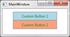
The following shows a very basic example for a button. The control still functions as a button (i.e., supports Click event), however it does not visually behave like a button (i.e. does not appear depressed when the left mouse button is down, etc.). Changing the button's appearance when it is in a different state is discussed later in this chapter (using VisualStateManager):
<UserControl x:Class="ControlTemplateDemo.CustomButton"
             xmlns="http://schemas.microsoft.com/winfx/2006/xaml/presentation"
             xmlns:x="http://schemas.microsoft.com/winfx/2006/xaml"
             xmlns:mc="http://schemas.openxmlformats.org/markup-compatibility/2006"
             xmlns:d="http://schemas.microsoft.com/expression/blend/2008"
             mc:Ignorable="d"
             d:DesignHeight="300" d:DesignWidth="300">
    <UserControl.Resources>

      <!-- Create a simple ControlTemplate for a button
      TargetType is required to identify the target element to which the ControlTemplate can be applied -->
      <Style x:Key="ButtonNewStyle" TargetType="{x:Type Button}">
          <Setter Property="Template">
             <Setter.Value>
                 <ControlTemplate TargetType="Button">
                    <!-- The one and only root element -->
                    <Border x:Name="RootElement">

                       <!-- Create a solid color brush for the background as an object element so that it
                        has a name that can be referred-->
                        <Border.Background>
                            <SolidColorBrush x:Name="BorderBrush" Color="DarkGray" />
                        </Border.Background>

                        <!-- Other FrameworkElement elements that are children of the root element. In
                        this case a Grid is used as a container to center the button's content
                        Background="{TemplateBinding Background} indicates that the background for the grid
                        is obtained from the background of the templated control
                        -->
                        <Grid Background="{TemplateBinding Background}" Margin="2">

                           <!-- A child FrameworkElement is used to display the content of the the button -->
                           <ContentPresenter
                                  HorizontalAlignment="{TemplateBinding HorizontalContentAlignment}"
                                  VerticalAlignment="{TemplateBinding VerticalContentAlignment}"/>
                       </Grid>
                    </Border>
                </ControlTemplate>
            </Setter.Value>
        </Setter>
    </Style>

   </UserControl.Resources>
   <Grid>

    <!-- The value of the Content attribute will be handled by ContentPresenter in the ControlTemplate.
    The value of the Background attribute will be assigned to the Grid Background via TemplateBinding-->
    <StackPanel Orientation="Vertical" Margin="10">
        <Button Width="150" Height="30"
                Style="{StaticResource ButtonNewStyle}"
                Content="Custom Button 1" Background="LightBlue"
                Foreground="Green" FontSize="12"/>

        <Button Width="150" Height="30"
                Style="{StaticResource ButtonNewStyle}"
                Content="Custom Button 1" Background="LightSalmon"
                Foreground="Green" FontSize="12"/>
    </StackPanel>
  </Grid>
</UserControl>
The visual structure consists of the following parts:
A Border named RootElement that serves as the template's root FrameworkElement.
A Grid that is a child of RootElement.
A Content Presenter that displays the button's content. The ContentPresenter enables any type of object to be displayed.
In the example above note the use of the TemplateBinding markup extension:
TemplateBinding binds a target property to a source property.
The target property is a property of a ControlTemplate child element
The source property is a public property that is defined by the templated control (Button which derives from Control)
For example, Grid.Background target property is bound to Button.Background source property, and ContentPresenter.HorizontalAlignment target property is bound to Button.HorizontalContentAlignment source property, etc.
The names of the two properties do not need to be identical.
Target and source properties must have the same types.
The Control class defines several (source) properties that must be used by the ControlTemplate to have an effect on the control when they are set. How the ControlTemplate uses the (source) property depends on the property. The ControlTemplate must use the (source) property in one of the following ways:
A target property of an element in the ControlTemplate template binds to the source property. For example, Grid.Background binds to Button.Background.
A target property of an element in the ControlTemplate inherits the source property from a parent FrameworkElement.
For example, Background, BorderThickness, BorderBrush, Padding and a few others must use template binding, whereas others such as FontFamily, FontSize, Foreground and a few others can must use either template binding or property value inheritance. See Control class properties. The previous example sets the Background, Foreground, and FontSize properties on each button. Setting the Background property has an effect because it is template bound in the ControlTemplate. Even though the Foreground and FontSize properties are not template bound, setting them has an effect because their values are inherited. Also note that if you wanted to set Padding on each button, then it won't have an effect unless it was template bound.
Also, if the ContentPresenter is in the ControlTemplate of a ContentControl (a control with a single piece of content, such as Text or Content), the ContentPresenter will automatically bind to the ContentTemplate and Content properties. Likewise, an ItemsPresenter that is in the ControlTemplate of an ItemsControl (a control with a collection of items such as Items)) will automatically bind to the Items and ItemsPresenter properties.
The difference between a button with its default appearance and the
button in the preceding example is that the default button subtly changes when
it is in different states. For example, the default button's appearance changes
when the button is pressed, or when the mouse pointer is over the button.
Although the ControlTemplate does not change
the functionality of a control, it does change the control's visual behaviour.
A visual behaviour describes the control appearance when it is in a
certain state. To understand the difference between the functionality
and visual behaviour of a control, consider the button example. The button's
functionality is to raise the Click event when it is
clicked, but the button's visual behaviour is to change its appearance when it
is pointed to or pressed.
You use VisualState objects to specify
the appearance of a control when it is in a certain state. A
VisualState contains a
Storyboard that changes the appearance of the elements that are in the
ControlTemplate. You do not have to write any code
to make this occur because the control's logic changes state by using the
VisualStateManager. When the control enters the
state that is specified by the VisualState.Name
property, the Storyboard begins. When the control
exits the state, the Storyboard stops.
The following example shows the VisualState that
changes the appearance of a Button when the mouse
pointer is over it. The Storyboard changes the
button's border color by changing the color of the
BorderBrush. If you refer to the ControlTemplate
example at the beginning of this topic, you will recall that
BorderBrush is the name of the
SolidColorBrush that is assigned to the Background
of the Border:
<!--Change the border of the button to red when the mouse is over the button -->
<VisualState x:Name="MouseOver">
  <Storyboard>
    <ColorAnimation Storyboard.TargetName="BorderBrush"
                    Storyboard.TargetProperty="Color"
                    To="Red" />
  </Storyboard>
</VisualState>
To use visual states, you need to know each WPF control's visual states which can be found in Control Styles and Templates. For example, the following table lists visual states for the Button control:
| VisualState Name | VisualStateGroup Name | Description |
|---|---|---|
| Normal | CommonStates | The default state. |
| MouseOver | CommonStates | The mouse pointer is positioned over the control. |
| Pressed | CommonStates | The control is pressed. |
| Disabled | CommonStates | The control is disabled. |
| Focused | FocusStates | The control has focus. |
|
Unfocused |
FocusStates | The control does not have focus. |
States in the same state group are mutually exclusive. The control is always in exactly one state per group. For example, a Button in the Focused state can be in the MouseOver, Pressed, or Normal state.
The following example shows how to extend the button in the Basic Example to support visual behaviour:
<UserControl x:Class="ControlTemplateDemo.CustomButton"
             xmlns="http://schemas.microsoft.com/winfx/2006/xaml/presentation"
             xmlns:x="http://schemas.microsoft.com/winfx/2006/xaml"
             xmlns:mc="http://schemas.openxmlformats.org/markup-compatibility/2006"
             xmlns:d="http://schemas.microsoft.com/expression/blend/2008"
             mc:Ignorable="d"
             d:DesignHeight="300" d:DesignWidth="300">
    <UserControl.Resources>

       <!-- Create a simple ControlTemplate for a button
       TargetType is required to identify the target element to which the ControlTemplate can be
       applied -->
       <Style x:Key="ButtonNewStyle" TargetType="{x:Type Button}">
         <Setter Property="Template">
             <Setter.Value>
                <ControlTemplate TargetType="Button">
                    <!-- The one and only root element -->
                    <Border x:Name="RootElement">

                        <!-- Create a solid color brush for the background as an object element so that
                        it has a name that can be referred-->
                        <Border.Background>
                            <SolidColorBrush x:Name="BorderBrush" Color="DarkGray" />
                        </Border.Background>

                        <!-- Other FrameworkElement elements that are children of the root element. In
                        this case a Grid is used as a container to center the button's content
                        Background="{TemplateBinding Background} indicates that the background for the
                        grid is obtained from the background of the templated control
                        -->
                        <Grid Background="{TemplateBinding Background}" Margin="2">

                          <!-- A child FrameworkElement is used to display the content of the button -->
                          <ContentPresenter
                                  HorizontalAlignment="{TemplateBinding HorizontalContentAlignment}"
                                  VerticalAlignment="{TemplateBinding VerticalContentAlignment}"/>
                        </Grid>
                        <!-- Define visual states. See Control Styles and Templates in MSDN for
		     available states and state groups for the relevant control -->
                        <VisualStateManager.VisualStateGroups>

                               <!-- Common States -->
                               <VisualStateGroup Name="CommonStates">
                                   <VisualState Name="Normal" />

                                    <VisualState Name="MouseOver">
                                       <Storyboard>
                                            <ColorAnimation Storyboard.TargetName="BorderBrush"
						     Storyboard.TargetProperty="Color"
                                                            To="Red"/>
                                        </Storyboard>
                                    </VisualState>

                                    <VisualState Name="Pressed">
                                        <Storyboard>
                                            <ColorAnimation Storyboard.TargetName="BorderBrush"
						     Storyboard.TargetProperty="Color"
                                                            To="Transparent"/>
                                        </Storyboard>
                                    </VisualState>
                                </VisualStateGroup>

                                <!-- Focus States -->
                                <VisualStateGroup Name="FocusStates">
                                    <!--  Not implemented for brevity -->
                                </VisualStateGroup>
                            </VisualStateManager.VisualStateGroups>

                        </Border>
                    </ControlTemplate>
                </Setter.Value>
            </Setter>
        </Style>
    </UserControl.Resources>

    <Grid>

        <!-- The value of the Content attribute will be handled by ContentPresenter in the
	ControlTemplate. The value of the Background attribute will be assigned to the Grid
	Background via TemplateBinding-->
        <StackPanel Orientation="Vertical" Margin="10">
            <Button Width="150" Height="30"
                    Style="{StaticResource ButtonNewStyle}"
                    Content="Custom Button 1" Background="LightBlue"
                    Foreground="Green" FontSize="12"/>

            <Button Width="150" Height="30"
                    Style="{StaticResource ButtonNewStyle}"
                    Content="Custom Button 1" Background="LightSalmon"
                    Foreground="Green" FontSize="12"/>
        </StackPanel>
    </Grid>
</UserControl>
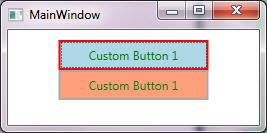
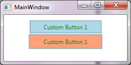
The following shows snapshots for MouseOver and Pressed visual states:
In the preceding example, VisualState "Pressed" causes the appearance of the button to change when the user clicks it, but unless the button is pressed for a full second (default animation duration), the user does not see the effect. You can specify the amount of time that it takes an animation to occur by adding a Duration attribute to the animation, but a more flexible approach is to use VisualTransition objects in the ControlTemplate. When you create a VisualTransition, you specify one or more of the following:
Additional changes in the control's appearance that occur at the time of the transition. Use a Storyboard which begins when the transition begins.
Which states the VisualTransition is applied to. Use To and From attributes. Note the following:
From state s1 to state s2: Use From and To.
From any state to s2. Use To only.
From s1 to any state: Use From only.
From any state to any state: Do not use From and To.
Finally ensure that From and To refer to state names that are part of the enclosing VisualStateGroup.
<UserControl x:Class="ControlTemplateDemo.CustomButton"
             xmlns="http://schemas.microsoft.com/winfx/2006/xaml/presentation"
             xmlns:x="http://schemas.microsoft.com/winfx/2006/xaml"
             xmlns:mc="http://schemas.openxmlformats.org/markup-compatibility/2006"
             xmlns:d="http://schemas.microsoft.com/expression/blend/2008"
             mc:Ignorable="d"
             d:DesignHeight="300" d:DesignWidth="300">
    <UserControl.Resources>

        <!-- Create a simple ControlTemplate for a button TargetType is required to identify
        the target element to which the ControlTemplate can be applied -->
        <Style x:Key="ButtonNewStyle" TargetType="{x:Type Button}">
            <Setter Property="Template">
                <Setter.Value>
                  <ControlTemplate TargetType="Button">
                     <!-- The one and only root element -->
                     <Border x:Name="RootElement">

                         <!-- Create a solid color brush for the background as an object element so
                         that it has a name that can be referred-->
                         <Border.Background>
                             <SolidColorBrush x:Name="BorderBrush" Color="DarkGray" />
                         </Border.Background>

                         <!-- Other FrameworkElement elements that are children of the rootelement.
                         In this case a Grid is used as a container to center the button's content
                         Background="{TemplateBinding Background} indicates that the background for
                         the grid is obtained from the background of the templated control
                         -->
                         <Grid Background="{TemplateBinding Background}" Margin="2">

                            <!-- A child FrameworkElement is used to display the button content -->
                            <ContentPresenter
                                HorizontalAlignment="{TemplateBinding HorizontalContentAlignment}"
                                VerticalAlignment="{TemplateBinding VerticalContentAlignment}"/>
                         </Grid>

                         <!-- Define visual states. See Control Styles and Templates in MSDN for
                         available states and state groups for the relevant control -->
                         <VisualStateManager.VisualStateGroups>

                              <!-- Common States -->
                              <VisualStateGroup Name="CommonStates">

                                  <!-- Transitions to states -->
                                  <VisualStateGroup.Transitions>

                                    <!--Take one hundredth of a second to transition to the
				Pressed state.-->
                                    <VisualTransition To="Pressed" GeneratedDuration="0:0:0.01" />

                                    <!--Take one hundredth of a second to transition to the
				MouseOver state.-->
                                    <VisualTransition To="MouseOver" GeneratedDuration="0:0:0.01" />

                                    </VisualStateGroup.Transitions>

                                    <!-- States -->
                                    <VisualState Name="Normal" />

                                    <VisualState Name="MouseOver">
                                        <Storyboard>
                                            <ThicknessAnimation Storyboard.TargetName="RootElement"
                                                                Storyboard.TargetProperty="Padding"
                                                                To="2" />
                                        </Storyboard>
                                    </VisualState>

                                    <VisualState Name="Pressed">
                                        <Storyboard>
                                            <ThicknessAnimation Storyboard.TargetName="RootElement"
                                                                Storyboard.TargetProperty="Padding"
                                                                To="1" />
                                        </Storyboard>
                                    </VisualState>
                                </VisualStateGroup>

                                <!-- Focus States -->
                                <VisualStateGroup Name="FocusStates">
                                    <!--  Not implemented for brevity -->
                                </VisualStateGroup>

                            </VisualStateManager.VisualStateGroups>

                        </Border>
                    </ControlTemplate>
                </Setter.Value>
            </Setter>
        </Style>

    </UserControl.Resources>
    <Grid>

        <!-- The value of the Content attribute will be handled by ContentPresenter in the
        ControlTemplate. The value of the Background attribute will be assigned to the Grid
        Background via TemplateBinding-->
        <StackPanel Orientation="Vertical" Margin="10">
            <Button Width="150" Height="30"
                    Style="{StaticResource ButtonNewStyle}"
                    Content="Custom Button 1" Background="LightBlue"
                    Foreground="Green" FontSize="12"/>

            <Button Width="150" Height="30"
                    Style="{StaticResource ButtonNewStyle}"
                    Content="Custom Button 1" Background="LightSalmon"
                    Foreground="Green" FontSize="12"/>
        </StackPanel>
    </Grid>
</UserControl>
Note: To find the control contract for controls that are included with WPF, see Control Styles and Templates.
WPF controls have a strict separation between control logic and control visuals. This is ideal for customising the visuals without affecting the logic, and vice versa. To properly use a ControlTemplate you need to know what elements are needed inside the ControlTemplate. The elements that a ControlTemplate needs are communicated through the control contract. A control contract - referred to as Parts and States - has three main parts:
Named visual elements. The control logic expects these parts to appear in the template because it needs to manipulate them in some way.
States and State Groups: Visual states represent the way the control looks in a particular logic state. State groups represent mutually exclusive visual states. Note that a control can be in different states at the same time as long as each state belongs to a different group (For example, a button can be unfocused and with the mouse over it).
The public properties that visually affect the control.
A WPF control is typically implemented using a combination of logic and XAML. Control logic may expect to find and use a particular FrameworkElement in the ControlTemplate. To convey this information to the ControlTemplate author, the control logic uses [TemplatePart] attribute to convey the type and name of the element that is expected. Button does not use parts in its ControlTemplate, but most other controls do. For example, the logic for ComboBox expects to find in its ControlTemplate two parts, a TextBox named PART_EditableTextBox, and a Popup named PART_Popup:
[TemplatePartAttribute(Name = "PART_EditableTextBox", Type = typeof(TextBox))]
[TemplatePartAttribute(Name = "PART_Popup", Type = typeof(Popup))]
[TemplateVisualState(Name = "Normal", GroupName = "CommonStates")]
[TemplateVisualState(Name = "MouseOver", GroupName = "CommonStates")]
[TemplateVisualState(Name = "Pressed", GroupName = "CommonStates")]
[TemplateVisualState(Name = "Disabled", GroupName = "CommonStates")]
[TemplateVisualState(Name = "Unfocused", GroupName = "FocusStates")]
[TemplateVisualState(Name = "Focused", GroupName = "FocusStates")]
public class ComboBox : ItemsControl
{
...
}
The following show a skeletal ControlTemplate for the ComboBox:
<ControlTemplate TargetType="ComboBox">
    <Grid>
        <ToggleButton x:Name="DropDownToggle" ... />
        <ContentPresenter x:Name="ContentPresenter" ... >
        <TextBox x:Name="PART_EditableTextBox" ... />
        <Popup x:Name="PART_Popup" ... >
    </Grid>
</ControlTemplate>
When creating a ControlTemplate, it is often easiest to begin with an existing ControlTemplate and make changes to it. You can do one of the following to change an existing ControlTemplate:
Use a designer, such as Expression Blend, which provides a UI for creating control templates.
Get the default ControlTemplate and edit it. To find the default control templates that are included with WPF, see Default WPF Themes.
This section shows how to use the Parts and States model to create your own controls. The Parts and States model specifies how to define visual structure (Parts) and visual behaviour (States) of a control. The Parts and States model requires the following steps:
Create a ControlTemplate to define visual structure and visual behaviour.
Create a Control-derived class that interacts with the parts of the control template (note, do not derive from UserControl because it does not have a control template).
Provide a control contract to specify what should be included in the ControlTemplate.
<!-- PART 1 -->
<ControlTemplate TargetType="ComboBox">
    <Grid>
        <ToggleButton x:Name="DropDownToggle" ... />
        <ContentPresenter x:Name="ContentPresenter" ... >
        <TextBox x:Name="PART_EditableTextBox" ... />
        <Popup x:Name="PART_Popup" ... >
    </Grid>
</ControlTemplate>
// PART 3
[TemplatePartAttribute(Name = "PART_EditableTextBox", Type = typeof(TextBox))]
[TemplatePartAttribute(Name = "PART_Popup", Type = typeof(Popup))]
[TemplateVisualState(Name = "Normal", GroupName = "CommonStates")]
[TemplateVisualState(Name = "MouseOver", GroupName = "CommonStates")]
[TemplateVisualState(Name = "Pressed", GroupName = "CommonStates")]
[TemplateVisualState(Name = "Disabled", GroupName = "CommonStates")]
[TemplateVisualState(Name = "Unfocused", GroupName = "FocusStates")]
[TemplateVisualState(Name = "Focused", GroupName = "FocusStates")]
// PART 2
public class ComboBox : ItemsControl
{
// Control logic should properly
handle an incomplete ControlTemplate
}
The following are the recommended practices when using the states and parts model to create customizable controls:
The control should be resilient to a ControlTemplate that is missing FrameworkElement or VisualState objects, and should not throw an exception or report an error if such an element is missing from the ControlTemplate.
Set the x:Name attribute for each FrameworkElement that is referenced from code.
Define private properties for each FrameworkElement that you need to interact with, and set them in the OnApplyTemplate method.
Subscribe to and unsubscribe from any events that your control handles.
Check that the FrameworkElement is not null before accessing its members. If it is null, do not report an error.
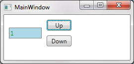
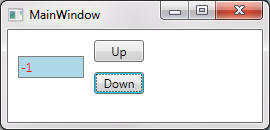
The following shows how to create a custom control. The NumericUpDown custom control displays a numeric value, which a user can increase or decrease by clicking on the control's buttons. The control looks like this:
Full code is below:
<Application x:Class="ControlTemplateDemo.App"
             xmlns="http://schemas.microsoft.com/winfx/2006/xaml/presentation"
             xmlns:x="http://schemas.microsoft.com/winfx/2006/xaml"
             Startup="Application_Startup"
             StartupUri="MainWindow.xaml">
    <Application.Resources/>
</Application>
namespace ControlTemplateDemo
{
    /// <summary>
    /// Interaction logic for App.xaml
    /// </summary>
    public partial class App : Application
    {
        private void Application_Startup(object sender, StartupEventArgs e)
        {
            // Add the global resource file to the application. Search for 'Pack URIs in WPF' for
            // Uri formats. The Uri format below is taken from 'Table 4: Relative Pack URIs in
	   // Code' in 'Pack URIs in WPF'
            var uri = @"/ControlTemplateDemo;component/MyControl/NumericUpDownResources.xaml";
            Current.Resources.MergedDictionaries.Add
                (
                    new ResourceDictionary { Source = new Uri(uri, UriKind.Relative) }
                );
        }
    }
}
<!-- NumericUpDownResources.xaml -->

<ResourceDictionary xmlns="http://schemas.microsoft.com/winfx/2006/xaml/presentation"
                    xmlns:x="http://schemas.microsoft.com/winfx/2006/xaml"
                    xmlns:src="clr-namespace:ControlTemplateDemo.MyControl">

    <Style TargetType="{x:Type src:NumericUpDown}">
        <Setter Property="Template">
            <Setter.Value>
                <!-- ControlTemplate for NumericUpDown.
                When using the parts and states model, you define the control's visual structure
                and visual behavior in its ControlTemplate instead of in its logic. The visual
                structure of a control is the composite of FrameworkElement objects that make up
                the control. The visual behavior is the way the control appears when it is in a
	      certain state

                The visual structure includes a text box, two repeat buttons, and a focus rectangle
                -->
                <ControlTemplate TargetType="{x:Type src:NumericUpDown}" >

                    <!-- The root element is a grid to center the contents -->
                    <Grid Background="{TemplateBinding Background}" Margin="5">

                        <!-- - - - -- - - - - - START VISUAL STRUCTURE - - - - - - - - - -  -->

                        <!-- Two rows and two columns to help position a textbox and two buttons-->
                        <Grid.RowDefinitions>
                            <RowDefinition Height="Auto" />
                            <RowDefinition Height="Auto" />
                        </Grid.RowDefinitions>
                        <Grid.ColumnDefinitions>
                            <ColumnDefinition Width="Auto" />
                            <ColumnDefinition Width="Auto" />
                        </Grid.ColumnDefinitions>


                        <Border BorderThickness="1"
                                BorderBrush="Gray"
                                Margin="5"
                                Grid.RowSpan="2"
                                Background="LightBlue"
                                VerticalAlignment="Center"
                                HorizontalAlignment="Stretch">

                                 <!-- TextBlox Text binds to the Value attribute of our control -->
                                <TextBlock Name="PART_Text"
                                           Grid.Column="0" Grid.RowSpan="2"
                                           Width="60" Margin="2"
                                           Foreground="Green"
                                           Text="{Binding
				        RelativeSource={RelativeSource FindAncestor,
                                            AncestorType={x:Type src:NumericUpDown}}, Path=Value}"/>
                        </Border>

                        <!-- Add two repeat button in the right column -->
                        <RepeatButton x:Name="PART_UpButton"
                                        Content="Up" Width="50"
                                        Grid.Column="1" Grid.Row="0" Margin="5"/>
                        <RepeatButton x:Name="PART_DownButton"
                                        Content="Down" Width="50"
                                        Grid.Column="1" Grid.Row="1" Margin="5"/>

                        <!-- Displays focus rectangle -->
                        <Rectangle x:Name="PART_FocusVisual"
                                    Grid.ColumnSpan="2" Grid.RowSpan="2"
                                    StrokeThickness="1" Stroke="DarkBlue"
                                   Visibility="Collapsed" />

                        <!-- - - - - - - - - - - - - END VISUAL STRUCTURE - - - - - - - - - - - - -->

                        <!-- - - - - - - - - - - - - START VISUAL BEHAVIOR - - - - - - - - - - - -->
                        <VisualStateManager.VisualStateGroups>

                            <!-- Positive value are green, negative values are red -->
                            <VisualStateGroup x:Name="ValueStates">
                                <VisualState x:Name="Negative" >
                                    <Storyboard>
                                        <ColorAnimation To="Red" Storyboard.TargetName="PART_Text"
					Storyboard.TargetProperty="(Foreground).(Color)"/>
                                    </Storyboard>
                                </VisualState>

                                <!--Return the control to its initial state by return the TextBlock's
                                    Foreground to its original color.-->
                                <VisualState Name="Positive"/>

                            </VisualStateGroup>

                            <VisualStateGroup x:Name="FocusStates">

                                <!--Add a focus rectangle to highlight the entire control when it
			    has focus.-->
                                <VisualState Name="Focused">
                                    <Storyboard>
                                      <ObjectAnimationUsingKeyFrames
					Storyboard.TargetName="PART_FocusVisual"
                                              Storyboard.TargetProperty="Visibility" Duration="0">
                                          <DiscreteObjectKeyFrame KeyTime="0">
                                              <DiscreteObjectKeyFrame.Value>
                                                  <Visibility>Visible</Visibility>
                                              </DiscreteObjectKeyFrame.Value>
                                          </DiscreteObjectKeyFrame>
                                      </ObjectAnimationUsingKeyFrames>
                                  </Storyboard>
                              </VisualState>

                                <!-- Return the control to its initial state by hiding the focus
			    rectangle -->
                                <VisualState Name="Unfocused"/>
                            </VisualStateGroup>
                        </VisualStateManager.VisualStateGroups>
                        <!-- - - - - - - - - - - - - END VISUAL BEHAVIOR - - - - - - - - - - - - -->

                    </Grid>
                </ControlTemplate>
            </Setter.Value>
        </Setter>
    </Style>
</ResourceDictionary>
// NumericUpDown control logic
// TemplatePartAttribute: Used to specify name and type of FrameworkElement objects the control
// expects.
// TemplateVisualStateAttribute: Used to specify the possible states of a control.
[TemplatePart(Name="PART_Text", Type=typeof(TextBlock))]
[TemplatePart(Name = "PART_UpButton", Type = typeof(RepeatButton))]
[TemplatePart(Name = "PART_DownButton", Type = typeof(RepeatButton))]
[TemplatePart(Name = "PART_FocusVisual", Type=typeof(Rectangle))]
[TemplateVisualState(Name = "Positive", GroupName = "ValueStates")]
[TemplateVisualState(Name = "Negative", GroupName = "ValueStates")]
[TemplateVisualState(Name = "Focused", GroupName = "FocusedStates")]
[TemplateVisualState(Name = "Unfocused", GroupName = "FocusedStates")]
class NumericUpDown : Control
{
    #region Data Members

    // BEST PRACTICE: Define private properties for each FrameworkElement that you need
    // to interact with.
    private RepeatButton upButtonElement;
    private RepeatButton downButtonElement;
    #endregion

    #region Constructors
    public NumericUpDown()
    {
        // Sets the key to use to reference the style for this control, when theme styles are used
        // or defined
        DefaultStyleKey = typeof (NumericUpDown);
        IsTabStop = true;
    }
    #endregion

    #region Properties

    // BEST PRACTICE: Subscribe to and unsubscribe from any events that your control handles
    // in the FrameworkElement property's set

    private RepeatButton UpButtonElement
    {
        get { return upButtonElement; }
        set
        {
            // Unsubscribe
            if (upButtonElement != null)
                upButtonElement.Click -= UpButtonElementOnClick;

            upButtonElement = value;

            // Subscribe
            if (upButtonElement != null)
                upButtonElement.Click += UpButtonElementOnClick;
        }
    }

    private RepeatButton DownButtonElement
    {
        get { return upButtonElement; }
        set
        {
            // Unsubscribe
            if (downButtonElement != null)
                downButtonElement.Click -= DownButtonElementOnClick;

            downButtonElement = value;

            // Subscribe
            if (downButtonElement != null)
                downButtonElement.Click += DownButtonElementOnClick;
        }
    }
    #endregion

    #region Dependency Properties
    #region Value
    public static readonly DependencyProperty ValueProperty =
                DependencyProperty.Register("Value",
                                            typeof (int),
                                            typeof (NumericUpDown),
                                            new PropertyMetadata(ValueChangedCallback));

    // This method is called when the Value dependency property changes
    private static void ValueChangedCallback(DependencyObject obj,
				        DependencyPropertyChangedEventArgs args)
    {
        // Get underlying contorl and call UpdateStates. It is acceptable to call UpdateStates when
        // Value changes but remains positive or negative because in that case, the control will not
        // change states
        NumericUpDown ctl = obj as NumericUpDown;
        int newValue = (int)args.NewValue;
        ctl.UpdateStates(true);

        // Get new value
        ctl.OnValueChanged( new ValueChangedEventArgs(NumericUpDown.ValueChangedEvent, newValue));
    }

    public int Value
    {
        get { return (int) GetValue(ValueProperty); }
        set { SetValue(ValueProperty, value); }
    }
    #endregion

    #endregion

    #region Routed Events

    public event EventHandler<ValueChangedEventArgs> ValueChanged;

    private static readonly RoutedEvent ValueChangedEvent =
        EventManager.RegisterRoutedEvent("ValueChanged",
                                            RoutingStrategy.Direct,
                                            typeof(EventHandler<ValueChangedEventArgs>),
                                            typeof(NumericUpDown) );

    protected virtual void OnValueChanged(ValueChangedEventArgs args)
    {
        RaiseEvent( args);
    }

    #endregion

    #region Required overrides

    // OnApplyTemplate: Note use of GetTemplateChild method to get FrameworkElement objects from
    // the ControlTemplate. Notice that the override guards against cases where GetTemplateChild
    // finds a FrameworkElement with the specified name that is not of the expected type.
    public override void OnApplyTemplate()
    {
        UpButtonElement = GetTemplateChild("PART_UpButton") as RepeatButton;
        DownButtonElement = GetTemplateChild("PART_DownButton") as RepeatButton;
        TextBlock tb  = GetTemplateChild("PART_Text") as TextBlock;

        UpdateStates(false);
    }

    // OnGotFocus: Forces proper state to be applied
    protected override void OnGotFocus(RoutedEventArgs e)
    {
        base.OnGotFocus(e);
        UpdateStates(true);
    }
    #endregion

    #region Event Handlers
    private void UpButtonElementOnClick(object sender, RoutedEventArgs routedEventArgs)
    {
        Value++;
    }

    private void DownButtonElementOnClick(object sender, RoutedEventArgs routedEventArgs)
    {
        Value--;
    }
    #endregion

    #region Implementation Details

    // UpdateStates: Centralize all calls to the VisualStateManager to update all states
    // for all groups:
    // ValueStates: The NumericUpDown control uses its Value property to track whether it
    // is in the Positive or Negative state
    // FocusStates :  The NumericUpDown control uses its IsFocused inherited property to track whether
    // it is in the Focused or Unfocused state
    // Note 1: If you pass a state name to GoToState when the control is already in that state,
    // GoToState does nothing, so you don't need to check for the control's current state.
    // For example, if Value changes from one negative number to another negative number,
    // the storyboard for the Negative state is not interrupted and the user will not see
    // a change in the control
    // Note 2: There are three typical places where the state of a control might change:
    //      1. When the ControlTemplate is applied to the Control.
    //      2. When a property changes.
    //      3. When an event occurs
    private void UpdateStates(bool useTransitions)
    {
        // VisualStateGroup: ValueStates
        if (Value >= 0)
            VisualStateManager.GoToState(this, "Positive", useTransitions);
        else
            VisualStateManager.GoToState(this, "Negative", useTransitions);

        // VisualStateGroup: FocusStates
        if (IsFocused)
            VisualStateManager.GoToState(this, "Focused", useTransitions);
        else
            VisualStateManager.GoToState(this, "Unfocused", useTransitions);

    }
    #endregion
}

    public class ValueChangedEventArgs : RoutedEventArgs
    {
        private int _value;

        public ValueChangedEventArgs(RoutedEvent id, int num)
        {
            _value = num;
            RoutedEvent = id;
        }

        public int Value
        {
            get { return _value; }
        }
    }
<Window x:Class="ControlTemplateDemo.MainWindow"
        xmlns="http://schemas.microsoft.com/winfx/2006/xaml/presentation"
        xmlns:x="http://schemas.microsoft.com/winfx/2006/xaml"
        xmlns:my="clr-namespace:ControlTemplateDemo"
        xmlns:src="clr-namespace:ControlTemplateDemo.MyControl"
        Title="MainWindow" Height="350" Width="525">
    <Grid>
        <src:NumericUpDown Value="3" ValueChanged="NumericUpDown_ValueChanged" />
    </Grid>
</Window>
/// <summary>
/// Interaction logic for MainWindow.xaml
/// </summary>
public partial class MainWindow : Window
{
    public MainWindow()
    {
        InitializeComponent();
    }

    private void NumericUpDown_ValueChanged(object sender, ValueChangedEventArgs e)
    {
        Debug.WriteLine("ValueChanged: New value: " + e.Value);
    }
}
Visual State Manager:
http://windowsclient.net/wpf/wpf35/wpf-35sp1-toolkit-visual-state-manager-overview.aspx
http://blogs.msdn.com/b/wpfsdk/archive/2009/02/27/the-visualstatemanager-and-triggers.aspx
http://www.codeproject.com/Articles/57664/Silverlight-and-WPF-Behaviours-and-Triggers-Unders
http://www.slideshare.net/EyalV/triggers-actions-behaviors-in-xaml
http://brianpclab.blogspot.co.uk/2009/12/advanced-wpf-validation-using-behaviors.html
http://www.wpftutorial.net/Templates.html
http://julmar.com/blog/mark/?p=34
http://msdn.microsoft.com/en-us/library/ff724707%28v=expression.40%29.aspx
http://msdn.microsoft.com/en-us/library/ff723950%28v=expression.40%29.aspx
http://www.silverlightshow.net/items/Behaviors-and-Triggers-in-Silverlight-3.aspx