For most controls, there is appearance and behavior. For example, for a Button object, appearance is the raised area that you can press, and behavior is the Click event that gets raised in response to a click. While developing an application, you find that there is a control that provides the behavior that you need but not the appearance that you need. To change the visual structure of a control or to set property values on the components that comprise visual parts of a control, you need to use a ControlTemplate.
The following example are provides:
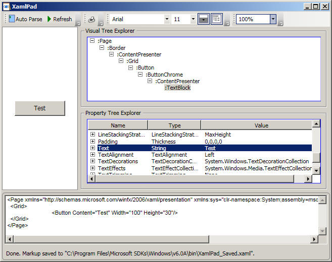
Let's start by examining the visual tree of a Button and then use ControlTemplate to change Button's visual tree. The following XamlPad snapshot shows the entire visual tree for a Page containing only a Button. Note the standard visual tree for the WPF Button:
To change the visual structure (and just as important, behaviour) of a Button, we need to use ControlTemplate as shown below:
<Window x:Class="Templates.ControlTemplate1"
xmlns="http://schemas.microsoft.com/winfx/2006/xaml/presentation"
xmlns:x="http://schemas.microsoft.com/winfx/2006/xaml"
Title="ControlTemplate1" Height="300" Width="300">
<Window.Resources>
<Style x:Key="MyButtonStyle"
TargetType="{x:Type Button}">
<Setter
Property="Template">
<Setter.Value>
<ControlTemplate TargetType="{x:Type Button}">
<Grid>
<Ellipse Fill="{TemplateBinding Background}"/>
<ContentPresenter HorizontalAlignment="Center" VerticalAlignment="Center"/>
</Grid>
</ControlTemplate>
</Setter.Value>
</Setter>
</Style>
</Window.Resources>
<Grid>
<Button Content="Button1" Style="{StaticResource
MyButtonStyle}" Width="100" Height="40" Background="Red"></Button>
</Grid>
</Window>
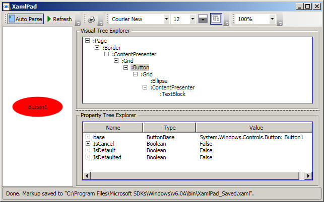
The button now looks like this (note the changed visual tree):
So how do you use ControlTemplate to change the visual structure of a control? The following XAML shows the basic starting point
<Style x:Key="YourKeyName"
TargetType="{x:Type
SomeControlClass}">
<Setter
Property="Template">
<Setter.Value>
<ControlTemplate TargetType="{x:Type
SomeControlClass}">
<Grid>
...
</Grid>
</ControlTemplate>
</Setter.Value>
</Setter>
</Style>
The Grid element is typically used as a container for the content. A Grid typically has RowDefinition and ColumnDefinition elements to define rows and columns, but in this case the absence of these elements causes any child elements of Grid to appear centred within the Grid.
When you set the Template property of a control (either via code or via XAML as shown above), you are effectively replacing the entire template, or visual structure/behaviour of a control. What the Button looks like when it is in focus or pressed is all part of the template that you are replacing. Therefore, depending on your needs, you may want to put in your definition what your button should look like when it is pressed, and so on.
This example explores how to fully customize the visual and structure behaviour of a Button. Recall that what the Button looks like when it pressed, enabled/disabled, in/out-of focus, etc is all part of the template that you are replacing. We'll start by creating different brushes to fully control the appearance of the Button under different conditions:
<!-- A resource dictionary
containING resources for use by various ControlTemplates -->
<ResourceDictionary xmlns="http://schemas.microsoft.com/winfx/2006/xaml/presentation"
xmlns:x="http://schemas.microsoft.com/winfx/2006/xaml">
<LinearGradientBrush x:Key="NormalBrush" StartPoint="0,0" EndPoint="0,1">
<GradientBrush.GradientStops>
<GradientStopCollection>
<GradientStop
Color="#FFF" Offset="0.0"/>
<GradientStop Color="#CCC" Offset="1.0"/>
</GradientStopCollection>
</GradientBrush.GradientStops>
</LinearGradientBrush>
<LinearGradientBrush x:Key="HorizontalNormalBrush" StartPoint="0,0"
EndPoint="1,0">
<GradientBrush.GradientStops>
<GradientStopCollection>
<GradientStop
Color="#FFF" Offset="0.0"/>
<GradientStop
Color="#CCC" Offset="1.0"/>
</GradientStopCollection>
</GradientBrush.GradientStops>
</LinearGradientBrush>
<LinearGradientBrush x:Key="LightBrush" StartPoint="0,0" EndPoint="0,1">
<GradientBrush.GradientStops>
<GradientStopCollection>
<GradientStop
Color="#FFF" Offset="0.0"/>
<GradientStop
Color="#EEE" Offset="1.0"/>
</GradientStopCollection>
</GradientBrush.GradientStops>
</LinearGradientBrush>
<LinearGradientBrush x:Key="HorizontalLightBrush" StartPoint="0,0"
EndPoint="1,0">
<GradientBrush.GradientStops>
<GradientStopCollection>
<GradientStop
Color="#FFF" Offset="0.0"/>
<GradientStop
Color="#EEE" Offset="1.0"/>
</GradientStopCollection>
</GradientBrush.GradientStops>
</LinearGradientBrush>
<LinearGradientBrush x:Key="DarkBrush" StartPoint="0,0" EndPoint="0,1">
<GradientBrush.GradientStops>
<GradientStopCollection>
<GradientStop
Color="#FFF" Offset="0.0"/>
<GradientStop
Color="#AAA" Offset="1.0"/>
</GradientStopCollection>
</GradientBrush.GradientStops>
</LinearGradientBrush>
<LinearGradientBrush x:Key="PressedBrush" StartPoint="0,0" EndPoint="0,1">
<GradientBrush.GradientStops>
<GradientStopCollection>
<GradientStop
Color="#BBB" Offset="0.0"/>
<GradientStop
Color="#EEE" Offset="0.1"/>
<GradientStop
Color="#EEE" Offset="0.9"/>
<GradientStop
Color="#FFF" Offset="1.0"/>
</GradientStopCollection>
</GradientBrush.GradientStops>
</LinearGradientBrush>
<SolidColorBrush x:Key="DisabledForegroundBrush" Color="#888" />
<SolidColorBrush x:Key="DisabledBackgroundBrush" Color="#EEE" />
<SolidColorBrush x:Key="WindowBackgroundBrush" Color="#FFF" />
<SolidColorBrush x:Key="SelectedBackgroundBrush" Color="#DDD" />
<LinearGradientBrush x:Key="NormalBorderBrush" StartPoint="0,0" EndPoint="0,1">
<GradientBrush.GradientStops>
<GradientStopCollection>
<GradientStop
Color="#CCC" Offset="0.0"/>
<GradientStop
Color="#444" Offset="1.0"/>
</GradientStopCollection>
</GradientBrush.GradientStops>
</LinearGradientBrush>
<LinearGradientBrush x:Key="HorizontalNormalBorderBrush" StartPoint="0,0"
EndPoint="1,0">
<GradientBrush.GradientStops>
<GradientStopCollection>
<GradientStop
Color="#CCC" Offset="0.0"/>
<GradientStop
Color="#444" Offset="1.0"/>
</GradientStopCollection>
</GradientBrush.GradientStops>
</LinearGradientBrush>
<LinearGradientBrush x:Key="DefaultedBorderBrush" StartPoint="0,0"
EndPoint="0,1">
<GradientBrush.GradientStops>
<GradientStopCollection>
<GradientStop
Color="#777" Offset="0.0"/>
<GradientStop
Color="#000" Offset="1.0"/>
</GradientStopCollection>
</GradientBrush.GradientStops>
</LinearGradientBrush>
<LinearGradientBrush x:Key="PressedBorderBrush" StartPoint="0,0" EndPoint="0,1">
<GradientBrush.GradientStops>
<GradientStopCollection>
<GradientStop
Color="#444" Offset="0.0"/>
<GradientStop
Color="#888" Offset="1.0"/>
</GradientStopCollection>
</GradientBrush.GradientStops>
</LinearGradientBrush>
<SolidColorBrush x:Key="DisabledBorderBrush" Color="#AAA" />
<SolidColorBrush x:Key="SolidBorderBrush" Color="#888" />
<SolidColorBrush x:Key="LightBorderBrush" Color="#AAA" />
<SolidColorBrush x:Key="GlyphBrush" Color="#444" />
<SolidColorBrush x:Key="LightColorBrush" Color="#DDD" />
</ResourceDictionary>
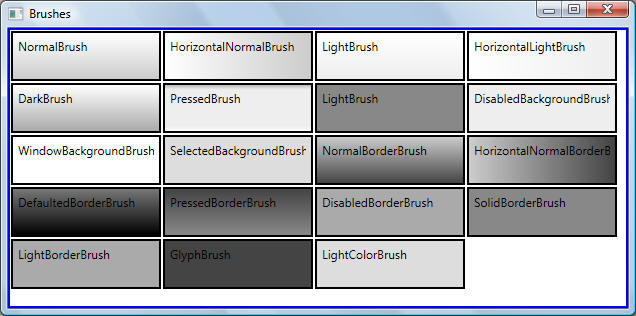
These brushes are shown below for illustration purposes:
The following code shows how to use a ControlTemplate to redefine the visual structure and behaviour of buttons in clearly marked sections:
Central to defining the visual structure with ControlTemplate is the use of ContentPresenter element to mark where the content is to be added. The ContentPresenter is responsible for the UI generation. In the example below the ContentPresenter marks that the Content of the Button should be displayed and centred vertically and horizontally within the containing Grid.
Central to defining the behaviour with ControlTemplate is the use of ContralTemplate.Triggers property to perform actions based on specific conditions. For example, in the example below, if the Button.IsMouseOver property is true, then the <Border> element that was defined in the visual structure under ControlTemplate should have its BorderBrush property set to DarkBrush.
<Window x:Class="Templates.TemplatedControls.ButtonComplex"
xmlns="http://schemas.microsoft.com/winfx/2006/xaml/presentation"
xmlns:x="http://schemas.microsoft.com/winfx/2006/xaml"
Title="ButtonComplex" Height="300"
Width="300">
<Window.Resources>
<ResourceDictionary>
<ResourceDictionary.MergedDictionaries>
<ResourceDictionary Source="..\Resources\Common.xaml"/>
</ResourceDictionary.MergedDictionaries>
<Style
TargetType="Button" x:Key="ButtonCustomStyle">
<!-- rendering for this element should use device-specific pixel settings
during rendering. Serves to minimize anti-aliasing visual artefacts in the
vicinity of single-unit solid lines-->
<Setter Property="SnapsToDevicePixels" Value="true"/>
<!--OverridesDefaultStyle: If false, application styles apply first, and then
theme
styles apply for properties that were not specifically set in application
styles.
If true, this element does not use theme style properties-->
<Setter Property="OverridesDefaultStyle" Value="true"/>
<Setter Property="MinHeight" Value="23"/>
<Setter Property="MinWidth" Value="75"/>
<!-- A Template property followed by a ControlTemplate child element
is the standard syntax for defining a new template, i.e., visual tree -->
<Setter Property="Template">
<Setter.Value>
<ControlTemplate TargetType="Button">
<!-- The following element and child elements define the visual
structure of the button (behaviour is defined immediately after this
section in ControlTemplate.Triggers element -->
<Border x:Name="Border" CornerRadius="10" BorderThickness="5"
Background="{StaticResource NormalBrush}"
BorderBrush="{StaticResource NormalBorderBrush}"
Cursor="Hand" Margin="5,0,5,0">
<!-- The Content of the Button should be displayed and centered vertically
and horizontally within the containing Grid -->
<ContentPresenter HorizontalAlignment="Center"
VerticalAlignment="Center" RecognizesAccessKey="True"
TextBlock.FontFamily="Arial" TextBlock.Foreground="DarkBlue"
TextBlock.FontSize="12" TextBlock.FontWeight="Bold">
</ContentPresenter>
</Border>
<!-- The following element and child elements define the
behaviour of the button -->
<ControlTemplate.Triggers>
<Trigger Property="IsKeyboardFocused" Value="true">
<Setter TargetName="Border" Property="BorderBrush" Value="{StaticResource
DefaultedBorderBrush}" />
</Trigger>
<Trigger Property="IsDefaulted" Value="true">
<Setter TargetName="Border" Property="BorderBrush" Value="{StaticResource
DefaultedBorderBrush}" />
</Trigger>
<Trigger Property="IsMouseOver" Value="true">
<Setter TargetName="Border" Property="Background" Value="{StaticResource
DarkBrush}" />
</Trigger>
<Trigger Property="IsPressed" Value="true">
<Setter TargetName="Border" Property="Background" Value="{StaticResource
PressedBrush}" />
<Setter TargetName="Border" Property="BorderBrush" Value="{StaticResource
PressedBorderBrush}" />
</Trigger>
<Trigger Property="IsEnabled" Value="false">
<Setter TargetName="Border" Property="Background" Value="{StaticResource
DisabledBackgroundBrush}" />
<Setter TargetName="Border" Property="BorderBrush" Value="{StaticResource
DisabledBorderBrush}" />
<Setter Property="Foreground" Value="{StaticResource DisabledForegroundBrush}"/>
</Trigger>
</ControlTemplate.Triggers>
</ControlTemplate>
</Setter.Value>
</Setter>
</Style>
</ResourceDictionary>
</Window.Resources>
<Grid>
<StackPanel Orientation="Horizontal"
Margin="5">
<Button
Content="New Style Button" Style="{StaticResource
ButtonCustomStyle}" Width="150" Height="30"></Button>
<Button
Content="Default Style" Width="150" Height="30"></Button>
</StackPanel>
</Grid>
</Window>
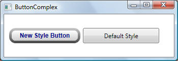
The new style button is shown and compared below against the default style button:
Recall from Logical and Visual Trees chapter that for a ListBox with one ListViewItem displaying a string, the visual tree looks like this:
System.Windows.Controls.ListBox
System.Windows.Controls.Border
System.Windows.Controls.ScrollViewer
System.Windows.Controls.Grid
System.Windows.Shapes.Rectangle
System.Windows.Controls.ScrollContentPresenter
System.Windows.Controls.ItemsPresenter
System.Windows.Controls.VirtualizingStackPanel
System.Windows.Controls.ListBoxItem
System.Windows.Controls.Border
System.Windows.Controls.ContentPresenter
System.Windows.Controls.TextBlock
System.Windows.Documents.AdornerLayer
System.Windows.Controls.Primitives.ScrollBar
System.Windows.Controls.Primitives.ScrollBar
Analyzing the visual tree for the default control that you wish to template is usually the first step. Note the following from the visual tree shown above:
The ListBox starting visual element is the Border element
Contained within the Border element is a ScrollViewer element. A ScrollViewer element is the base element for any scrollable content.
ScrollViewer element is further structured based on a Grid that contains three elements; ScrollContentPresenter and two ScrollBars.
The visual tree shown above can be improved/expanded by showing how many rows/columns the Grid contains, and identifying row/column memberships for elements further down the visual tree.
The following code shows how to use a ControlTemplate to redefine the visual structure and behaviour of ListBox and ListBoxItem in clearly marked sections:
<Window x:Class="Templates.TemplatedControls.ListBox"
xmlns="http://schemas.microsoft.com/winfx/2006/xaml/presentation"
xmlns:x="http://schemas.microsoft.com/winfx/2006/xaml"
Title="ListBox" Height="300" Width="300">
<Window.Resources>
<ResourceDictionary>
<ResourceDictionary.MergedDictionaries>
<ResourceDictionary Source="..\Resources\Common.xaml" />
</ResourceDictionary.MergedDictionaries>
<!-- ListBox
-->
<Style x:Key="ListBoxCustomStyle"
TargetType="ListBox">
<!-- See comments for ButtonCustomStyle above-->
<Setter Property="SnapsToDevicePixels" Value="true"/>
<Setter
Property="OverridesDefaultStyle" Value="true"/>
<!-- Scrollbars should be displayed when all the content cannot be displayed-->
<Setter Property="ScrollViewer.HorizontalScrollBarVisibility" Value="Auto"/>
<Setter
Property="ScrollViewer.VerticalScrollBarVisibility" Value="Auto"/>
<Setter
Property="ScrollViewer.CanContentScroll" Value="true"/>
<Setter
Property="MinWidth" Value="100"/>
<Setter
Property="MinHeight" Value="40"/>
<!-- Define visual structure and behaviour -->
<Setter Property="Template">
<Setter.Value>
<ControlTemplate TargetType="ListBox">
<!-- Visual structure. Note the use of ScrollViewer element which encapsulates a
content element and up to two ScrollBar controls. Also note the use of
IsItemsHost
on the StackPanel which indicates that StackPanel is a container for UI items
that are generated by an ItemsControl (Recall that an ItemsControls is any
control that can be used to present a collection of items)-->
<Border Name="Border" Background="{StaticResource WindowBackgroundBrush}"
BorderBrush="{StaticResource SolidBorderBrush}"
BorderThickness="2"
CornerRadius="10">
<ScrollViewer Focusable="false">
<StackPanel Margin="5" IsItemsHost="True" />
</ScrollViewer>
</Border>
<!-- Behaviour -->
<ControlTemplate.Triggers>
<Trigger Property="IsEnabled" Value="false">
<Setter TargetName="Border" Property="Background" Value="{StaticResource
DisabledBackgroundBrush}" />
<Setter TargetName="Border" Property="BorderBrush" Value="{StaticResource
DisabledBorderBrush}" />
</Trigger>
<Trigger Property="IsGrouping" Value="true">
<Setter Property="ScrollViewer.CanContentScroll" Value="false"/>
</Trigger>
</ControlTemplate.Triggers>
</ControlTemplate>
</Setter.Value>
</Setter>
</Style>
<!--
ListBoxItem -->
<Style x:Key="ListBoxItemCustomStyle"
TargetType="ListBoxItem">
<!-- See comments for ButtonCustomStyle above-->
<Setter Property="SnapsToDevicePixels" Value="true"/>
<Setter
Property="OverridesDefaultStyle" Value="true"/>
<!-- Define visual structure and behaviour -->
<Setter Property="Template">
<Setter.Value>
<ControlTemplate TargetType="ListBoxItem">
<!-- Visual structure -->
<Border Name="Border" Padding="2" SnapsToDevicePixels="true">
<ContentPresenter TextBlock.FontWeight="Bold" TextBlock.Foreground="DarkRed"/>
</Border>
<!-- Behaviour -->
<ControlTemplate.Triggers>
<Trigger Property="IsSelected" Value="true">
<Setter TargetName="Border" Property="Background" Value="{StaticResource
SelectedBackgroundBrush}"/>
</Trigger>
<Trigger Property="IsEnabled" Value="false">
<Setter Property="Foreground" Value="{StaticResource DisabledForegroundBrush}"/>
</Trigger>
</ControlTemplate.Triggers>
</ControlTemplate>
</Setter.Value>
</Setter>
</Style>
</ResourceDictionary>
</Window.Resources>
<Grid>
<ListBox Style="{StaticResource
ListBoxCustomStyle}" Width="200" Height="100">
<ListBoxItem
Content="Item 1" Style="{StaticResource ListBoxItemCustomStyle}"/>
<ListBoxItem
Content="Item 2" Style="{StaticResource ListBoxItemCustomStyle}"/>
<ListBoxItem
Content="Item 3" Style="{StaticResource ListBoxItemCustomStyle}"/>
<ListBoxItem
Content="Item 4" Style="{StaticResource ListBoxItemCustomStyle}"/>
<ListBoxItem
Content="Item 5" Style="{StaticResource ListBoxItemCustomStyle}"/>
<ListBoxItem
Content="Item 6" Style="{StaticResource ListBoxItemCustomStyle}"/>
<ListBoxItem
Content="Item 7" Style="{StaticResource ListBoxItemCustomStyle}"/>
<ListBoxItem
Content="Item 8" Style="{StaticResource ListBoxItemCustomStyle}"/>
</ListBox>
</Grid>
</Window>
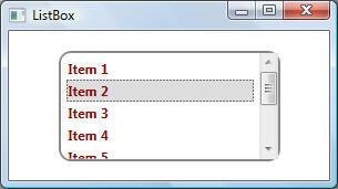
The result is shown below:
The following code expands on Example 3 - Simple ListBox by templating ScrollViewer to give more control over the visual structure of the ListBox. ScrollViewer represents a scrollable area that encapsulates a content element and up to two ScrollBar controls. Because the scroll bars for a ScrollViewer element are defined in the default style of the element, scroll bars will no longer appear if you apply a custom style to a ScrollViewer. Scroll bars must be defined in the custom style for them to appear.
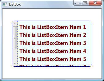
The code for this example is best understood if the results are shown first:
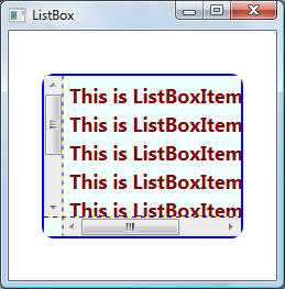
The first window shows the templated ListBox when both scroll bars are visible. First, note that the vertical scroll bar in now on the left side of the ListBox. More importantly, the physical layout of the ListBox is based on Grid with the grid lines only shown to highlight this fact. The code is shown below:
<Style x:Key="LeftScrollViewer"
TargetType="{x:Type ScrollViewer}">
<Setter Property="OverridesDefaultStyle" Value="True"/>
<Setter Property="Template">
<Setter.Value>
<ControlTemplate TargetType="{x:Type ScrollViewer}">
<Grid ShowGridLines="True" Background="Azure">
<Grid.ColumnDefinitions>
<ColumnDefinition Width="Auto"/>
<ColumnDefinition/>
</Grid.ColumnDefinitions>
<Grid.RowDefinitions>
<RowDefinition/>
<RowDefinition Height="Auto"/>
</Grid.RowDefinitions>
<ScrollContentPresenter Grid.Column="1" Grid.Row="0"/>
<ScrollBar Name="PART_VerticalScrollBar"
Grid.Column="0" Grid.Row="0"
Value="{TemplateBinding VerticalOffset}"
Maximum="{TemplateBinding ScrollableHeight}"
ViewportSize="{TemplateBinding ViewportHeight}"
Visibility="{TemplateBinding ComputedVerticalScrollBarVisibility}"/>
<ScrollBar Name="PART_HorizontalScrollBar" Orientation="Horizontal"
Grid.Row="1" Grid.Column="1"
Value="{TemplateBinding HorizontalOffset}"
Maximum="{TemplateBinding ScrollableWidth}"
ViewportSize="{TemplateBinding ViewportWidth}"
Visibility="{TemplateBinding ComputedHorizontalScrollBarVisibility}"/>
</Grid>
</ControlTemplate>
</Setter.Value>
</Setter>
</Style>
...
<ScrollViewer Focusable="false" Style="{StaticResource
LeftScrollViewer}">
<StackPanel Margin="5" IsItemsHost="True"
Orientation="Vertical"/>
</ScrollViewer>
...
Note the following points about the code:
Different parts of the ListBox are assigned to different grid rows and columns. The effect of this was shown previously at the beginning o this example.
ScrollContentPresenter provides support for styling the various components of a ScrollViewer control.
ScrollBar.Name attribute specifies a specific name; PART_VerticalScrollBar for the vertical scroll bar and PART_HorizontalScrollBar for the horizontal scroll bar. Where do these names come from? The following shows C# declaration for ScrollViewer:
[LocalizabilityAttribute(LocalizationCategory.Ignore)]
[TemplatePartAttribute(Name = "PART_HorizontalScrollBar", Type =
typeof(ScrollBar))]
[TemplatePartAttribute(Name = "PART_VerticalScrollBar", Type =
typeof(ScrollBar))]
[TemplatePartAttribute(Name = "PART_ScrollContentPresenter", Type =
typeof(ScrollContentPresenter))]
public class ScrollViewer : ContentControl
PART_VerticalScrollBar and
PART_HorizontalScrollBar are
TemplatePart attributes.
TemplatePart attributes are usually added to the class definition to
identify the types of the named parts that are used for templating. In other
words, instead of having to specify ScrollBar
elements from scratch (i.e., visual structure and behaviour including all mouse
and keyboard interactions), we can instruct the template to reuse the
existing scroll bars that are part of the standard (i.e., default)
ScrollViewer class. This way, we avoid having to specify
from scratch visual structure
and required behaviours .
The use of named parts in templates is typically associated with using TemplateBinding elements. TemplateBinding is XAML markup extension whose purpose is to create a binding between the value of a property in a template and the value of some other exposed property on the templated control:
<object property="{TemplateBinding Property=targetProperty}" .../>
Using a TemplateBinding is equivalent to using a Binding with the Source property set to RelativeSource.TemplatedParent. For example, the following binding:
<ScrollBar Name="PART_HorizontalScrollBar" Maximum="{TemplateBinding ScrollableWidth}" />
indicates that the Maximum property which sets the highest possible Value of the range element of the ScrollBar should be synchronized with the Maximum value that is set on the horizontal scrollbar.
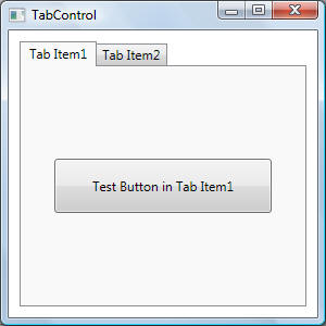
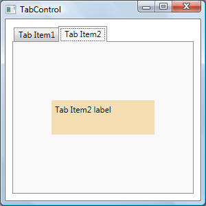
To better understand this example, the default TabControl with two simple TabItem items is shown below along with the corresponding visual trees:
Visual tree when the first tab item is selected is shown below. Note that indentation of coloured items Border and TabPanel indicate that they are children of Grid. This should give us a starting point as to how to structure the visual layout using ControlTemplate - i.e., use Grid with two rows, one row contains TabPanel element and the other row contains Border element:
System.Windows.Controls.TabControl
System.Windows.Controls.Grid
System.Windows.Controls.Border
Sytem.Windows.Controls.ContentPresenter
System.Windows.Controls.Button
Microsoft.Windows.Themes.ButtonChrome
System.Windows.Controls.ContentPresenter
System.Windows.Controls.TextBlock
System.Windows.Controls.Primitives.TabPanel
System.Windows.Controls.TabItem
System.Windows.Controls.Grid
System.Windows.Controls.Border
System.Windows.Controls.ContentPresenter
System.Windows.Controls.TextBlock
System.Windows.Controls.TabItem
System.Windows.Controls.Grid
System.Windows.Controls.Border
System.Windows.Controls.ContentPresenter
System.Windows.Controls.TextBlock
Visual tree when the second tab item is selected:
System.Windows.Controls.TabControl
System.Windows.Controls.Grid
// (Grid has two rows as indicated by coloured
items)
System.Windows.Controls.Border
Sytem.Windows.Controls.ContentPresenter
System.Windows.Controls.Label
System.Windows.Controls.Border
System.Windows.Controls.ContentPresenter
System.Windows.Controls.TextBlock
System.Windows.Controls.Primitives.TabPanel
System.Windows.Controls.TabItem
System.Windows.Controls.Grid
System.Windows.Controls.Border
System.Windows.Controls.ContentPresenter
System.Windows.Controls.TextBlock
System.Windows.Controls.TabItem
System.Windows.Controls.Grid
System.Windows.Controls.Border
System.Windows.Controls.ContentPresenter
System.Windows.Controls.TextBlock
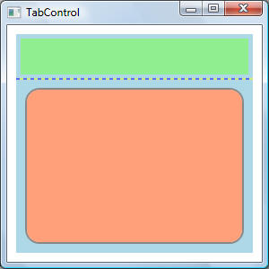
This example shows how to use a ControlTemplate to redefine the visual structure and behaviour of TabControl based on the visual tree structures shown above for the default TabControl. The code for this example is best understood if the results are shown first. Note that exaggerated colours, margins, corner radii and other GUI-related properties are used to highlight all components of the TabControl:
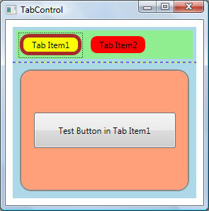
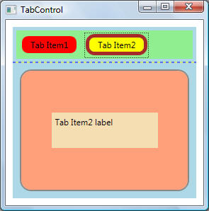
The TabControl in the figures above is visual structured as follows:
The light blue Grid is the main container.
The Grid has two rows. The top row is used to contain TabItem items, while the bottom row contains the contents of the selected TabItem item.
The code is shown below:
<Window x:Class="Templates.TemplatedControls.TabControl"
xmlns="http://schemas.microsoft.com/winfx/2006/xaml/presentation"
xmlns:x="http://schemas.microsoft.com/winfx/2006/xaml"
Title="TabControl" Height="300" Width="300">
<Window.Resources>
<ResourceDictionary>
<ResourceDictionary.MergedDictionaries>
<ResourceDictionary Source="..\Resources\Common.xaml"/>
</ResourceDictionary.MergedDictionaries>
<!-- TabControl Style-->
<Style
TargetType="TabControl">
<Setter Property="OverridesDefaultStyle" Value="true"/>
<Setter Property="SnapsToDevicePixels" Value="true"/>
<Setter Property="Template">
<Setter.Value>
<ControlTemplate TargetType="TabControl">
<!-- Visual Tree
The KeyboardNavigation class is responsible for implementing default keyboard
focus navigation when one of the navigation keys is pressed. The navigation keys
are: Tab, Shift+Tab, Ctrl+Tab, Ctrl+Shift+Tab, UpArrow, DownArrow, LeftArrow,
and RightArrow keys. An example of logical navigation is using the tab key to
move
focus. An example of directional navigation is using the arrow keys to move
focus
Note that the visual tree of the tab control is based on a grid with two rows.
First row is a TabPanel while second row
-->
<Grid KeyboardNavigation.TabNavigation="Local" ShowGridLines="True" Background="LightBlue">
<Grid.RowDefinitions>
<RowDefinition Height="Auto"/>
<RowDefinition Height="*"/>
</Grid.RowDefinitions>
<!-- The TabPanel serves as an item host for the tab items in a TabControl. It
determines the correct sizing and positioning for tab items and handles the
logic for multiple rows of TabItem objects -->
<TabPanel Name="HeaderPanel"
Grid.Row="0" Grid.Column="0"
Panel.ZIndex="1"
Margin="5"
IsItemsHost="True"
KeyboardNavigation.TabIndex="1"
Background="LightGreen"/>
<Border Name="Border"
Grid.Row="1" Grid.Column="0"
Background="LightSalmon"
BorderBrush="{StaticResource SolidBorderBrush}"
BorderThickness="2"
CornerRadius="15"
Margin="10"
KeyboardNavigation.TabNavigation="Local"
KeyboardNavigation.DirectionalNavigation="Contained"
KeyboardNavigation.TabIndex="2" >
<ContentPresenter Name="PART_SelectedContentHost" Margin="4" ContentSource="SelectedContent"
/>
</Border>
</Grid>
<!-- Behaviour -->
<ControlTemplate.Triggers>
<Trigger Property="IsEnabled" Value="False">
<Setter Property="Foreground" Value="{StaticResource DisabledForegroundBrush}"
/>
<Setter TargetName="Border" Property="BorderBrush" Value="{StaticResource
DisabledBorderBrush}" />
</Trigger>
</ControlTemplate.Triggers>
</ControlTemplate>
</Setter.Value>
</Setter>
</Style>
<!-- TabItem Style -->
<Style
TargetType="{x:Type TabItem}">
<Setter Property="Template">
<Setter.Value>
<ControlTemplate TargetType="{x:Type TabItem}">
<Grid>
<Border
Name="Border"
Margin="5"
Background="Red"
BorderThickness="3"
CornerRadius="10,10,10,10" >
<ContentPresenter x:Name="ContentSite" VerticalAlignment="Center"
HorizontalAlignment="Center" ContentSource="Header"Margin="12,2,12,2"
RecognizesAccessKey="True"/>
</Border>
</Grid>
<ControlTemplate.Triggers>
<Trigger Property="IsSelected" Value="True">
<Setter Property="Panel.ZIndex" Value="100" />
<Setter TargetName="Border" Property="Background" Value="Yellow" />
<Setter TargetName="Border" Property="BorderThickness" Value="5" />
<Setter TargetName="Border" Property="BorderBrush" Value="Brown" />
</Trigger>
<Trigger Property="IsEnabled" Value="False">
<Setter TargetName="Border" Property="Background" Value="{StaticResource
DisabledBackgroundBrush}" />
<Setter TargetName="Border" Property="BorderBrush" Value="{StaticResource
DisabledBorderBrush}" />
<Setter Property="Foreground" Value="{StaticResource DisabledForegroundBrush}"
/>
</Trigger>
</ControlTemplate.Triggers>
</ControlTemplate>
</Setter.Value>
</Setter>
</Style>
</ResourceDitionary>
/Window.Resources>
<Grid Margin="10">
<TabControl Name="tc">
<TabItem
Header="Tab Item1">
<Button Content="Test Button in Tab Item1" Width="200" Height="50"></Button>
</TabItem>
<TabItem
Header="Tab Item2">
<Label Content="Tab Item2 label" Width="150" Height="50"
Background="Wheat"></Label>
</TabItem>
</TabControl>
</Grid>
</Window>
Note the following points about the code:
A Grid with two rows (and one column) is used as the base visual element.
The first row of the Grid is used
to hold the tab buttons (TabPanel).
TabPanel is effectively a collection of buttons
but with logic that determines the correct sizing and positioning for tab
items (i.e, buttons) and handles the logic for multiple rows of
TabItem objects. The following shows the base
TabControl with no TabItem
items:
The second row of the Grid is used to host the contents for the selected TabPanel. Note the following points for this second row:
KeyboardNavigation.DirectionalNavigation="Contained" ensures that focus returns to the first or the last item when the end or the beginning of the container is reached, but does not move past the beginning or end of the container. For example, when controls for tab item 1 are shown, this KeyboardNavigation setting ensures that tabbing only affects tab item 1 controls.
KeyboardNavigation.TabNavigation="Local" ensures that that tab Indexes are considered on local subtree only inside this container.
PART_SelectedContentHost is a TemplatePart attribute and should be used as shown below
...
<ContentPresenter Name="PART_SelectedContentHost" Margin="<ANumericValue>" ContentSource="SelectedContent" />TemplatePart attributes are usually added to the class definition to identify the types of the named parts that are used for templating:
[TemplatePartAttribute(Name = "PART_SelectedContentHost", Type = typeof(ContentPresenter))]
[StyleTypedPropertyAttribute(Property = "ItemContainerStyle", StyleTargetType = typeof(TabItem))]
public class TabControl : SelectorIn other words, instead of having to specify elements from scratch to contain controls specific for a tab item (i.e., visual structure and behaviour including all mouse and keyboard interactions), we can instruct the template to reuse the existing container that are part of the standard (i.e., default) TabControl class. This way, we avoid having to specify from scratch visual structure and required behaviours.
This example shows how to use a ControlTemplate to redefine the visual structure and behaviour of TreeView. To better understand this example, the default TreeView with two TreeViewItem items is shown below along with code that traverses the corresponding visual trees:
public static void PrintVisualTree(int depth,
object obj)
{
// Print the object with preceding
spaces that represent its depth
Trace.WriteLine(new string(' ', depth) +
obj.GetType().ToString());
// If current element is a grid,
display information about its rows and columns
if (obj is Grid)
{
Grid gd = (Grid)obj;
Trace.WriteLine(new string(' ',
depth) + "Grid has " + gd.RowDefinitions.Count +
" rows and " + gd.ColumnDefinitions.Count + " columns.");
foreach (UIElement element in
gd.Children)
{
Trace.WriteLine(new string(' ', depth) +
element.GetType().ToString() + " in row " + Grid.GetRow(element) +
" column " + Grid.GetColumn(element));
}
}
// Recursive call for each visual child
for (int i = 0; i <
VisualTreeHelper.GetChildrenCount(obj as DependencyObject); i++)
PrintVisualTree(depth + 1,
VisualTreeHelper.GetChild(obj as DependencyObject, i));
}
System.Windows.Controls.TreeView
System.Windows.Controls.Border
System.Windows.Controls.ScrollViewer
System.Windows.Controls.Grid
{Grid has 2 rows and 2
columns.
System.Windows.Shapes.Rectangle in row 1 column 1
System.Windows.Controls.ScrollContentPresenteri n row 0
column 0
System.Windows.Controls.Primitives.ScrollBar in row 0 column
1
System.Windows.Controls.Primitives.ScrollBar in row 1 column
0}
System.Windows.Shapes.Rectangle
System.Windows.Controls.ScrollContentPresenter
System.Windows.Controls.ItemsPresenter
System.Windows.Controls.StackPanel
System.Windows.Controls.TreeViewItem
System.Windows.Controls.Grid
{Grid has 2 rows and 3 columns.
System.Windows.Controls.Primitives.ToggleButton in row 0 column 0
System.Windows.Controls.Border in row
0 column 1
System.Windows.Controls.ItemsPresenter in row 1 column 1}
System.Windows.Controls.Primitives.ToggleButton
System.Windows.Controls.Border
System.Windows.Shapes.Path
System.Windows.Controls.Border
System.Windows.Controls.ContentPresenter
System.Windows.Controls.TextBlock
System.Windows.Controls.ItemsPresenter
System.Windows.Documents.AdornerLayer
System.Windows.Controls.Primitives.ScrollBar
System.Windows.Controls.Primitives.ScrollBar
Each grid and its children are highlighted accordingly. The grid information that is displayed immediately after each Grid element (in black font) is for information only and is not part of the visual tree. This information matches the Grid children that are highlighted accordingly The visual tree above shows that the default structure of the TreeView is based on a ScrollViewer whose sub-structure (ScollContentPresenter and two ScrollBar elements) is contained within a Grid element and is summarized below:
System.Windows.Controls.TreeView
...
System.Windows.Controls.ScrollViewer
System.Windows.Controls.Grid
System.Windows.Shapes.Rectangle
System.Windows.Controls.ScrollContentPresenter
...
System.Windows.Controls.Primitives.ScrollBar
System.Windows.Controls.Primitives.ScrollBar
The visual tree above also shows that the default structure of the TreeViewItem is contained within a Grid and is summarized below:
System.Windows.Controls.TreeViewItem
System.Windows.Controls.Grid
System.Windows.Controls.Primitives.ToggleButton
...
System.Windows.Controls.Border
...
System.Windows.Controls.ItemsPresenter
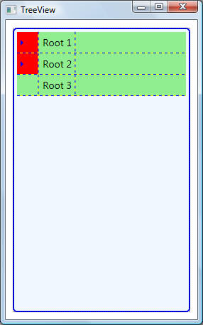
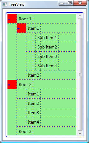
The code for this example is best understood if the results are shown first. Note that exaggerated colours, margins, corner radii and other GUI-related properties are used to highlight all components of the TreeView:
Note the following:
First, the code for styling a TreeView (<Style TargetType="TreeView">) does not do much at all besides changing border properties. In fact, code for <Style TargetType="TreeView"> can be removed altogether.
Likewise, the code for ToggleButton can also be removed. It has been added just to show how the control used to expand/collapse tree items can be changed. One interesting thing to note here is the use of TargetName property in the ControlTemplate trigger. This property is used to get/set the name of the object to animate, which in this case is a Path element as given in <Path x:Name="ExpandPath" ... > element definition.
<Window x:Class="Templates.TemplatedControls.TreeView"
xmlns="http://schemas.microsoft.com/winfx/2006/xaml/presentation"
xmlns:x="http://schemas.microsoft.com/winfx/2006/xaml"
Title="TreeView" Height="300" Width="300" Loaded="Window_Loaded">
<Window.Resources>
<ResourceDictionary>
<ResourceDictionary.MergedDictionaries>
<ResourceDictionary Source="..\Resources\Common.xaml"/>
</ResourceDictionary.MergedDictionaries>
<!-- TreeView -->
<Style
TargetType="TreeView">
<Setter Property="OverridesDefaultStyle" Value="True" />
<Setter Property="SnapsToDevicePixels" Value="True" />
<Setter Property="ScrollViewer.HorizontalScrollBarVisibility" Value="Auto"/>
<Setter Property="ScrollViewer.VerticalScrollBarVisibility" Value="Auto"/>
<Setter Property="Template">
<Setter.Value>
<ControlTemplate TargetType="TreeView">
<Border Name="Border" CornerRadius="5" Background="AliceBlue" BorderBrush="Blue"
BorderThickness="2" >
<ScrollViewer Focusable="False" CanContentScroll="False" Padding="4">
<ItemsPresenter/>
</ScrollViewer>
</Border>
</ControlTemplate>
</Setter.Value>
</Setter>
</Style>
<!-- ToggleButton -->
<Style
x:Key="ExpandCollapseToggleStyle" TargetType="ToggleButton">
<Setter Property="Focusable" Value="False"/>
<Setter Property="Template">
<Setter.Value>
<ControlTemplate TargetType="ToggleButton">
<Grid Width="30" Height="30" Background="Red" ShowGridLines="True">
<!-- Path is used to set the Geometry of the shape to be drawn -->
<Path x:Name="ExpandPath" HorizontalAlignment="Left" VerticalAlignment="Center"
Margin="1,1,1,1" Fill="Blue" Data="M 4 0 L 8 4 L 4 8 Z"/>
</Grid>
<ControlTemplate.Triggers>
<Trigger Property="IsChecked" Value="True">
<Setter Property="Data" TargetName="ExpandPath" Value="M 0 4 L 8 4 L 4 8 Z"/>
</Trigger>
</ControlTemplate.Triggers>
</ControlTemplate>
</Setter.Value>
</Setter>
</Style>
<!-- TreeViewItem -->
<Style
TargetType="{x:Type TreeViewItem}">
<Setter Property="Background" Value="Transparent"/>
<Setter Property="HorizontalContentAlignment"
Value="{Binding Path=HorizontalContentAlignment, RelativeSource={RelativeSource
AncestorType={x:Type ItemsControl}}}"/>
<Setter Property="VerticalContentAlignment"
Value="{Binding Path=VerticalContentAlignment, RelativeSource={RelativeSource
AncestorType={x:Type ItemsControl}}}"/>
<Setter Property="Padding" Value="1,0,0,0"/>
<Setter Property="Foreground" Value="{DynamicResource {x:Static
SystemColors.ControlTextBrushKey}}"/>
<Setter Property="Template">
<Setter.Value>
<ControlTemplate TargetType="{x:Type TreeViewItem}">
<Grid ShowGridLines="True" Background="LightGreen">
<Grid.ColumnDefinitions>
<ColumnDefinition MinWidth="19" Width="Auto"/>
<ColumnDefinition Width="Auto"/>
<ColumnDefinition Width="*"/>
</Grid.ColumnDefinitions>
<Grid.RowDefinitions>
<RowDefinition Height="Auto"/>
<RowDefinition/>
</Grid.RowDefinitions>
<ToggleButton x:Name="Expander" Style="{StaticResource ExpandCollapseToggleStyle}"
IsChecked="{Binding Path=IsExpanded, RelativeSource={RelativeSource
TemplatedParent}}" ClickMode="Press"/>
<Border Name="Bd"
Grid.Column="1"
BorderBrush="LightBlue"
BorderThickness="{TemplateBinding BorderThickness}"
Padding="{TemplateBinding Padding}">
<ContentPresenter x:Name="PART_Header" ContentSource="Header"
HorizontalAlignment="{TemplateBinding HorizontalContentAlignment}"
TextBlock.FontSize="14" Margin="5"/>
</Border>
<ItemsPresenter x:Name="ItemsHost"
Grid.Row="1" Grid.Column="1" Grid.ColumnSpan="2"/>
</Grid>
<ControlTemplate.Triggers>
<Trigger Property="IsExpanded" Value="false">
<Setter TargetName="ItemsHost" Property="Visibility" Value="Collapsed"/>
</Trigger>
<Trigger Property="HasItems" Value="false">
<Setter TargetName="Expander" Property="Visibility" Value="Hidden"/>
</Trigger>
<MultiTrigger>
<MultiTrigger.Conditions>
<Condition Property="HasHeader" Value="false"/>
<Condition Property="Width" Value="Auto"/>
</MultiTrigger.Conditions>
<Setter TargetName="PART_Header" Property="MinWidth" Value="75"/>
</MultiTrigger>
<MultiTrigger>
<MultiTrigger.Conditions>
<Condition Property="HasHeader" Value="false"/>
<Condition Property="Height" Value="Auto"/>
</MultiTrigger.Conditions>
<Setter TargetName="PART_Header" Property="MinHeight" Value="19"/>
</MultiTrigger>
<Trigger Property="IsSelected" Value="true">
<Setter TargetName="Bd" Property="Background"
Value="{DynamicResource {x:Static SystemColors.HighlightBrushKey}}"/>
<Setter Property="Foreground" Value="{DynamicResource {x:Static
SystemColors.HighlightTextBrushKey}}"/>
</Trigger>
<MultiTrigger>
<MultiTrigger.Conditions>
<Condition Property="IsSelected" Value="true"/>
<Condition Property="IsSelectionActive" Value="false"/>
</MultiTrigger.Conditions>
<Setter TargetName="Bd" Property="Background"
Value="{DynamicResource {x:Static SystemColors.ControlBrushKey}}"/>
<Setter Property="Foreground" Value="{DynamicResource {x:Static
SystemColors.ControlTextBrushKey}}"/>
</MultiTrigger>
<Trigger Property="IsEnabled" Value="false">
<Setter Property="Foreground" Value="{DynamicResource {x:Static
SystemColors.GrayTextBrushKey}}"/>
</Trigger>
</ControlTemplate.Triggers>
</ControlTemplate>
</Setter.Value>
</Setter>
</Style>
</ResourceDictionary>
</Window.Resources>
<Grid>
<TreeView Height="400" Width="400">
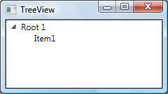
<TreeViewItem
Name="tv" Header="Root 1">
<TreeViewItem Header="Item1">
<TreeViewItem Header="Sub Item1" />
<TreeViewItem Header="Sub Item2" />
<TreeViewItem Header="Sub Item3" />
<TreeViewItem Header="Sub Item4" />
</TreeViewItem>
<TreeViewItem Header="Item2" />
</TreeViewItem>
<TreeViewItem
Header="Root 2">
<TreeViewItem Header="Item1" />
<TreeViewItem Header="Item2" />
<TreeViewItem Header="Item3" />
<TreeViewItem Header="Item4" />
</TreeViewItem>
<TreeViewItem
Header="Root 3"></TreeViewItem>
</TreeView>
</Grid>
</Window>
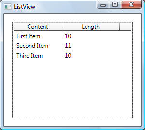
This example shows how to use a ControlTemplate to redefine the visual structure and behaviour of ListView. To better understand this example, the default ListView in the Grid view mode with three ListViewItem items is shown below along with code that traverses the corresponding visual trees:
System.Windows.Controls.ListView
System.Windows.Controls.Border
System.Windows.Controls.ScrollViewer
System.Windows.Controls.Grid
Grid has 2 rows and 2 columns
System.Windows.Controls.DockPanel in row 0 column 0
System.Windows.Controls.Primitives.ScrollBar in row 1 column 0
System.Windows.Controls.Primitives.ScrollBar in row 0 column 1
System.Windows.Controls.DockPanel
System.Windows.Controls.ScrollViewer
System.Windows.Controls.Grid
Grid has 2 rows and 2 columns.
System.Windows.Shapes.Rectangle in row 1 column 1
System.Windows.Controls.ScrollContentPresenter in
row 0 column 0
System.Windows.Controls.Primitives.ScrollBar in
row 0 column 1
System.Windows.Controls.Primitives.ScrollBar in
row 1 column 0
System.Windows.Shapes.Rectangle
System.Windows.Controls.ScrollContentPresenter
System.Windows.Controls.GridViewHeaderRowPresenter
System.Windows.Controls.GridViewColumnHeader
System.Windows.Controls.Border
System.Windows.Controls.GridViewColumnHeader
System.Windows.Controls.Grid
Grid has 0 rows and 0
columns.
System.Windows.Controls.Border in row 0 column 0
System.Windows.Controls.Primitives.Thumb in row 0 column 0
System.Windows.Controls.Border
System.Windows.Controls.ContentPresenter
System.Windows.Controls.TextBlock
System.Windows.Controls.Primitives.Thumb
System.Windows.Controls.Border
System.Windows.Shapes.Rectangle
System.Windows.Controls.GridViewColumnHeader
System.Windows.Controls.Grid
Grid has 0 rows and 0 columns.
System.Windows.Controls.Border
in row 0 column 0
System.Windows.Controls.Primitives.Thumb in row 0 column 0
System.Windows.Controls.Border
System.Windows.Controls.ContentPresenter
System.Windows.Controls.TextBlock
System.Windows.Controls.Primitives.Thumb
System.Windows.Controls.Border
System.Windows.Shapes.Rectangle
System.Windows.Controls.Separator
System.Windows.Controls.GridViewColumnHeader
System.Windows.Documents.AdornerLayer
System.Windows.Controls.Primitives.ScrollBar
System.Windows.Controls.Primitives.ScrollBar
System.Windows.Controls.ScrollContentPresenter
System.Windows.Controls.ItemsPresenter
System.Windows.Controls.VirtualizingStackPanel
System.Windows.Controls.ListViewItem
System.Windows.Controls.Border
System.Windows.Controls.GridViewRowPresenter
System.Windows.Controls.TextBlock
System.Windows.Controls.TextBlock
System.Windows.Controls.ListViewItem
System.Windows.Controls.Border
System.Windows.Controls.GridViewRowPresenter
System.Windows.Controls.TextBlock
System.Windows.Controls.TextBlock
System.Windows.Controls.ListViewItem
System.Windows.Controls.Border
System.Windows.Controls.GridViewRowPresenter
System.Windows.Controls.TextBlock
System.Windows.Controls.TextBlock
System.Windows.Documents.AdornerLayer
System.Windows.Controls.Primitives.ScrollBar
System.Windows.Controls.Primitives.ScrollBar
The visual tree presented above is simplified as shown below. The ListView is based on a ScrollViewer and the ScrollViewer is based on a Grid with rows and columns used to hold a DockPanel (containing ListView items) and two scroll bars, one horizontal and one vertical:
System.Windows.Controls.ListView
...
System.Windows.Controls.ScrollViewer
System.Windows.Controls.Grid
System.Windows.Controls.DockPanel
System.Windows.Controls.ScrollViewer
...
System.Windows.Controls.Primitives.ScrollBar
System.Windows.Controls.Primitives.ScrollBar
As shown above the main ScrollViewer on which ListView is based on contains a DockPanel which holds the contents of the ListView. The DockPanel contains two elements, one element docked at the top to show the ListView headers and is represented by another ScrollViewer, while the actual contents of the ListView are represented by ScrollContentPresenter and fills the remaining area of the DockPanel:
...
System.Windows.Controls.DockPanel
// These elements hold the
ListViewHeader
System.Windows.Controls.ScrollViewer
System.Windows.Controls.Grid
...
System.Windows.Controls.ScrollContentPresenter
System.Windows.Controls.GridViewHeaderRowPresenter
...
System.Windows.Controls.Primitives.ScrollBar
System.Windows.Controls.Primitives.ScrollBar
// These elements hold ListView
items
System.Windows.Controls.ScrollContentPresenter
System.Windows.Controls.ItemsPresenter
System.Windows.Controls.VirtualizingStackPanel
System.Windows.Controls.ListViewItem
...
System.Windows.Controls.ListViewItem
...
System.Windows.Controls.ListViewItem
...
System.Windows.Documents.AdornerLayer
...
TODO
Conten
tPresenter.ContentSource
ContentPresenter.ContentTemplate
ItemsPresenter
SelectedContentTemplateSelector
DataTemplateSelector
StoryBoard
Freezable
Geometry
Full ControlTemplate examples can be found here.