Note the following facts about Windows Presentation Foundation:
Note the following facts about eXtensible Application Market-up Language XAML:
The result of using XAML is that your UI code forms a tree-structured hierarchy called the Element Tree.
The following examples are meant to provide a quick introduction into WPF. These examples and their content will be discussed in detail in subsequent chapters. For now treat these example as a preview to XAML syntax and code layout.
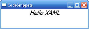
Consider this extremely simple 'Hello XAML' WPF application:
<Window x:Class="CodeSnippets.Window1" xmlns="" xmlns:x=""
Title="CodeSnippets" Height="300" Width="300">
<StackPanel>
<TextBlock FontSize="20" FontStyle="Italic"
HorizontalAlignment="Center">Hello XAML</TextBlock>
</StackPanel>
</Window>
Output is shown below:
Consider the following WPF which illustrates a very basic page layout:
<Window x:Class="CodeSnippets.Window1" xmlns="..." xmlns:x="..."
Title="CodeSnippets" Height="300" Width="300">
<StackPanel>
<Button HorizontalAlignment="Left"
Width="100" Margin="10,10,10,10">Apply</Button>
<Button HorizontalAlignment="Left"
Width="100" Margin="10,10,10,10">OK</Button>
<Button HorizontalAlignment="Left"
Width="100" Margin="10,10,10,10">Cancel</Button>
</StackPanel>
</Window>
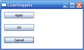
Note the following about the preceding XAML:
Consider the following WPF which illustrates a complex page layout:
<Window x:Class="CodeSnippets.Window1" xmlns="..." xmlns:x="..."
Title="CodeSnippets" Height="300" Width="300" >
<DockPanel>
<TextBlock Background="Red" DockPanel.Dock="Top">Top Text</TextBlock>
<TextBlock Background="Blue" DockPanel.Dock="Bottom">Bottom
Text</TextBlock>
<TextBlock Background="Green" DockPanel.Dock="Left">Left
Text</TextBlock>
<DockPanel Background="Bisque">
<StackPanel DockPanel.Dock="Top">
<Button HorizontalAlignment="Left"
Width="100" Margin="10,10,10,10">Apply</Button>
<Button HorizontalAlignment="Left"
Width="100" Margin="10,10,10,10">OK</Button>
</StackPanel>
<TextBlock Background="LightGreen">Text below
buttons</TextBlock>
</DockPanel>
</DockPanel>
</Window>
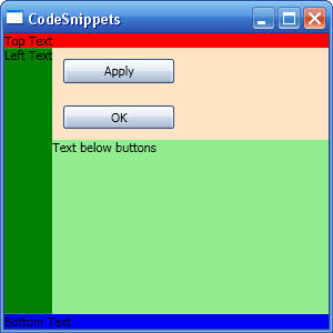
Note the following about the preceding XAML:
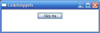
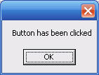
The following WPF application shows how to handle events from a buttons:
<Window x:Class="CodeSnippets.Window1" xmlns="" xmlns:x=""
Title="CodeSnippets" Height="94" Width="326">
<StackPanel>
<!-- The actual handler is implemented in the code-behind file for the page
(discussed later) -->
<Button Click="Button1_Hanbdler"
Width="80" Height="20"
VerticalContentAlignment="Center" Margin="10,10,10,10">Click Me</Button>
</StackPanel>
</Window>
public partial class Window1 : System.Windows.Window
{
public Window1()
{
InitializeComponent();
}
public void Button1_Hanbdler(object oSender,
RoutedEventArgs args)
{
MessageBox.Show("Button has been
clicked");
}
}
The following example introduces the <Page> element which is commonly used as a root element. The <Page> element is a proxy for the window that contains the page. You can use it declaratively to set window properties such as Height or Width. A WPF application typically consists of multiple dynamic XAML pages. The user progresses through the application by navigating from one to another. Optionally, you can open a new window to display the new page. However, the easiest way to navigate to a new page is to use the <Hyperlink> element (uses the application Hyperlink object to provide navigation to a specified target page).
The following shows how to create a multi-page application. First, the start-up window is identified by the Application object through the StartupUri attribute:
<Application x:Class="CodeSnippets.App"
xmlns="..."
xmlns:x="..." StartupUri="Page1.xaml">
<Application.Resources>
</Application.Resources>
</Application>
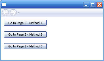
The following shows code for the main Page which will be hosted inside the main application window:
<Page x:Class="CodeSnippets.Page1"
xmlns="... " xmlns:x="..." Title="Page1">
<StackPanel>
<Button HorizontalAlignment="Left" Width="150" Margin="10,10,10,10"
Click="ClickHandler_Method1" Name="GoToPage2_Method1">Go to Page 2 - Method
1</Button>
<Button HorizontalAlignment="Left" Width="150" Margin="10,10,10,10"
Click="ClickHandler_Method2" Name="GoToPage2_Method2">Go to Page 2 - Method
2</Button>
<Button HorizontalAlignment="Left" Width="150" Margin="10,10,10,10"
Click="ClickHandler_Method3" Name="GoToPage2_Method3">Go to Page 2 - Method
3</Button>
</StackPanel>
</Page>
public partial class Page1 : System.Windows.Controls.Page
{
public Page1()
{
InitializeComponent();
}
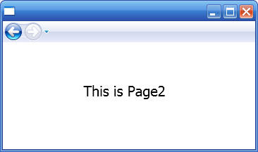
private void ClickHandler_Method1(object sender, RoutedEventArgs e)
{
// Create the new page
Page2 page2 = new Page2();
page2.InitializeComponent();
// Navigate to the new page
NavigationWindow navWindow = (NavigationWindow)App.Current.MainWindow;
navWindow.Content = page2;
}
private void ClickHandler_Method2(object sender, RoutedEventArgs e)
{
// Get naviagtion window
NavigationWindow navWindow = (NavigationWindow)App.Current.MainWindow;
// Navigate to new window
navWindow.Navigate(new Uri("Page2.xaml", UriKind.RelativeOrAbsolute));
}
private void ClickHandler_Method3(object sender, RoutedEventArgs e)
{
// Get naviagtion window
NavigationWindow navWindow = (NavigationWindow)App.Current.MainWindow;
// Navigate to new window
navWindow.Source = new Uri("Page2.xaml", UriKind.RelativeOrAbsolute);
}
}
The Click event handler is implemented in the code-behind file for the page. By convention, the code-behind file has the same name as the .xaml file appended with a language specific extension (For example, Page1.xaml.cs). So to handle the Click event for the <Button> element, we added the following code to Page1.xaml.cs (note that the class is a partial class):
private void ClickHandler_Method1(object sender, RoutedEventArgs e)
{
// Create the new page
Page2 page2 = new Page2();
page2.InitializeComponent();
// Navigate to the new page
NavigationWindow navWindow = (NavigationWindow)App.Current.MainWindow;
navWindow.Content = page2;
}
Note that when the application is compiled, the XAML code in Page1.xaml is converted to an equivalent partial class implementation called Page1.g.cs. This implementation has the namespace and class name that is specified by the x:Class attribute in the root element. This partial class is merged with the one in the code-behind file to create the executable page.
A high percentage of classes in WPF inherit from
four classes which are commonly referred to in this documentation as the base
element classes. These are UIElement,
FrameworkElement, ContentElement, and
FrameworkContentElement.
UIElement provides a starting point for layout,
keyboard/mouse input, focusing behaviour, and raising routed events.
UIElement can be considered roughly equivalent to a
window handle in Win32 programming.The ContentElement
class implements many of the same members as does UIElement;
the difference between these two classes has to do with their intended place in
the overall content model. UIElement derived class
defines a rigid content model, meaning that there are restrictions on what
elements may be child elements in mark-up. A ContentElement
derived class is typically not as restrictive about content as
UIElement, to support scenarios such as flow-format
documents.
UIElement is inherited by FrameworkElement, and ContentElement is inherited by FrameworkContentElement. The reason for this next level of classes is to support the notion of a WPF core that is separate from a WPF Framework: WPF core is a subset of WPF programming features available in WindowsBase.DLL. WPF Framework is the complete set of all of WPF programming features and is available in PresentationFramework.DLL.
The following tree shows how the classes above relate:
System.Windows.DependencyObject
System.Windows.ContentElement
System.Windows.FrameworkContentElement
Derived Classes
System.Windows.DependencyObject
System.Windows.Media.Visual
System.Windows.UIElement
System.Windows.FrameworkElement
Derived Classes
WPF has a property system whose main function is to compute the values of properties, and to provide system notification about values that have change. A central concept in this property system is a dependency property. A 'dependency property' is an instance of a DependencyProperty class that is registered with WPF. A 'dependency property' allows any property on your custom type to support value expressions, property invalidation, per-type default values, inheritance, data binding, animation, or styling. Another central class in the WPF 'property system' in addition to DependencyProperty class is DependencyObject class. DependencyObject class is the base class of WPF classes and enables objects to use dependency properties.
The most practical way to create a custom class that extends WPF is by subclassing one of the WPF classes so you get some of the functionality through the hierarchy. This section lists the functionality that comes with three of the most important classes to help you decide which class to inherit from:
| Base Class | Acquired Functionality |
| DependencyObject |
|
| UIElement |
|
| FrameworkElement |
|
| ContentElement |
|
| FrameworkContentElement |
|
WPF contains a 'logical' tree structure that is used to organize elements and
components. This tree is not intended to be manipulated directly, but
understanding the concept of the logical tree is a helpful way to understand how
property inheritance and event routing work in Windows Presentation Foundation
In addition to the concept of the logical tree, there is also the concept of the
visual tree in Windows Presentation Foundation. The visual tree describes the
structure of visuals represented by the Visual base class. The visual tree is of
greatest interest to developers who want lower-level control over drawing for
performance and optimization reasons, and generally is not a concept that is
exposed to developers working primarily with existing controls and with
Extensible Application Markup Language (XAML).
Consider a
DockPanel that contains a Button control and a
TextBlock control. If
you set the FontWeight property on the
DockPanel, the TextBlock control inherits
the FontWeight property value from the parent
DockPanel element. A property is
inherited through either its logical parent or visual parent, but the logical
parent is used if both parents are present. In addition, resource references are
resolved by looking upwards through the logical tree for Resources collections
Through event routing, parent elements participate in events directed to their
child elements or other descendants. Unlike properties and resources, an event
is routed through its visual parent if both the logical parent and the visual
parent are present
The visual tree also supports a helper class for tree traversal,
VisualTreeHelper. The visual tree is not exposed as conveniently through
control-specific properties, so the VisualTreeHelper
class is the recommended way to traverse the visual tree if that is necessary
for your programming scenario. For more information, see Visual Layer
Overview in MSDN.
This section looks at the WPF architecture by examining most of the major
sub-systems of WFP and describes how they interact.
The major components
of WPF are presented below:
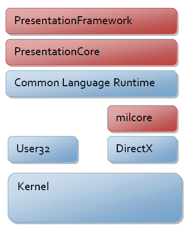
The red sections of the diagram (PresentationFramework, PresentationCore and milcore) are the major code portions of the WPF. Of these, only milcore is written in unmanaged code due to 1) tight integration with DirectX and 2) performance considerations.
Most objects in WPF derive from DispatchObject which
provides functionality to
deal with concurrency and threading. WPF is based on a messaging system
implemented by the dispatcher (very similar to the Win32 message pump).
There are two core concepts to understand when discussing concurrency in WPF -
dispatcher and thread-affinity: Thread affinity happens when a component uses the identify of the executing
thread to store some type of state (the most common is thread-local storage -
TLS). Thread affinity requires that each logical thread of execution be owned by
one and only one physical thread in the OS. WPF threading model is in sync with
existing User32 threading model of single threaded-execution with thread
affinity.
Given that WPF objects have STA threading, you need a way to communicate between
threads and validate that you are on the correct thread. This is the role of the
dispatcher: The dispatcher is a basic message-dispatching system with multiple
prioritized queues. By deriving from DispatchObject you get a CLR object that has
an STA behaviour and
will be given a pointer to the dispatcher at creation time.
WPF has a preference for properties over methods or events. This is because
properties are declarative and allow you to more easily specify intent instead
of action.
WPF provides a rich property system derived from the
DependencyObject type. The WPF property system is a
dependency property system in that it tracks
dependencies between property expressions and automatically revalidates property
values when dependencies change.
A key feature of the property system is the notion of attached properties. WPF
elements are built on the principle of composition and component reuse. For
example, a containing element like the <Grid> layout panel, needs additional data on
child elements to control its behaviour. Instead of associating all of these properties with every element, WPF allows
any object to provide property definitions for any other object.
Visual class is the entry point to the WPF composition system. When programming WPF, you create Visual elements, and derived types, which internally communicate with the composition tree through a messaging protocol.
UIElement object defines core platform services including Layout, Input, Focus,
and Event (aka, LIFE). Layout is a core concept in WPF. At the
UIElement level, layout uses a two phase
model with Measure and Arrange passes. The Measure phase allows a component
to determine how
much size it would like to take. The Arrange phase allows a parent to position
and determine the size of each child.
Input (i.e., keyboard input or
mouse input) originates as a signal on some kernel mode device driver and gets
routed by the OS to the correct process/thread. User32 then routes the message
to WPF where it is converted to raw WPF input message and sent to the
dispatcher. Each input event is converted to at least two events - a preview event and the
actual event. Events are said
to bubble if they traverse from a target up to the root, and are said to
tunnel if they start at the root and traverse down to a target.
Input preview
events tunnel, thereby enabling any element in the tree an opportunity to filter
or take action on the event. The regular (non-preview) event then bubbles from
the target up to the root.
FrameworkElement introduces among many other things, data binding and styles. Data-binding allows you to bind the value of a property of a given element to a piece of data. The most interesting part of data binding in WPF in the introduction of data templates. Data templates allow you to declaratively specify how a piece of data should be visualized. Styling is a lightweight form of data binding. Using styling you can bind a set of properties from a shared definition to one or more instances of an element.
FrameworkElement class is the connection point between framework-level element classes and the core set of UIElement presentation services. As can be seen from the class hierarchy below, many WPF classes derive from FrameworkElement either directly or through intermediate bases classes such as Panel and Control:
Classes that derive from FrameworkElement are: