Styles allow an application, document, or UI to assume a particular look and feel. An important feature of WPF styles is the separation of presentation and logic. This means that designer can design the appearance of an application, while developers write the programming logic.
Styles can be declared on any element that derives from FrameworkElement or
FrameworkContentElement. The most common way to declare a style is using a
resource inside a Resources element. Styles are scoped resources; where you
declare a style affects where it can be applied. For example, a style declared in the
root element of the application can be used anywhere in the application.
A style declaration consists of a <Style> element with one or more
<Setter> elements. Each
<Setter> has a Property and a Value
attribute. Property is the name of the DependencyProperty of the element it is declared on. For
example:
<Style x:Key="MyStyle">
<Setter Property="Control.Background" Value="Green" />
</Style>
<!--
The above style is associated with an element as follows: -->
<Button Style="{StaticResource.MyStyle}">Abort</Button>
You can apply a style to all elements of a certain type using the TargetType property and x:Type resource key. For example:
<Style TargetType="{x:Type TextBlock}" >
<Setter Property="FontFamily" value="Arial"/>
<Setter Property="FontSize" value="10pt"/>
</Style>
Styles can be inherited from other styles through the BasedOn property. In the following example, Style2 inherits the Control.Background value of Red and adds a Control.Foreground value of Green:
<Style x:Key="Style1">
<Setter property="Control.Background" value="Red" />
</Style>
<Style x:Key="Style2" BasedOn="{StaticResource.Style1}">
<Setter property="Control.Foreground" value="Green" />
</Style>
Styles can also be based on the style of an existing WPF element. In the following code, the new style for TextBlock elements is based on the default style for TextBlock elements (note how the complex value for the Foreground property is specified):
<Style
x:Key="TitleText" BasedOn="{StaticResource {x:Type TextBlock}}"
TargetType="{x:Type TextBlock}">
<Setter Property="FontSize" Value="32pt" />
<Setter Property="Foreground">
<Setter.Value>
<LinearGradientBrush StartPoint="0.5,0" EndPoint="0.5,1">
<LinearGradientBrush.GradientStops>
<GradientStop Offset="0.0" Color="#90C117" />
<GradientStop Offset="1.0" Color="#5C9417" />
</LinearGradientBrush.GradientStops>
</LinearGradientBrush>
</Setter.Value>
</Setter>
</Style>
WPF defines properties that correspond to end-user actions such as IsMouseOver which returns true when the mouse is hovering over a UIElement. Representing user actions in property values along with the Trigger element allows WPF to change property values based on end-user actions, all from within the markup. In the following example, there are two triggers with the first changing the Background property of a Button to Red when IsMouseOver is true, while the second trigger changes the Foreground property of a Button to Green when IsPressed is true:
<Style x:Key="Triggers" TargetType="{x:Type Button}">
<Style.Triggers>
<!-- Trigger 1.
Button background set to Red if IsMouseOver is true -->
<Trigger Property="Button.IsMouseOver" Value="true">
<Setter Property="Background" Value="Red"/>
</Trigger>
<!-- Trigger 2.
Button foreground is set to green if IsPressed is true -->
<Trigger Property="Button.IsPressed" Value="true">
<Setter Property="Foreground" Value="Green"/>
</Trigger>
</Style.Triggers>
</Style>
Note that the properties set by triggers are automatically reset to their pervious value when the triggered conditions is no longer satisfied. A <MultiTrigger> element allows you to use the value of multiple properties. For example, this <MultiTrigger> sets the MinWidth property to 120 when the HasItems=false and Width = Auto:
<Style.Triggers>
<MultiTrigger>
<MultiTrigger.Conditions>
<Condition Property="HasItems" Value="false" />
<Condition Property="Width" Value="Auto" />
</MultiTrigger.Conditions>
<Setter Property="MinWidth" Value="120"/>
</MultiTrigger>
</Style.Triggers>
You can also change property values of an element in response to an event using the <EventTrigger> element. The following example contains two event triggers - one occurs when the mouse enters the element and the other occurs when the mouse leave the element:
<!-- This style is targeted at the Rectangle type -->
<Style TargetType="{x:Type Rectangle}">
<Setter Property="Width" Value="50" />
<Setter Property="Height" Value="50" />
<Setter Property="Margin" Value="20" />
<Setter Property="HorizontalAlignment" Value="Left" />
<Style.Triggers>
<!-- Perform animation on
MouseEnter-->
<EventTrigger RoutedEvent="Rectangle.MouseEnter">
<EventTrigger.Actions>
<BeginStoryboard>
<Storyboard>
<DoubleAnimation To="300" Duration="0:0:1.5"
AccelerationRatio="0.10"
DecelerationRatio="0.25"
Storyboard.TargetProperty="(Canvas.Width)" />
</Storyboard>
</BeginStoryboard>
</EventTrigger.Actions>
</EventTrigger>
<!-- Reverse animation effects
on MouseLeave event -->
<EventTrigger RoutedEvent="Rectangle.MouseLeave">
<EventTrigger.Actions>
<BeginStoryboard>
<Storyboard>
<DoubleAnimation Duration="0:0:1.5"
AccelerationRatio="0.10"
DecelerationRatio="0.25"
Storyboard.TargetProperty="(Canvas.Width)" />
</Storyboard>
</BeginStoryboard>
</EventTrigger.Actions>
</EventTrigger>
</Style.Triggers>
</Style>
Note that event triggers have no concept of termination of state, so the property value will not change back to its original state once the condition that raised the event is no longer true. As in the example above, you can use the opposite event (MouseLeave) to undo changes.
An XAML resource can be thought of as a repository of commonly used objects and values. For example, a <SolidColorBrush> is a resource that establishes a specific brush colour. Because every element (FrameworkElement or FrameworkContentElement) has a <Resources> collection, you can define resources on any element. However, resources are most often defined on the root element.
Every resource in the <Resources> collection must have a unique key by using the x:Key attribute for that value. Typically, the key is a string, but you can also set it to other object types by using the appropriate markup extensions. For example, the following example defines a SolidColorBrush as a resource on the root element of a page. Other styles are also defined as resources on the root element of a page:
<StackPanel Name="root" xmlns="..." xmlns:x="...">
<!-- Define resources on the root element. Note how each
resource is identified through its x:Key attribute -->
<StackPanel.Resources>
<!-- Resource 1 -->
<SolidColorBrush x:Key="MyBrush"
Color="Gold"/>
<!-- Resource 2 -->
<Style x:Key="PageBackground" TargetType="{x:Type
Border}">
<Setter Property="Background"
Value="Blue"/>
</Style>
<!-- Resource 3 -->
<Style x:Key="TitleText"
TargetType="{x:Type TextBlock}">
<Setter Property="Background"
Value="Blue"/>
<Setter Property="DockPanel.Dock"
Value="Top"/>
<Setter Property="FontSize"
Value="18"/>
<Setter Property="Foreground"
Value="#4E87D4"/>
<Setter Property="FontFamily"
Value="Trebuchet MS"/>
<Setter Property="Margin"
Value="0,40,10,10"/>
</Style>
<!-- Resource 4 -->
<Style x:Key="Label" TargetType="{x:Type TextBlock}">
<Setter Property="DockPanel.Dock"
Value="Right"/>
<Setter Property="FontSize"
Value="8"/>
<Setter Property="Foreground"
Value="{StaticResource MyBrush}"/>
<Setter Property="FontFamily"
Value="Arial"/>
<Setter Property="FontWeight"
Value="Bold"/>
<Setter Property="Margin"
Value="0,3,10,0"/>
</Style>
</StackPanel.Resources>
After you define the resource, you can reference the resource to be used in a property value by using a particular markup extension syntax as follows:
<Button Background="{StaticResource
MyBrush}" />
<TextBlock style="{StaticResource TitleText}"
>Title</TextBlock>
In the preceding example, when the XAML loader processes the value {StaticResource MyBrush} for the Button.Background property, the resource lookup logic first checks the resource dictionary for the Button element. If Button does not have a definition of the resource key MyBrush, the lookup next checks the parent element of Button, which is Window. Thus, when you define a resource on the Window root element, all the elements in the logical tree of the Window can access it, and you can reuse the same resource for setting the value of any property that accepts the Type that the resource represents. Note that you could have also defined the Resources section under the main application file (App.xaml); in this case, the resources within will be accessible to all pages and windows.
Resources are usually defined using one of the following structures:
<object>
<object.Resources>
OneOrMoreResourceElements
</object.Resources>
</object>
<object>
<object.Resources>
<ResourceDictionary Source="MergedDictionarySource"
/>
</object.Resources>
</object>
OneOrMoreResourceElements corresponds to a <Resource> element is usually defined using the property element syntax and represents a dictionary ( [key,value] pairs) of resources. Each resource is an element that must have a unique value for its x:Key attribute. which serves as the unique key value when the resource is retrieved from the ResourceDictionary dictionary, either at compile-time or run-time. On the other hand, <ResourceDictionary Source="..." /> corresponds to a special syntax for merging resource dictionaries from external sources.
Lookup of resources by key is first performed by checking the collections of the immediate element where the resource reference was made. If no resource identified by that key is found, the resources collection of every successive parent in the logical tree is checked until the root element is reached. If no resources have been found yet, the Resources collection on the Application object is checked. Finally, resource lookup continues into themes used by controls and then to system resources.
In the preceding example, when the XAML processor sees {StaticResource MyBrush} on the <Button>, it first checks the Resources collection for the <Button> element. If the button does not have a definition of the resource key MyBrush, it checks the parent of the button and moves up the hierarchy until it finds a ancestor that has a resources collection with that specific resource key. Resources are typically defined on a root element so that all elements in the page/window can access it.
x:Static is typically used to reference constants, static properties, fields, or enumeration values. x:Static syntax is:
<object property={x:Static prefix:typeName.StaticMemberName} ... />
For example,
<Button
Content="SystemFonts"
FontSize="{x:Static SystemFonts.IconFontSize}"
FontWeight="{x:Static SystemFonts.MessageFontWeight}"
FontFamily="{x:Static SystemFonts.CaptionFontFamily}">
</Button>
However, to use the values of SystemFonts in code, you do not have to use either a static value or a dynamic resource reference. Instead, use the non-key properties of the SystemFonts class as follows:
// Equivalent to XAML code block
above
Button btncsharp = new Button();
btncsharp.Content = "SystemFonts";
btncsharp.FontSize = SystemFonts.IconFontSize;
btncsharp.FontWeight = SystemFonts.MessageFontWeight;
btncsharp.FontFamily = SystemFonts.CaptionFontFamily;
Recall that after you define the resource, you can reference the resource to be used in a property value by using a particular markup extension syntax as follows:
<Button Background="{StaticResource MyBrush}" />
<TextBlock style="{StaticResource TitleText}"
>Title</TextBlock>
You can reference a resource using either StaticResource or DynamicResource keyword. In most cases, reference a resource statically in order to use the least overhead. A static resource is evaluated only once at the time that the markup is parsed or loaded and is then cached for future reference.
Use a static resource if:
A DynamicResoruce on the other hand uses more overhead because an intermediate expression object must be created to make the dynamic lookup. Use a dynamic resource in the following cases:
Resource lookup traverses the
logical tree. Objects
that are not in the logical tree can reference resources, but the lookup
starts at the point where that object is connected to the logical tree. Only
logical tree nodes can have a Resources property
that contains a ResourceDictionary, so that
means there is no benefit in traversing the visual tree looking for
resources.
However, resource lookup can also extend beyond the immediate logical tree.
For application markup, the resource lookup can then continue onward to
application resources and to theme support and system values. Themes
themselves can also reference system values outside of the theme logical
tree if the resource references are dynamic. For more information on
resources and the lookup logic,
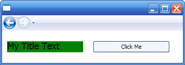
The following example shows how to retrieve resources through code:
<Page x:Class="CodeSnippets.Resourcesl"
xmlns="..."
xmlns:x="..."
Title="Resourcesl"
VerticalAlignment="Stretch"
HorizontalAlignment="Stretch">
<!-- Resources property is derived from
FrameworkElement and is used to internally
set/get a 'dictionary' for local resources -->
<Page.Resources>
<!-- Resource 1
-->
<SolidColorBrush Color="AliceBlue"
x:Key="Brush1" ></SolidColorBrush>
<!-- Resource 1
-->
<Style x:Key="Text" TargetType="{x:Type
TextBlock}">
<Setter
Property="Background" Value="Green" />
<Setter
Property="FontSize" Value="18" />
<Setter
Property="FontFamily" Value="Courie" />
</Style>
</Page.Resources>
<DockPanel>
<TextBlock Style="{StaticResource
Text}"
HorizontalAlignment="Left" Margin="10,10,10,10" Width="150"
VerticalAlignment="Center">My Title Text</TextBlock>
<Button Background="{StaticResource
Brush1}"
HorizontalAlignment="Left" Width="150" Margin="10,10,10,10"
VerticalAlignment="Center" Click="Click_Handler">Click Me</Button>
</DockPanel>
</Page>
public partial class Resourcesl :
System.Windows.Controls.Page
{
public Resourcesl()
{
InitializeComponent();
}
private void Click_Handler(object sender, RoutedEventArgs e)
{
// Get the Resources associated with
this page
string strTypeName = String.Empty;
int nResCount = this.Resources.Count;
foreach (DictionaryEntry oRes in this.Resources)
{
Trace.WriteLine((string)oRes.Key);
Trace.WriteLine(oRes.Value.GetType().FullName);
}
}
}
Note that the x:Key attributes used to identify resources if they are defined through XAML are also used to retrieve specific resources through code. The easiest way to find a resource is to call FindResource of TryFndResource methods from the Framework-level objects in your application (FindResource raises an exception; TryFindResource will not raise an exception but returns null). Each method takes the resource key as an input parameter, and returns a loosely typed object. Typically you would cast the returned object to the type required by the property you are setting:
void SetBGByResource(object sender, RoutedEventArgs e)
{
Button b = sender as Button;
b.Background = (Brush)this.FindResource("RainbowBrush");
}
Output from page above:
Note that you can index within any given Resources collection, using a specific key as the index, but be aware that accessing the resource in this way does not follow the normal runtime rules of resource resolution. You are only accessing that particular collection. Resource lookup will not be traversing the scope to the root or the application if no valid object was found at the requested key. However, this approach may have performance advantages in some cases precisely because the scope of the search for the key is more constrained.
Also note that if you decide to create a WPF application entirely in procedural code, then you should create a new ResourceDictionary object and then add all resources to this dictionary using successive calls to Add. The ResourceDictionary object would then be normally used to set the Resources property on an element present in a page scope, or the System.Windows.Application.Resources. You could also maintain the ResourceDictionary object as a stand-alone object without adding it to any element.
Merged resource dictionaries provide a way to define the resource portion of a WPF application outside the compiled XAML application. Resources can then be shared across applications and more conveniently isolated for localizations. The following syntax shows how to use merged dictionary resources:
<Window.Resources>
<ResourceDictionary>
<ResourceDictionary.MergedDictionaries>
<!-- the order of the merged dictionaries in the collection is the order
of the
elements as provided in the markup -->
<ResourceDictionary Source="myresourcedictionary.xaml"/>
<ResourceDictionary Source="myresourcedictionary2.xaml"/>
</ResourceDictionary.MergedDictionaries>
</ResourceDictionary>
</Window.Resources>
Each ResourceDictionary within the MergedDictionaries collection specifies a Source attribute. The value of Source should be a uniform resource identifier (URI) that resolves to the location of the resources file to be merged. The destination of that URI must be another XAML file, with ResourceDictionary as its root element. Merged dictionaries can also be added to a Resources dictionary through code. The default, initially empty ResourceDictionary that exists for any Resources property also has a default, initially empty MergedDictionaries collection property which you can call Add on to add merged dictionaries:
ResourceDictionary dictResource = (ResourceDictionary)XamlReader.Load(strPathToXAMLResourceFile);
Resources.MergedDictionaries.Add(dictResource);
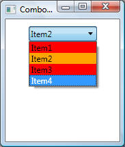
This example shows how triggers can be used to change the visual appearance of ComboBoxItem items. This example also includes the usage of ItemContainerStyle as well to style the container for each ComboBox item. This example uses XML data binding which was described in Data Binding chapter.
<!--
ListBoxData1.xml: XML data for the examples below -->
<Rows>
<Row Column1="R1C1 Value"
Column2="R1C2 Value"></Row>
<Row Column1="R2C1 Value"
Column2="R2C2 Value"></Row>
<Row Column1="R3C1 Value"
Column2="R3C2 Value"></Row>
<Row Column1="R4C1 Value"
Column2="R4C2 Value"></Row>
<Row Column1="R5C1 Value"
Column2="R5C2 Value"></Row>
</Rows>
<Window x:Class="Templates.ComboBox1"
xmlns="http://schemas.microsoft.com/winfx/2006/xaml/presentation"
xmlns:x="http://schemas.microsoft.com/winfx/2006/xaml"
Title="Templates" Height="300" Width="300">
<Window.Resources>
<!-- Create an
XML data provider to read XML data-->
<XmlDataProvider x:Key="ListBoxData1"
Source="DataFiles\ListBoxData1.xml" XPath="/Rows" />
<!-- Bind the
XML data to a collection view -->
<CollectionViewSource x:Key="ListBoxView1"
Source="{Binding Source={StaticResource ListBoxData1},
XPath=Row}" />
<!--
DataTemplate is always used in conjunction with an ItemTemplate to specify the
visual
appearance of a data item, where this
data item can be a ListBoxIem, ListViewItem, etc.-->
<DataTemplate x:Key="DataTemplate1">
<StackPanel
Orientation="Vertical" Margin="5,5,5,5" Background="Yellow">
<TextBlock FontSize="12" Text="{Binding XPath=@Column1}" FontWeight="Bold"
Margin="5,0,5,0"/>
<TextBlock FontSize="12" Text="{Binding XPath=@Column2}" FontStyle="Italic"/>
</StackPanel>
</DataTemplate>
<Style x:Key="ComboBoxStyle1"
TargetType="{x:Type ComboBoxItem}">
<Style.Triggers>
<Trigger Property="ComboBoxItem.IsVisible" Value="true">
<Setter Property="Foreground" Value="Black"></Setter>
</Trigger>
<Trigger Property="ComboBoxItem.IsSelected" Value="true">
<Setter Property="Foreground" Value="Green"></Setter>
</Trigger>
<Trigger Property="ComboBoxItem.IsHighlighted" Value="true">
<Setter Property="Foreground" Value="Red"></Setter>
</Trigger>
</Style.Triggers>
</Style>
</Window.Resources>
<StackPanel>
<!-- List box
is data bound to a collection view whose ID is ListBoxView1, which is bound to
an XML resource . Note that data will
show as blank lines because ListBox does not know how
to display data. To properly display
data, ItemTemplate must be specified to specify how each
item (ListBoxItem will be
displayed)-->
<ComboBox Name="cbData"
ItemsSource="{Binding Source={StaticResource
ListBoxView1}}"
ItemTemplate="{StaticResource DataTemplate1}"
ItemContainerStyle="{StaticResource ComboBoxStyle1}">
</ComboBox>
</StackPanel>
</Window>
The output is shown below:
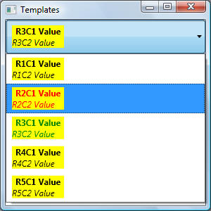
This example introduces the concept of ItemContainerStyle. ItemContainerStyle is used to get/set the style that is applied to the container element for each item in an ItemsControl, for example, for ListBox, the generated containers are ListBoxItem controls; for ComboBox, they are ComboBoxItem controls, and so on. The following example show how to use ItemContainerStyle to style each ComboBoxItem items:
<Window x:Class="Templates.DataTemplates.ComboBox3"
xmlns="http://schemas.microsoft.com/winfx/2006/xaml/presentation"
xmlns:x="http://schemas.microsoft.com/winfx/2006/xaml"
Title="ComboBox3" Height="300" Width="300">
<Window.Resources>
<Style x:Key="ComboBoxItemStyle"
TargetType="ListBoxItem">
<Setter
Property="Background" Value="Red" />
<Setter
Property="MaxHeight" Value="75" />
<Style.Triggers>
<Trigger Property="IsSelected" Value="True">
<Trigger.Setters>
<Setter Property="Background" Value="Orange" />
</Trigger.Setters>
</Trigger>
</Style.Triggers>
</Style>
</Window.Resources>
<StackPanel>
<ComboBox ItemContainerStyle="{StaticResource
ComboBoxItemStyle}"
Background="Silver" Width="100" Margin="10" SelectedIndex="0">
<ComboBoxItem>Item1</ComboBoxItem>
<ComboBoxItem>Item2</ComboBoxItem>
<ComboBoxItem>Item3</ComboBoxItem>
<ComboBoxItem>Item4</ComboBoxItem>
</ComboBox>
</StackPanel>
</Window>
Output is shown below. Notice how the selected item (Item2) has an Orange background:
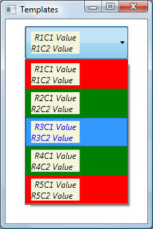
This example introduces the concept of a style selector. A style selector provides a way to apply styles based on custom logic. Programmatically, a style selector is a class that derives from StyleSelector and implements the SelectStyle method. Once you define a style selector class, how do you apply it? Just like ItemContainerStyle (presented in the previous example) is used to set a specific style for ComboBoxItem items, ItemContainerStyleSelector is used to set a specific style selector for ComboBoxItem items:
<Window x:Class="Templates.ComboxBox2"
xmlns="http://schemas.microsoft.com/winfx/2006/xaml/presentation"
xmlns:x="http://schemas.microsoft.com/winfx/2006/xaml"
xmlns:custom="clr-namespace:Templates"
Title="Templates" Height="300" Width="300">
<Window.Resources>
<!-- The
following shows how to define a resource key for a StyleSelector -->
<custom:ComboBoxItemStyleSelector
x:Key="CBOStylesSelector"/>
<!-- Create an
XML data provider to read XML data-->
<XmlDataProvider x:Key="ListBoxData1"
Source="DataFiles\ListBoxData1.xml" XPath="/Rows" />
<!-- Bind the
XML data to a collection view -->
<CollectionViewSource x:Key="ListBoxView1"
Source="{Binding Source={StaticResource ListBoxData1},
XPath=Row}" />
<!--
DataTemplate is always used in conjunction with an ItemTemplate to specify the
visual
appearance of a data item, where this
data item can be a ListBoxIem, ListViewItem, etc.-->
<DataTemplate x:Key="DataTemplate1">
<StackPanel
Orientation="Vertical" Margin="5,5,5,5" Background="Yellow">
<TextBlock FontSize="12" Text="{Binding XPath=@Column1}" FontWeight="Bold"
Margin="5,0,5,0"/>
<TextBlock FontSize="12" Text="{Binding XPath=@Column2}" FontStyle="Italic"/>
</StackPanel>
</DataTemplate>
<Style x:Key="ComboBoxStyle1"
TargetType="{x:Type ComboBoxItem}">
<Style.Triggers>
<Trigger Property="ComboBoxItem.IsVisible" Value="true">
<Setter Property="Foreground" Value="Black"></Setter>
</Trigger>
<Trigger Property="ComboBoxItem.IsSelected" Value="true">
<Setter Property="Foreground" Value="Green"></Setter>
</Trigger>
<Trigger Property="ComboBoxItem.IsHighlighted" Value="true">
<Setter Property="Foreground" Value="Red"></Setter>
</Trigger>
</Style.Triggers>
</Style>
</Window.Resources>
<StackPanel>
<!-- List box
is data bound to a collection view whose ID is ListBoxView1, which is bound to
an XML resource . Note that data will
show as blank lines because ListBox does not know how
to display data. To properly display
data, ItemTemplate must be specified to specify how each
item (ListBoxItem will be
displayed)-->
<ComboBox Name="cbData"
Width="150" Margin="10"
ItemsSource="{Binding Source={StaticResource
ListBoxView1}}"
ItemTemplate="{StaticResource DataTemplate1}"
ItemContainerStyleSelector="{StaticResource
CBOStylesSelector}">
</ComboBox>
</StackPanel>
</Window>
public class ComboBoxItemStyleSelector :
StyleSelector
{
public override Style SelectStyle(object item,
DependencyObject container)
{
// Build a
style similar to
// <style TargetType={x:Type
ComboxBoxItem}>
// <setter property="" value="" />
// <setter property="" value="" />
// </style>
Style style = new Style();
style.TargetType =
typeof(ComboBoxItem);
// Custom logic
to set background color based on item index. Custom logic could
// have been based on combox box item
content, or some other configuration entry
// or on any other logic. The
following simple logic server to illustrate that style
// is selected based on some
code-logic
Setter setterBkGnd = new
Setter();
setterBkGnd.Property =
ComboBoxItem.BackgroundProperty;
// Note how
static method ItemsControlFromItemContainer is used to get the actual conatiner
ComboBox cbo = (ComboBox)ItemsControl.ItemsControlFromItemContainer(container);
// From the
container, get the index of the item
int nIndex =
cbo.ItemContainerGenerator.IndexFromContainer(container);
setterBkGnd.Value = (nIndex % 2 == 0)
? Brushes.Red : Brushes.Green;
style.Setters.Add(setterBkGnd);
//
Trigger to change highlighted ComboBoxItem foreground color to Blue
Trigger trigger = new
Trigger();
trigger.Property =
ComboBoxItem.IsHighlightedProperty;
trigger.Value = true;
Setter triggersetter = new Setter();
triggersetter.Property =
ComboBoxItem.ForegroundProperty;
triggersetter.Value = Brushes.Blue;
trigger.Setters.Add(triggersetter);
style.Triggers.Add(trigger);
return style;
}
}
The output is shown below. Note how the foreground colour for the selected item (R3C1 Value R3C2 Value) is blue: