Panel class is the abstract base class for all of the Panel-derived classes below (Canvas, Grid, StackPanel, DockPabel, TabPanel, WrapPanel, etc.) A Panel-derived class is used to position and arrange child elements. Note that Panel-derived elements do not receive focus or stylus events if the Background property is not set. To compel a panel element to receive focus, set the Focusable property to true.
The following common members are of critical importance in using and understanding WPF layout:
All Panel-derived classes support sizing and positioning properties defined by the base FrameworkElement class:
HorizontalAlignment & VerticalAlignment: When Height and Width properties are explicitly set on an element, these measurements take layout precedent and cancel the regular effects of setting the alignment properties to Stretch. These two alignment properties are dependency properties and they describe how a child element should be positioned within a parent element's allocated layout space. For example, if a child specifies HorizontalAlignment.Left means then the child element is aligned to the left of the parent element's allocated layout space.
Background property is used to fill the area between the boundaries of derived panel elements with a Brush.
Children property represents a collection of child elements that are contained within a Panel. InternalChildren is a collection containing those elements found in Children property in addition to those members generated by data binding.
ZIndex property determines the order in which child elements that share the same coordinate space appear. A higher ZIndex means that an element will appear above another element with a lower ZIndex.
Margin gets or sets the amount of the space between the specifying element and other elements that will be adjacent when layout creates the user interface. Contrast this to Padding which gets or sets a thickness value that describes the amount of space between an element and its child elements.
The following screens shows how Height, Width, HorizontalAlignment, and VerticalAlignment interact:
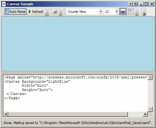
If Height or Width is not supplied, then ‘Auto’ is assumed to be the default value. Auto sizing behaviour implies that the element will fill the space available to it (note that specific controls frequently supply default values through their default theme styles that will disable the auto sizing behaviour unless it is specifically re-enabled):
The following XAML is equivalent to the above:
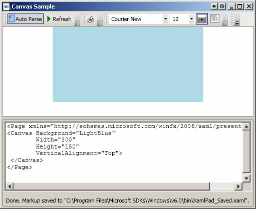
Setting Height and Width explicitly (note that VerticalAlignment and HorizontalAlignment both default to Center):

Same as above except that VerticalAlignment is explicitly set to Top:
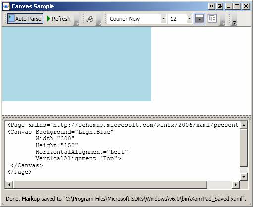
Same as above except that HorizontalAlignment is explicitly set to Left:
If no Width or Height are specified, then output becomes invisible:
Panel-derived elements make extensive use of attached properties as shown below. See first example for Canvas.
There are six defined panel classes (Canvas, Grid, DockPanel, StackPanel, VirtualizingStackPanel, and WrapPanel) that are designed specifically for creating application UI. Each panel element encapsulates its own special functionality, as seen in the following table.
|
Element Name |
UI Panel? |
Description |
|
Canvas |
Yes |
Defines an area within which you can explicitly position child elements by coordinates relative to the Canvas area. |
|
DockPanel |
Yes |
Defines an area within which you can arrange child elements either horizontally or vertically, relative to each other. |
|
Grid |
Yes |
Defines a flexible grid area consisting of columns and rows. Child elements of a Grid can be positioned precisely using the Margin property. |
|
StackPanel |
Yes |
Arranges child elements into a single line that can be oriented horizontally or vertically. |
|
TabPanel |
No |
Handles the layout of tab buttons in a TabControl. |
|
ToolBarOverflowPanel |
No |
Arranges content within a ToolBar control. |
|
UniformGrid |
No |
UniformGrid is used to arrange children in a grid with all equal cell sizes. |
|
VirtualizingPanel |
No |
Provides a base class for panels that can "virtualize" their children collection. |
|
VirtualizingStackPanel |
Yes |
Arranges and virtualizes content on a single line oriented horizontally or vertically. |
|
WrapPanel |
Yes |
WrapPanel positions child elements in sequential position from left to right, breaking content to the next line at the edge of the containing box. Subsequent ordering happens sequentially from top to bottom or right to left, depending on the value of the Orientation property. |
A Canvas is a layout control that enables absolute positioning of child elements using coordinates that are relative to the canvas area. Note the following:
Height and Width are used to determine the area of the Canvas.
Child elements of a Canvas are never resized – they are just positioned at their designated coordinated. This also means that child elements are always given the full size they require – vertical and horizontal alignment have no effect inside a canvas.
Canvas is the only layout element that has no inherent layout characteristics.
Canvas is the only layout element that allows its children to be drawn outside its bounds. This behaviour can be changed with ClipToBounds set to true.
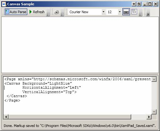
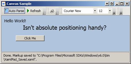
This example shows the basic usage of Canvas. Note how child elements of Canvas use the Top and Left Canvas attached-properties:
<Page
WindowTitle="Canvas Sample" xmlns="http://schemas.microsoft.com/winfx/2006/xaml/presentation">
<Canvas
Background="LightSteelBlue">
<TextBlock
Canvas.Top="10" Canvas.Left="10" FontSize="14">Hello World!</TextBlock>
<TextBlock
Canvas.Top="30" Canvas.Left="75" FontSize="20" >Isn't absolute positioning
handy?</TextBlock>
<Button Canvas.Top="70" Canvas.Left="50" Content="Click Me"
Width="100"></Button>
</Canvas>
</Page>
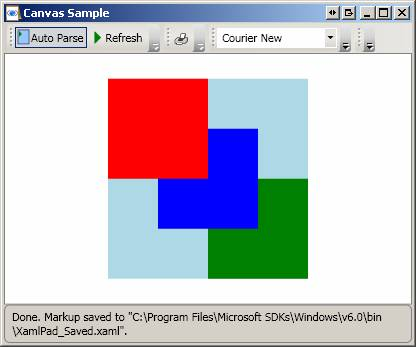
Top or Left properties take precedence over Bottom or Right properties.
<Page
xmlns="http://schemas.microsoft.com/winfx/2006/xaml/presentation"
xmlns:x="http://schemas.microsoft.com/winfx/2006/xaml">
<Canvas
Height="200" Width="200" Background="LightBlue">
<Canvas Canvas.Top="0" Canvas.Left="0" Height="100" Width="100"
Background="Red"/>
<Canvas Canvas.Top="50" Canvas.Left="50" Height="100" Width="100" Background="Blue"/>
<Canvas Canvas.Top="100" Canvas.Left="100" Height="100" Width="100" Background="Green"/>
</Canvas>
</Page>

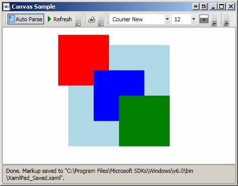
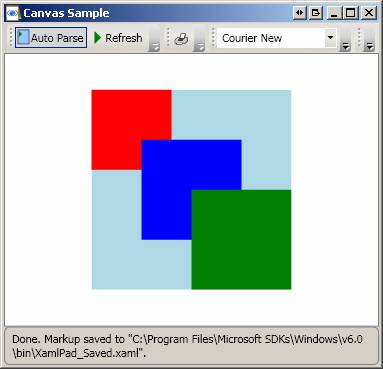
Same as above except that ZIndex is used to determine order of appearance.
<Page
xmlns="http://schemas.microsoft.com/winfx/2006/xaml/presentation"
xmlns:x="http://schemas.microsoft.com/winfx/2006/xaml">
<Canvas
Height="200" Width="200" Background="LightBlue">
<Canvas ZIndex="3" Canvas.Top="0" Canvas.Left="0" Height="100" Width="100"
Background="Red"/>
<Canvas ZIndex="2" Canvas.Top="50" Canvas.Left="50" Height="100"
Width="100" Background="Blue"/>
<Canvas ZIndex="1" Canvas.Top="100" Canvas.Left="100" Height="100"
Width="100" Background="Green"/>
</Canvas>
</Page>
Canvas allows elements to be drawn outside the canvas bounds:
<Page
xmlns="http://schemas.microsoft.com/winfx/2006/xaml/presentation"
xmlns:x="http://schemas.microsoft.com/winfx/2006/xaml">
<Canvas
Height="200" Width="200" Background="LightBlue">
<Canvas Canvas.Top="-20" Canvas.Left="-20" Height="100" Width="100"
Background="Red"/>
<Canvas Canvas.Top="50" Canvas.Left="50" Height="100" Width="100"
Background="Blue"/>
<Canvas Canvas.Top="100" Canvas.Left="100" Height="100" Width="100"
Background="Green"/>
</Canvas>
</Page>
ClipToBounds can be used to clip Canvas children that are drawn outside the Canvas borders:
<Page
xmlns="http://schemas.microsoft.com/winfx/2006/xaml/presentation"
xmlns:x="http://schemas.microsoft.com/winfx/2006/xaml">
<Canvas
Height="200" Width="200" Background="LightBlue"
ClipToBounds="true">
<Canvas Canvas.Top="-20" Canvas.Left="-20" Height="100" Width="100"
Background="Red"/>
<Canvas Canvas.Top="50" Canvas.Left="50" Height="100" Width="100" Background="Blue"/>
<Canvas Canvas.Top="100" Canvas.Left="100" Height="100" Width="100" Background="Green"/>
</Canvas>
</Page>
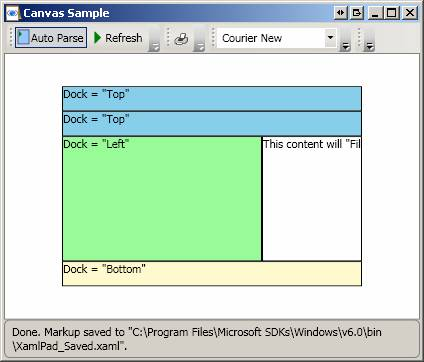
DockPanel defines a panel where you can arrange child elements by docking them along the edges of the DockPanel. Note the following:
The position of child elements of a DockPanel is determined by the Dock property of the child elements, and the relative order in which these child elements appear under the DockPanel tag.
By default, LastChildFill property is set to true and this causes the last child element of a DockPabel to always fill the remaining space, regardless of whether a Dock value was set on this element or not.
This example shows the basics of using a DockPanel
<Page
xmlns="http://schemas.microsoft.com/winfx/2006/xaml/presentation"
WindowTitle="DockPanel Sample">
<DockPanel
LastChildFill="True">
<!--
Note how these two elements are docked relative to the top edge of the DockPanel -->
<Border Height="25" Background="SkyBlue" BorderBrush="Black" BorderThickness="1"
DockPanel.Dock="Top">
<TextBlock
Foreground="Black">Dock = "Top"</TextBlock>
</Border>
<Border Height="25" Background="SkyBlue" BorderBrush="Black" BorderThickness="1"
DockPanel.Dock="Top">
<TextBlock Foreground="Black">Dock = "Top"</TextBlock>
</Border>
<!--
This element is docked relative to the bottom edge of the panel -->
<Border Height="25" Background="LemonChiffon" BorderBrush="Black"
BorderThickness="1" DockPanel.Dock="Bottom">
<TextBlock
Foreground="Black">Dock = "Bottom"</TextBlock>
</Border>
<!--
Dock element to the left edge of the DockPanel, taking into account the
remaining space taken
By the top and bottom elements-->
<Border Width="200" Background="PaleGreen" BorderBrush="Black"
BorderThickness="1" DockPanel.Dock="Left">
<TextBlock Foreground="Black">Dock = "Left"</TextBlock>
</Border>
<!-- Last element fills the remaining space -->
<Border Background="White" BorderBrush="Black" BorderThickness="1">
<TextBlock Foreground="Black">This content will "Fill" the remaining
space</TextBlock>
</Border>
</DockPanel>
</Page>

If Height and Width are not specified for DockPanel (see example above), DockPanel sizes to its content and can increase/decrease to accommodate the size of its child elements.
<Page
xmlns="http://schemas.microsoft.com/winfx/2006/xaml/presentation"
WindowTitle="DockPanel Sample">
<DockPanel Width="300" Height="200" LastChildFill="True">
Same
as above ...
</DockPanel>
</Page>
A Grid is a Panel-derived class that is used to position elements within rows and columns. In other words, it combines the functionality of absolute positioning and tabular data control. Note the following:
StackPanel
VirtualizingStackPanel
WrapPanel
Border draws a border around an element. Border can have only one child. To display multiple child elements, place a Panel element within the parent Border. Place child elements on the Panel. An important layout property often used with Border is Padding. Padding gets or sets a thickness value that describes the amount of space between a Border and its child elements:
<Page xmlns="http://schemas.microsoft.com/winfx/2006/xaml/presentation"
xmlns:x="http://schemas.microsoft.com/winfx/2006/xaml"
>
<Border Background="LightBlue"
BorderBrush="Black"
BorderThickness="2"
CornerRadius="45"
Padding="30">
<Border Background="LightGreen"
BorderBrush="Blue"
BorderThickness="2"
CornerRadius="45"
Padding="25">
</Border>
</Border>
</Page>
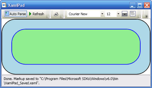
The following shows the results of reducing Padding for the parent Border (LightBlue) to 10:

A canvas (see Canvas) is nested inside a Border element to give the Canvas a border. Note how elements on the Canvas are placed using Canvas attached properties:
<Page
xmlns="http://schemas.microsoft.com/winfx/2006/xaml/presentation"
xmlns:x="http://schemas.microsoft.com/winfx/2006/xaml"
>
<Border BorderThickness="2"
BorderBrush="Black"
HorizontalAlignment="Center"
VerticalAlignment="Center"
Width="200"
Height="100">
<Canvas Background="LightBlue">
<TextBlock
Canvas.Top="10" Canvas.Left="20">Hello World!</TextBlock>
<Button Canvas.Top="30" Canvas.Left="20" Content="Click Me" Width="100" />#
</Canvas>
</Border>
</Page>

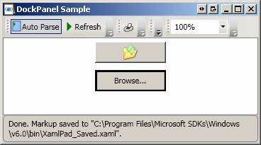
<Page
xmlns="http://schemas.microsoft.com/winfx/2006/xaml/presentation"
xmlns:x="http://schemas.microsoft.com/winfx/2006/xaml">
<StackPanel>
<Button Name="btn1" Width="100" Height="30" Margin="5,5,5,5">
<Image Source="H:\My Documents\My Shapes\_private\folder.ico"></Image>
</Button>
<Button Name="btn2" Width="100" Height="30" Margin="5,5,5,5" BorderBrush="Black">
Browse...
</Button>
</StackPanel>
</Page>