A Control's primary purpose is to display content. This content may be Text, Color, another control, or multiple items. The property used to store this content (i.e., what to display) is called a Content Property. The types described below discuss how they handle and display content.
An adorner is any FrameworkElement-derived type that is bound to a single
UIElement-derived type. An Adorner
object is rendered within an AdornerLayer object which is a
rendering surface that is always on top of the element(s) being adorned.
Rendering of an adorner is therefore, independent from rendering the adorned
object.
In practice, an adorner is used to:
Provide visual clues to the user.
Add functional handles to elements that enable the user to manipulate the element is some way (resize, rotate, etc.)
Provide visual feedback to indicate state information about a control.
Overlay visual decorations on a UIElement.
WPF provides a basic framework for adorning elements using the following types:
Adorner: An abstract base class from which all concrete adorner implementations inherit.
AdornerLayer: A class representing a rendering layer for the adorner(s). Note that the parent of an Adorner is the AdornerLayer. It isAdornerLayer that renders the Adorner, and not the adorned element.
AdornerDecorator: A class that enables an adorner layer to be associated with a collection of elements
Adorners receive input events just like any other FrameworkElement. Because an adorner always has a higher z-order than the element it adorns, the adorner receives input events (such as Drop or MouseMove) that may be intended for the underlying adorned element. An adorner can listen for certain input events and pass these on to the underlying adorned element by re-raising the event. To enable pass-through hit testing of elements under an adorner, set the hit test IsHitTestVisible property to false on the adorner.
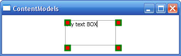
The following example shows an adorner that adorns the corners of a text box with small circles:
The following example show how to use the Adorner control:
<!-- Adorners.xaml:
Contains a text box whose corners will each be adorned with a circle -->
<Window x:Class="ContentModels.Adorners"
xmlns="http://schemas.microsoft.com/winfx/2006/xaml/presentation"
xmlns:x="http://schemas.microsoft.com/winfx/2006/xaml"
Title="ContentModels" Height="300" Width="300" Loaded="WindowLoaded">
<StackPanel Name="SP" Margin="10,10,10,10">
<TextBox Name="TB1" Width="100" Height="50" Text="My text box" Margin="0,0,0,0"
Padding="0,0,0,0"></TextBox>
</StackPanel>
</Window>
// Adorners.xaml.cs: The Loaded
event is used to adorn the text box with our custom Adorner
public partial class Adorners : System.Windows.Window
{
public Adorners()
{
InitializeComponent();
}
// This is a handler for the Loaded event which occurs when the designer load
// has completed. If code is thrown in this handler, the desiger is unloaded.
// The event is used to add adorners to UIElement. Calling
AdornerLayer.GetAdornerLayer
// in the constructor fails and returns null
private void WindowLoaded(object sender, RoutedEventArgs e)
{
// Get all child elements of the stack and panel
foreach (UIElement uie in SP.Children)
{
// Process only TextBox controls
if (!(uie is TextBox)) continue;
AdornerLayer myAdornerLayer = AdornerLayer.GetAdornerLayer(uie);
myAdornerLayer.Add(new TextBoxAdorner(uie));
}
}
}
class TextBoxAdorner : System.Windows.Documents.Adorner
{
// Ensure that the base class
constructor is called
public TextBoxAdorner(UIElement adornedElement) :
base(adornedElement)
{
/* Empty
implementation */
}
// Implement the adorner's rendering
behaviour by overriding the OnRender method
protected override void
OnRender(System.Windows.Media.DrawingContext drawingContext)
{
// Get size of
adorned element
Rect rectAdornedElement = new
Rect(this.AdornedElement.DesiredSize);
// Create some
drawing primitives
SolidColorBrush brush = new
SolidColorBrush(Colors.Red);
Pen pen = new Pen(new
SolidColorBrush(Colors.Green), 3);
// Draw a
cricle around each corner
Size sizeRect = new
Size(10,10);
drawingContext.DrawRectangle(brush,
pen, new Rect(rectAdornedElement.TopLeft , sizeRect));
drawingContext.DrawRectangle(brush,
pen, new Rect(rectAdornedElement.BottomLeft, sizeRect));
drawingContext.DrawRectangle(brush,
pen, new Rect(rectAdornedElement.TopRight, sizeRect));
drawingContext.DrawRectangle(brush,
pen, new Rect(rectAdornedElement.BottomRight, sizeRect));
}
}
Note that adorners do not have any inherent rendering behaviour. All functionality must be implemented by the adorner developer. A common way of implementing rendering behaviour is to override the OnRenderSizeChanged methods and use one of the DrawingContext objects to render the adorners visuals as needed (see previous example).
A content control is any control that derives from ContentControl and contains a single piece of content. Examples of ContentControl types are Button, RadioButton, ListViewItem, Label, Frame, ToolTip, Window, CheckBox, etc. A ContentControl control has a Content property that is typically used to specify the information that appears inside a control when it is rendered. For example, a button's content is the text or image that appears inside the button when the button is displayed. For example:
Button btn = new Button();
btn.Content = "Click Me";
The Content property can also accept a UIElement-derived object:
// Create and initialize an image
Image image = new Image();
image.Source = GetBitmapFromSomewhere();
Button btn = new Button();
btn.Content = image;
In fact, any ControlContent-derived model can have its Content property set to a UIElement-derived object.
A HeaderedContentControl, which is a subcategory of ContentControl, is a type of control that has two content properties: Content and Header. Examples of a headered content control are TabItem, GroupBox and Expander.
A HeaderedContentControl's Header content is typically used to label or identify the control's primary contents. For example, a TabItem's header is the content that appears on the tab, while its primary content appears in the panel. For example:
TabItem ti = new TabItem();
ti.Header = GetImage();
// GetImage() returns Image, a UIElement-derived type.
The content of a HeaderedContentControl is typically used to contain the control's primary contents. For example, the content of a TabItem is what appears when the TabItem is selected. For example,
TabItem ti = new TabItem();
ti.Content = GetPanel();
// Returns Panel which is a UIElement-derived type
An ItemsControl is a control that can contain multiple item, such as strings, objects, or other elements. Examples of ItemsControl are ListBox, ListView, MenuItem, ToolBar, StatusBar, TabControl, etc.
An ItemsControl has two content properties: Items and ItemsSource. The Items property can contain items such as strings, objects or other elements. For example,
Menu menu = new Menu();
Button btn = new Button();
btn.Content = "Click Me";
menu.Items.Add( new TextBlock( "Item 1" ) );
menu.Items.Add( new TextBlock( "Item 2" ) );
menu.Items.Add( btn );
Similarly, the ItemsSource property can be used to accept a collection of items.
A HeaderedItemsControl is a type of ItemsControl that can contain multiple items such as strings, objects and other elements, but also has a header. Examples of HeaderedItemsControl include MenuItem, TreeViewItem, and ToolBar. A HeaderedItemsControl has the following content properties: Header, Items, and ItemsSource.
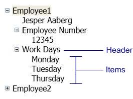
You typically use the Header content for a
HeaderedItemsControl to label or
identify the primary contents of a control. For example, the contents of the
Header of a TreeViewItem appear as a node in the
TreeView tree:
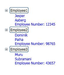
The Header
property supports both text and UIElement content. In the following
illustration, the TreeViewItem headers are buttons:
Therefore, the
Header property can accept Content that is either text or a
UIElement-derived type, such as a
Button.
A Decorator is a FrameworkElement-derived control that applies effects onto or around a child UIElement. Examples of a Decorator include Border, ButtonChrome, Viewbox, etc. A Decorator has a content property called Child which accepts a UIElement type. Child represents the element that will be decorated. The following shows how to decorate a TextBos with a Border:
// Create a text box (will
be deocrated
TextBox myTextBox = new TextBox();
myTextBox.Text = "TextBox with a black Border around it";
// Create a Border (this is the Decorator-derived
contorl)
Border myBorder = new Border();
myBorder.BorderThickness = new Thickness(20);
myBorder.BorderBrush = Brushes.Black;
// Decorate the textbox with the decorator
myBorder.Child = myTextBox;
// myTextBox is the decorated element
The Panel control has been covered under XAML By Example section.