Elements can be bound to data from a variety of data sources, and when the data changes its value, the elements that are bound to the data reflect changes automatically. In WPF, dependency properties of elements can be bound to CLR objects (including ADO.NET objects or objects associated with Web Services and Web properties) and XML data. Regardless of what element is being bound, and the nature of the data source, each data binding always follows the following mode:
Note the following fundamental WPF data binding concepts:
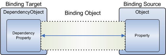
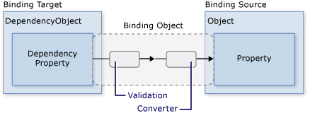
Each binding has these four components: a binding target object, a target property, a binding source, and a path to the value in the binding source to use. For example, if you want to bind the Text property of a TextBox object to the Name property of an Employee object, your target object is the TextBox, the target property is the Text property, the value to use is Name, and the source object is the Employee object.
The binding source refers to the object you obtain data from. The binding source object is not restricted to being a custom CLR object. Your binding source may be a UIElement, any list object, a CLR object that is associated with ADO.NET data or Web Services, or an XmlNode that contains your data. The types of objects that can be used as binding sources are covered in Binding Sources section.
As indicated by the arrow in the figure above, the data flow of a binding can go from the binding target to the binding source (for example, the source value changes when a user edits the value of a TextBox) and/or from the binding source to the binding target (for example, your TextBox content gets updated with changes in the binding source) if the binding source provides the proper notifications.
Data flow direction is controlled by the Mode property of your binding object. The following figure illustrates the different types of data flow:
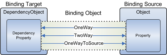
OneWay
OneWay binding causes changes to the source property to
automatically update the target property, but changes to the target
property are not propagated back to the source property. This type of
binding is appropriate if the control being bound is implicitly
read-only.
TwoWay
TwoWay binding causes changes to either the source
property or the target property to automatically update the other. This
type of binding is appropriate for editable forms or other
fully-interactive UI scenarios. A programmatic way to determine whether
a dependency property binds one-way or two-way by default is to get the
property metadata of the property using
GetMetadata and then check the boolean value of the
BindsTwoWayByDefault property.
OneWayToSource
OneWayToSource binding is the reverse of OneWay binding; it updates
the source property when the target property changes. One example
scenario is if you only need to re-evaluate the source value from the
UI.
OneTime
Not illustrated in the figure is
OneTime binding, which causes the source property to initialize the
target property, but subsequent changes do not propagate.
This type of binding is appropriate when using data where either a
snapshot of the current state is appropriate to use or the data is truly
static.
Bindings that are TwoWay or OneWayToSource listen for changes in the target property and propagate them back to the source. This is known as updating the source. example, you may edit the text of a TextBox to change the underlying source value. However, does your source value get updated while you are editing the text or after you finish editing the text and point your mouse away from the TextBox? The UpdateSourceTrigger property of the binding determines what triggers the update of the source.
If the UpdateSourceTrigger value is PropertyChanged, then the value pointed to by the right arrow of TwoWay or the OneWayToSource bindings gets updated as soon as the target property changes. However, if the UpdateSourceTrigger value is LostFocus, then that value only gets updated with the new value when the target property loses focus.
Different dependency properties have different default UpdateSourceTrigger values. The default value for most dependency properties is PropertyChanged, while the Text property has a default value of LostFocus. This means that source updates usually happen whenever the target property changes, which is fine for CheckBoxes and other simple controls. However, for text fields, updating after every keystroke can diminish performance and it denies the user the usual opportunity to backspace and fix typing errors before committing to the new value. That is why the Text property has a default value of LostFocus instead of PropertyChanged.
Consider the following example, in which the binding source object is a class named MyData that is defined in the MyNamespace namespace. For demonstration purposes, MyData class has a string property named ColorName, whose value is set to Red. Thus, this example generates a button with a red background:
<DockPanel xmlns="http://schemas.microsoft.com/winfx/2006/xaml/presentation"
	   xmlns:x="http://schemas.microsoft.com/winfx/2006/xaml"
	   xmlns:c="MyNamespace">
	<DockPanel.Resources>
		<c:MyData x:Key="myDataSource"/>
	</DockPanel.Resources>
	<DockPanel.DataContext>
		<Binding Source="{StaticResource myDataSource}"/>
	</DockPanel.DataContext>
	<Button Background="{Binding Path=ColorName}" Width="150" Height="30">
		I am bound to be RED!
	</Button>
</DockPanel>
Notice that in the previous XAML code, there are three components at work to specify a data binding:
A <Resources> element to identify a data source object. In the example above, myDataSource is a key that is used to identify MyData class as the data source object.
A <DataContext> element to allow child elements, <Button> in this case, to inherit information from their parent, <DockPanel> in this case, about the data source that is used for binding, as well as other characteristics of the binding such as the path..
The actual binding which uses a Path to identify the property within the MyData binding source object that will provide data.
This topic discusses the types of objects you can use as the binding source, i.e., the source of data. Data binding in WPF supports the following types of binding sources:
| Binding Source | Description |
| CLR objects | You can bind to public properties, sub-properties, as well as indexers of any existing CLR object. The binding engine uses CLR reflection to get the values of the properties. Alternatively, objects that implement ICustomTypeDescriptor or have a registered TypeDescriptionProvider also work with the binding engine. Another alternative to binding CLR objects is to use ObjectDataProvider, which wraps and creates an object that can be used as a binding source. |
| ADO.NET data | You can bind to ADO.NET objects such as DataTable. The ADO.NET DataView implements IBindingList, providing change notifications that the binding engine listens for |
| XML data | You can bind to and run XPath queries on an XmlNode, XmlDocument, or XmlElement. A convenient way to access XML data that is the binding source in markup is to use an XmlDataProvider object. |
If you want to create the object in XAML, the class must have a default constructor. In C#, the default constructor might be created for you.
The properties you use as source properties for a binding must be public properties of your class.
The following properties cannot be used as as source properties for a binding:
Explicitly defined interface properties.
Protected properties.
Private properties.
Virtual properties that have no base implementation.
You cannot bind to public fields of a CLR class.
The type of the property declared in your class is the type that is passed to the binding. However, the type ultimately used by the binding depends on the type of the binding target property, not of the source property. If there is a difference in type, you might want to write a data converter to handle how your custom property is initially passed to the binding.
Recall that Path property is used to specify the source value you want to bind to:. Note the following points:
In the simplest case, the Path property specifies the name of the source-object property to use for the binding, such as Path=FontSize.
Subproperties of a property can be specified by a similar syntax as in C#. For instance, Path=ShoppingCart.Order sets the binding to the subproperty Order of the object or property ShoppingCart.
To bind to an attached property, place parentheses around the attached property. For example, to bind to the attached property DockPanel.Dock, the syntax is Path=(DockPanel.Dock).
Indexers of a property can be specified within square brackets following the property name. For instance, the clause Path=ShoppingCart[0] sets the binding to the index that corresponds to how your property's internal indexing handles the literal string "0". Nested indexers are also supported.
Indexers and subproperties can be mixed in a Path clause; for example, Path=ShoppingCart.ShippingInfo[MailingAddress,Street].
Inside indexers you can have multiple indexer parameters separated by commas. The type of each parameter can be specified with parentheses. For example, you can have Path="[(sys:Int32)42,(sys:Int32)24", where sys is mapped to the System namespace.
The following example shows how to use CLR objects as binding sources
<!-- Note the use of 'src' namespace alias which is
assigned the value of the namespace
'DataBinding1' where the binding source 'LookAndFeelBindingSource' is located.
The use
of 'clr-namespace:' is required -->
<Window x:Class="DataBinding1.SimpleBinding"
xmlns="http://schemas.microsoft.com/winfx/2006/xaml/presentation"
xmlns:x="http://schemas.microsoft.com/winfx/2006/xaml"
xmlns:src="clr-namespace:DataBinding1"
Title="DataBinding1" Height="300" Width="300">
<Window.Resources>
<!-- STEP 1: The binding source object is a class of type LookAndFeelBindingSource.
LookAndFeelBindingSource is a type that is declared in DataBinding1 namespace
which is aliased by 'src'. This element is used to associate a key with the
binding
source object. -->
<src:LookAndFeelBindingSource x:Key="LookAndFeel" />
<!-- STEP 1:
You can also associate any required value conveters. See
Data conversion note -->
<src:ColorConverter x:Key="RGBConverter" />
</Window.Resources>
<!-- The one and only child element of
the <Window> element -->
<StackPanel HorizontalAlignment="Center" VerticalAlignment="Center"
Orientation="Vertical">
<!--
STEP 2:In this approach
we can use the DataContext property to set the binding source.
All child
elements of StackPanel then inherit the DataContext property. There are
several ways to
specify
the binding source object and using the DataContext approach
is useful if you
want to bind multiple properties to the same source.-->
<StackPanel.DataContext>
<Binding Source="{StaticResource LookAndFeel}"/>
</StackPanel.DataContext>
<!-- STEP 3 Approach 1:
With
respect to setting the Binding syntax, the binding declaration consists
of a series
of clauses following the
Binding keyword and separated by commas. The clauses
in the binding
can be in any order. The clauses are Name=Value pairs where Name is the
name of
the binding
property and Value is the value you are setting for the property.
When creating
binding
declaration strings in XAML, they must be attached to a specific
dependency
property of the
target object. The Path is used to indicate the name of the
property that will
be providing
data
-->
<Button Name="Button1"
Width="150"
Height="30"
Margin="10,10,10,10"
Content="{Binding Path=Text}"
FontSize="{Binding Path=FontSize}"></Button>
<!-- STEP 3 Approach 2:
Instead of using and then inheriting the DataContext property, you can
specify
the binding
source by setting the Source property directly on the binding declaration -->
<Button Name="Button2"
Width="150"
Height="30"
Margin="10,10,10,10"
Content="{Binding Source={StaticResource
LookAndFeel}, Path=Text}"
FontSize="{Binding Source={StaticResource
LookAndFeel}, Path=FontSize}"/>
<!-- STEP 3 Approach 3:
You can also use the
ElementName property or the RelativeSource property to
specify
the binding source. The ElementName property is useful when you are binding to
other
elements in your application, such as when you are using a slider to adjust the
width of
a button. The following sets the content (i.e., text) of the label to the
content of the
element named Button1
-->
<Label Content="{Binding ElementName=Button1, Path=Content}"
Margin="10,10,10,10" ></Label>
<!-- As mentioned, Path takes the name of a binding source property, and this
property
which must be a dependency object, will supply data to the binding target.
However,
when the path is not specified, the default is to bind to the entire object.
Other than binding to a collection, this scenario is also useful when you want
to
bind to an entire object instead of just a single property of an object. For
example,
if your source object is of type string and you simply want to bind to the
string
itself. Another common scenario is when you want to bind an element to an object
with several properties -->
<!-- Binding Expressions: The underlying object that maintains the connection
between
the source and the target is called BindingExpression -->
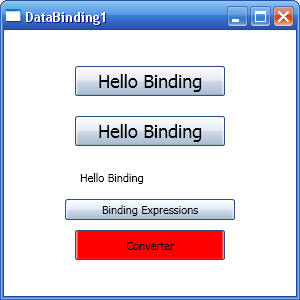
<Button Name="btnBindingExpression" Content="Binding Expressions" Click="BindingExpressionHandler"/>
<!-- Data Conversion:
In the following example, the binding source (which is an object
of type
LookAndFeelBindingSource has a property called Background of type Color. In
order for
the binding to work, we need to convert the Color value into a value that
the
Background
property understands. This is done by implementing a custom converter
(a custom
converter
is a class that implements the IValueConverter interface)
The following example converts the Background property whose type is Color to a
solid
brush
suitable for thethe Button.Background property.
A typical scenario for a converter when a property on the binding source is a
text
that
represents
full path to an image. This property can then be applied to some
dependency
property, say Button.Image,
and the converter, say called ImageConverter, will
take the full path and create
an Image and return it
to the button.
-->
<Button Content="Converter"
Width="150"
Height="30"
Margin="10,10,10,10"
Name="btnConversion"
Background="{Binding Source={StaticResource LookAndFeel},
Converter={StaticResource
RGBConverter}, Path=Background}" />
</StackPanel>
</Window>
namespace DataBinding1
{
public partial class SimpleBinding : System.Windows.Window
{
public SimpleBinding()
{
InitializeComponent();
}
/// <summary>
/// Handler for btnBindingExpression button. Shows how to obtain the binding
/// from a target property that is bound to data.
/// Note: You must specify the
dependency property for the binding you want because
/// it is possible that more than one
property of the target object is using data binding
/// </summary>
private void BindingExpressionHandler(object sender, RoutedEventArgs args)
{
// Get the binding for the Content property of button Button1
Binding binding = BindingOperations.GetBinding(Button1, Button.ContentProperty);
// Explore the binding object
object oSource = binding.Source;
PropertyPath pp = binding.Path;
string strElementName = binding.ElementName;
}
}
/// <summary>
/// This is the binding source whose properties will be used to provide data
/// to a binding target. The binding source in this case is an object of type
/// LookAndFeelBindingSource, and the binding target can be any element whose
/// look and feel can be set (for example, Button.Background, TextBox.Font, etc
/// </summary>
public class LookAndFeelBindingSource
{
private Color _colorBkgnd = Colors.Red;
private int _nFontSize = 18;
public string Text
{
get { return "Hello Binding"; }
}
public int FontSize
{
get { return _nFontSize; }
set { _nFontSize = value; }
}
public Color Background
{
get { return _colorBkgnd; }
set { _colorBkgnd = value; }
}
}
/// <summary>
/// A custom converter to covert color values. See comments in XAML under Data
Conversion.
/// Once the converter is created, it must be added as a resource to the XAML
file. The converter
/// is then associated with an element using the Converter={StaticResource key}
syntax. See
/// the button named 'btnConversion'
/// </summary>
public class ColorConverter : IValueConverter
{
#region IValueConverter Members
public object Convert(object value, Type targetType, object parameter,
System.Globalization.CultureInfo culture)
{
Color c = (Color)value;
return new SolidColorBrush(c);
}
public object ConvertBack(object value, Type targetType, object parameter,
System.Globalization.CultureInfo culture)
{
return value.ToString();
}
#endregion
}
}
Output screen is shown below:
This example introduces the Binding.UpdateSourceTrigger property. The UpdateSourceTrigger property deals with source updates and therefore is only relevant for TwoWay or OneWay bindings. For TwoWay and OneWay bindings to work, the source object needs to provide property change notifications, i.e., to implement INotifyPropertyChanged.
UpdateSourceTrigger gets/sets a value that determines when to update the contents of the binding source. UpdateSourceTrigger can be any one of the following:
| UpdateSourceTrigger Value | Description |
| Default | The default value for most dependency properties is PropertyChanged, while the Text property has a default value of LostFocus. |
| PropertyChanged | Updates the binding source immediately whenever the binding target property changes. |
| LostFocus | Updates the binding source whenever the binding target element loses focus. |
| Explicit | Updates the binding source only when you call the UpdateSource method. |
The following example illustrates how to bind to a CLR object in code and also illustrates the various settings of UpdateSourceTrigger:
<Window x:Class="DataBinding1.SimpleBinding4"
xmlns="http://schemas.microsoft.com/winfx/2006/xaml/presentation"
xmlns:x="http://schemas.microsoft.com/winfx/2006/xaml"
Title="SimpleBinding4" Height="153" Width="381" Loaded="Window_Loaded">
<Canvas>
<Label Content="Enter Text:"
></Label>
<TextBox Name="txtName" Background="LightBlue"
></TextBox>
<Label Content="You have entered:
"></Label>
<TextBlock Name="txbOutput"
Background="LightGreen"></TextBlock>
<Button Content="Test
Focus"></Button>
<Button Content="Update Now" Name="btnUpdate"
Click="btnUpdate_Click"></Button>
</Canvas>
</Window>
private void Window_Loaded(object sender,
RoutedEventArgs e)
{
// Create data source
MyDataSource source = new
MyDataSource("Yazan");
// Bind data source to text box. The
property to bind to is usually available
// as a field of the element that is being bound
Binding bTextBox = new Binding("Name");
bTextBox.Source = source;
bTextBox.UpdateSourceTrigger = UpdateSourceTrigger.PropertyChanged;
txtName.SetBinding(TextBox.TextProperty, bTextBox);
// Bind the same data source to the
TextBlock
Binding bTextBlock = new Binding("Name");
bTextBlock.Source = source;
txbOutput.SetBinding(TextBlock.TextProperty, bTextBlock);
// Check binding directions
BindingMode mode1 = bTextBlock.Mode;
// mode1 = Default (what does Default mean? See
GetMetadata below.)
BindingMode mode2 = bTextBlock.Mode;
// mode2 = Default (what does Default mean? See
GetMetadata below. )
// GetMetadata can be used to examine the meaning of
'Default' for Binding.Mode property
FrameworkPropertyMetadata fwpm = (FrameworkPropertyMetadata)TextBox.TextProperty.GetMetadata(typeof(TextBox));
bool bBindsTwoWayByDefault = fwpm.BindsTwoWayByDefault;
// True
}
public class MyDataSource
: INotifyPropertyChanged
{
private string _strName = string.Empty;
public event PropertyChangedEventHandler PropertyChanged;
public MyDataSource(string name)
{
_strName = name;
}
public string Name
{
get { return _strName; }
set
{
_strName =
value;
OnPropertyChanged("Name");
}
}
protected void OnPropertyChanged(string name)
{
if (PropertyChanged != null)
PropertyChanged(this, new PropertyChangedEventArgs(name));
}
}
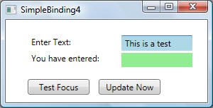
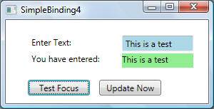
In the screen below, anything that was typed in the LightBlue text box will was immediately displayed in the LightGreen text block:
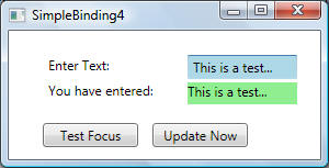
Note that the Binding objects (bTextBox and bTextBlock) use the default Mode value of the binding target. The default value varies for each dependency property. In general, user-editable control properties, such as those of text boxes and check boxes, default to two-way bindings, whereas most other properties default to one-way bindings. GetMetadata provides a programmatic way to determine whether a dependency property binds one-way or two-way by default. As shown in the code above, the default Binding Mode for TextBox.Text property is TwoWay. Recall that to detect MyDataSource source changes (applicable to OneWay and TwoWay bindings), MyDataSource implements INotifyPropertyChanged.
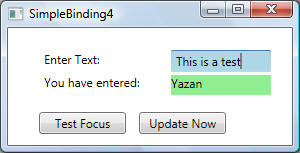
When the UpdateSourceTrigger in the code above was changed to UpdateSourceTrigger.LostFocus, text only appeared in the LightGreen text block when the LightBlue text box lost its focus by pressing the 'Test Focus' button - there is no Click handler for the button labelled 'Test Focus':
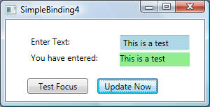
When the UpdateSourceTrigger in the code above was changed to UpdateSourceTrigger.Explicit, text only appeared in the LightGreen text block when the 'Update Now' button was clicked. The Click event handler for 'Update Now' button calls UpdateSource as follows:
private void btnUpdate_Click(object sender,
RoutedEventArgs e)
{
// Get the binding expression
asssociated with txtName so that UpdateSource
// can be called on it
BindingExpression be =
txtName.GetBindingExpression(TextBox.TextProperty);
be.UpdateSource();
}
This sequence of events is shown below:
There are many ways to create an object to use as a binding source. In the previous example, we created an object in code and set it as the DataContext of a StackPanel. We can also create an object in XAML (not in code) and use it as a binding source. ObjectDataProvider enables you to create an object in XAML to be available as a binding source, and provides a few properties to execute a query on this object and bind to the results.
This example shows how to bind to a CLR object using ObjectDataProvider. This example also introduces a few properties on Binding:
BindsDirectlyToSource
Converter
Binding.BindsDirectlyToSource is used to indicate whether to evaluate the Path property relative to the data item or to the ObjectDataProvider object. The normal behaviour (BindsDirectlyToSource =false) evaluates the Path relative to the object wrapped by ObjectDataProvider. Setting BindsDirectlyToSource to true gives the binding access to the properties of the ObjectDataProvider object itself and not properties of the object wrapped by ObjectDataProvider.
Binding.Converter is used to set the converter to use. A converter is any class that implements the IValueConverter interface (Convert and ConvertBack methods). A converter can change data from one type to another. A binding implicitly uses a default converter that tries to do a type conversion between the source value and the target value. If a conversion cannot be made, the default converter returns null reference. To associate a custom value converter with a binding, you should create a class that implements the IValueConverter interface.
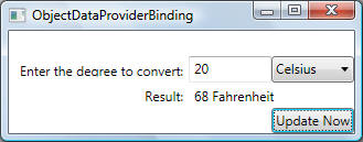
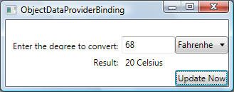
In the following example, the TextBox.Text property and the ComboBox.SelectedValue property are bound to the two parameters of the ConvertTemp method. This allows users to specify the temperature to convert and the temperature scale to convert from. Note that BindsDirectlyToSource is set to True because we are binding to the ObjectDataProvider.MethodParameters property instance and not properties of the object wrapped by the ObjectDataProvider (the TemperatureScale object).
<Window x:Class="DataBinding1.ObjectDataProviderBinding"
xmlns="http://schemas.microsoft.com/winfx/2006/xaml/presentation"
xmlns:x="http://schemas.microsoft.com/winfx/2006/xaml"
xmlns:system="clr-namespace:System;assembly=mscorlib"
xmlns:local="clr-namespace:DataBinding1"
Title="ObjectDataProviderBinding" Height="300" Width="300">
<Window.Resources>
<local:DoubleToString x:Key="doubleToString"
/>
<!-- Create and initialize
TemperatureScale class. Note that syntax to specify ObjectType for
a CLR type. If x:Type was not
supplied, the following syntax error would be generated
'{local:TemperatureScale}' value is
not a valid MarkupExtension expression. Cannot resolve
'TemperatureScale' in namespace
'clr-namespace:DataBinding1'. 'TemperatureScale' must be a
subclass of MarkupExtension -->
<ObjectDataProvider x:Key="TemperatureScaleProvider"
ObjectType="{x:Type local:TemperatureScale}" MethodName="ConvertTemp">
<ObjectDataProvider.MethodParameters>
<system:Double>10</system:Double>
<local:TempType>Celsius</local:TempType>
</ObjectDataProvider.MethodParameters>
</ObjectDataProvider>
</Window.Resources>
<Grid>
<!-- Grid definition for element layout -->
<Grid.ColumnDefinitions>
<ColumnDefinition />
<ColumnDefinition Width="75"/>
<ColumnDefinition Width="75"/>
</Grid.ColumnDefinitions>
<Grid.RowDefinitions>
<RowDefinition />
<RowDefinition />
<RowDefinition />
<RowDefinition />
</Grid.RowDefinitions>
<!-- In the following XAML, the TextBox and the ComboBox are used to specify
the values to be sent to method ConvertTemp.-->
<Label Grid.Row="1" HorizontalAlignment="Right">Enter the degree to
convert:</Label>
<TextBox Grid.Row="1" Grid.Column="1" Name="tb">
<TextBox.Text>
<!-- Note the use of BindDirectlyToSource as explained above, because we are
binding to the MethodParameters property of the ObjectDataProvider instance and
not properties of the object wrapped by the ObjectDataProvider.
Finally, the Binding.Converter poperty is used to identify a CLR object in
Resources used to convert the text of this TextBox from string to double -->
<Binding Source="{StaticResource TemperatureScaleProvider}"
Path="MethodParameters[0]"
BindsDirectlyToSource="true" UpdateSourceTrigger="PropertyChanged"
Converter="{StaticResource doubleToString}">
</Binding>
</TextBox.Text>
</TextBox>
<!-- Same comments as above with respect to BindsDirectlyToSource and Path.
Of interest here is the syntax used to initialize combo box items with items
declared in a CLR enum -->
<ComboBox Grid.Row="1" Grid.Column="2"
SelectedValue="{Binding Source={StaticResource TemperatureScaleProvider},
Path=MethodParameters[1], BindsDirectlyToSource=true}">
<local:TempType>Celsius</local:TempType>
<local:TempType>Fahrenheit</local:TempType>
</ComboBox>
<Label Grid.Row="2" HorizontalAlignment="Right">Result:</Label>
<!-- Binding to
the results of ObjectDataProvider requires that you only add the Resources
key of the ObjectDataProvider
resource. This will automatically bind to the result of the
method specified in
ObjectDataProvider -->
<Label Content="{Binding Source={StaticResource TemperatureScaleProvider}}"
Grid.Row="2" Grid.Column="1" Grid.ColumnSpan="2"/>
<Button Name="btnUpdate" Grid.Row="3" Grid.Column="2" Content="Update Now"
Click="btnUpdate_Click"></Button>
</Grid>
</Window>
using System;
using System.Collections.Generic;
using System.Text;
using System.Windows;
using System.Windows.Controls;
using System.Windows.Data;
using System.Windows.Documents;
using System.Windows.Input;
using System.Windows.Media;
using System.Windows.Media.Imaging;
using System.Windows.Shapes;
using System.ComponentModel;
namespace DataBinding1
{
// Main window class. Contains handler
to obtain binding object and update the binding source
public partial class ObjectDataProviderBinding : Window
{
public ObjectDataProviderBinding()
{
InitializeComponent();
}
private void btnUpdate_Click(object sender, RoutedEventArgs e)
{
BindingExpression be = tb.GetBindingExpression(TextBox.TextProperty);
be.UpdateSource();
}
}
public enum TempType
{
Celsius,
Fahrenheit
}
// Binding source object. Implements INotifyPropertyChanged
so that changes to its properties
// Can be seen by binding targets that are bound to this
binding source
public class TemperatureScale : INotifyPropertyChanged
{
private TempType type;
public event PropertyChangedEventHandler PropertyChanged;
public TemperatureScale() { /* Empty implementation */ }
public TemperatureScale(TempType type)
{
this.type = type;
}
public TempType Type
{
get { return type; }
set
{
type = value;
OnPropertyChanged("Type");
}
}
//
ObjectDataProvoder method
public string ConvertTemp(double degree, TempType temptype)
{
this.Type = temptype;
if (temptype == TempType.Celsius)
return (degree * 9 / 5 + 32).ToString() + " " + "Fahrenheit";
if (temptype == TempType.Fahrenheit)
return ((degree - 32) / 9 * 5).ToString() + " " + "Celsius";
return "Unknown Type";
}
protected void OnPropertyChanged(string name)
{
if (PropertyChanged != null)
PropertyChanged(this, new PropertyChangedEventArgs(name));
}
}
// Converter class used to convert
between double and string.
public class DoubleToString: IValueConverter
{
public object Convert(object value, Type targetType, object parameter,
System.Globalization.CultureInfo culture)
{
if (value != null)
{
return value.ToString();
}
return null;
}
public object ConvertBack(object value, Type targetType, object parameter,
System.Globalization.CultureInfo culture)
{
string strValue = value as string;
if (strValue != null)
{
double result;
bool converted = Double.TryParse(strValue, out result);
if (converted)
{
return result;
}
}
return null;
}
}
}
The output is shown below: When UpdateSourceTrigger is set to PropertyChanged, the result is shown immediately as you type digits. When UpdateSourceTrigger is set to Explicit, no results are shown until you click the Update Now button:
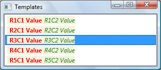
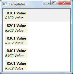
A convenient way to access XML data that is the binding source in markup is to use an XmlDataProvider object. In other words, an XmlDataProvider provides a convenient way to use any tree of XML nodes as a binding source. When the binding source is XML data instead of a common language runtime (CLR) object, the XPath property is used instead of the Path property to indicate the path to the value on the binding source to use. By setting the XPath property, you are creating an XPath query to select a node or a collection of nodes. The following examples shows how to use XML data as a binding source:
<!--
ListBoxData1.xml: XML data for the examples below -->
<Rows>
<Row Column1="R1C1 Value"
Column2="R1C2 Value"></Row>
<Row Column1="R2C1 Value"
Column2="R2C2 Value"></Row>
<Row Column1="R3C1 Value"
Column2="R3C2 Value"></Row>
<Row Column1="R4C1 Value"
Column2="R4C2 Value"></Row>
<Row Column1="R5C1 Value"
Column2="R5C2 Value"></Row>
</Rows>
<!-- Shows
basics of XmlDataProvider, ItemTemplate and DataTemplate -->
<Window x:Class="Templates.Window1"
xmlns="http://schemas.microsoft.com/winfx/2006/xaml/presentation"
xmlns:x="http://schemas.microsoft.com/winfx/2006/xaml"
Title="Templates" Height="317" Width="329"
Loaded="Window1_Loaded">
<Window.Resources>
<!-- Create an
XML data provider to read XML data-->
<XmlDataProvider x:Key="ListBoxData1"
Source="DataFiles\ListBoxData1.xml" XPath="/Rows" />
<!--
DataTemplate is always used in conjunction with an ItemTemplate to specify the
visual
appearance of a data item, where this
data item can be a ListBoxIem, ListViewItem, etc.-->
<DataTemplate x:Key="DataTemplate1">
<StackPanel
Orientation="Horizontal" Margin="2,2,2,2" Background="Beige">
<TextBlock FontSize="12" Text="{Binding XPath=@Column1}"
Foreground="Red" FontWeight="Bold" Margin="5,0,5,0"/>
<TextBlock FontSize="12" Text="{Binding XPath=@Column2}"
Foreground="Green" FontStyle="Italic"/>
</StackPanel>
</DataTemplate>
</Window.Resources>
<StackPanel>
<!-- List box
is data bound to XML resource whose ID is ListBoxData1. Note that data will show
as blank lines because ListBox does
not know how to display data. To properly display data,
ItemTemplate must be specified to
specify how each item (ListBoxItem will be displayed)-->
<ListBox Name="lstData"
ItemsSource="{Binding Source={StaticResource ListBoxData1}, XPath=Row}"
ItemTemplate="{StaticResource DataTemplate1}"
ScrollViewer.VerticalScrollBarVisibility="Auto"/>
</StackPanel>
</Window>
The following shows the output generated from the code above:
In the previous example, the binding source is specified by setting the DockPanel.DataContext property The Button then inherits the DataContext value from the DockPanel, which is its parent element. There are several ways to specify the binding source object. You can use Source, ElementName, or RelativeSource as shown below:
For the previous example, instead of using the DataContext property, you can specify the binding source by setting the Source property directly on the binding declaration of the button, as in the following example:
<DockPanel.Resources>
<c:MyData
x:Key="myDataSource"/>
</DockPanel.Resources>
<DockPanel
DockPanel.Dock="Top" HorizontalAlignment="Left"
VerticalAlignment="Top">
<Button
Background="{Binding Source={StaticResource myDataSource},
Path=ColorName}"
Width="150" Height="30">I
am bound to be RED!</Button>
</DockPanel>
You can also use the ElementName property or the RelativeSource property to specify the binding source. The ElementName property is useful when you are binding to other elements in your application, such as when you are using a slider to adjust the width of a button, of if you want to bind the Content of a control to the selected item in some container. The RelativeSource property is useful when the binding is specified in a ControlTemplate or a Style element.
Note that Source, ElementName and RelativeSource properties of the Binding class are used to set the source of the binding explicitly. However, only one of the three properties, Source, ElementName and RelativeSource , should be set for each binding, or a conflict might occur.
Binding.ElementName property is used to get/set the name of the element to use as the binding source object. The following example shows how to use ElementName:
<!-- Illustrates basic
usage of the Binding.ElementName property -->
<Window x:Class="DataBinding1.SimpleBinding2"
xmlns="http://schemas.microsoft.com/winfx/2006/xaml/presentation"
xmlns:x="http://schemas.microsoft.com/winfx/2006/xaml"
Title="SimpleBindin2" Height="300"
Width="300" Loaded="Window_Loaded">
<Window.Resources>
<!-- TextBlock
style -->
<Style TargetType="TextBlock">
<Setter
Property="FontSize" Value="16"/>
<Setter
Property="FontWeight" Value="Bold"/>
<Setter
Property="DockPanel.Dock" Value="Top"/>
<Setter
Property="HorizontalAlignment" Value="Center"/>
</Style>
<!-- Canvas
style -->
<Style TargetType="Canvas">
<Setter
Property="Height" Value="50"/>
<Setter
Property="Width" Value="50"/>
<Setter
Property="Margin" Value="8"/>
<Setter
Property="DockPanel.Dock" Value="Top"/>
</Style>
<!-- ComboBox
style -->
<Style TargetType="ComboBox">
<Setter
Property="Width" Value="150"/>
<Setter
Property="Margin" Value="8"/>
<Setter
Property="DockPanel.Dock" Value="Top"/>
</Style>
</Window.Resources>
<DockPanel>
<!-- GUI to
select color-->
<TextBlock>Choose a Color:</TextBlock>
<ComboBox Name="myComboBox"
SelectedIndex="0">
<ComboBoxItem>Green</ComboBoxItem>
<ComboBoxItem>Blue</ComboBoxItem>
<ComboBoxItem>Red</ComboBoxItem>
</ComboBox>
<StackPanel Orientation="Horizontal"
DockPanel.Dock="Bottom" Background="Orange">
<!-- A Canvas element whose background colour is bound to the selected value in
'myComboBox' -->
<Canvas Margin="5" Background="{Binding ElementName=myComboBox,
Path=SelectedItem.Content}"/>
<!-- Same as above but using element-property syntax for 'Background' -->
<Canvas Margin="5">
<Canvas.Background>
<Binding ElementName="myComboBox"
Path="SelectedItem.Content"/>
</Canvas.Background>
</Canvas>
<!-- Binding via ElementName is set up programmatically (see code below) -->
<Canvas Name="cnvs" Margin="5" />
</StackPanel>
</DockPanel>
</Window>
private void Window_Loaded(object sender,
RoutedEventArgs e)
{
// Create binding
Binding binding = new Binding("SelectedItem.Content");
binding.ElementName = "myComboBox";
// Apply binding
cnvs.SetBinding(Canvas.BackgroundProperty, binding);
}
The output is shown below (binding was established programmatically for the right-most canvas):
While Source and ElementName explicitly specify the binding source, RelativeSource is used to describe the location of the binding source in a way that is relative to the position of the binding target. The XAML attribute syntax is shown below (you could also use XAML property-element syntax):
<!--
modeEnumValue is a value from RelativeSourceMode enumeration-->
<object property="{Binding RelativeSource={RelativeSource
modeEnumValue} ...}" .../>
For example, you use RelativeSource if you know that the binding source location is in some element in the parent-chain of the bound element. You also use RelativeSource if you know that the binding source location is in the same element on which you are setting the binding. See RelativeSourceMode enumeration for more information. A few examples should clarify the concept:
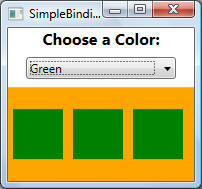
This example shows how to use RelativeSource to access the binding source on the same element on which we are setting the binding. A Combo box has a few items with each item displaying a colour name. We would like to use data binding to set the background colour for each ComboBoxItem item according to the content of that ComboBoxItem item:
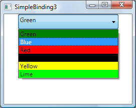
First step is identifying the data and its source. Required data is a valid colour name, and this data exists as the actual content of each ComboBoxItem. In other words, ComboBoxItem.Content is the data source. To set the background colour on each ComboBoxItem item, we use RelativeSourceMode.Self to refer back to the same ComboBoxItem item. (Note: a relative binding can be realized by pointing to the source element by name using ElementName. However, binding via RelativeSource is the best option if binding is defined in a template, which will probably be saved in a separate ResourceDictionary):
<Window x:Class="DataBinding1.SimpleBinding3"
xmlns="http://schemas.microsoft.com/winfx/2006/xaml/presentation"
xmlns:x="http://schemas.microsoft.com/winfx/2006/xaml"
Title="SimpleBinding3" Height="300"
Width="300">
<StackPanel Orientation="Vertical" VerticalAlignment="Top">
<ComboBox Name="myComboBox"
SelectedIndex="0" Width="200" Height="30">
<ComboBoxItem
Background="{Binding RelativeSource={RelativeSource self}, Path=Content}"
Content="Green"></ComboBoxItem>
<ComboBoxItem
Background="{Binding RelativeSource={RelativeSource self}, Path=Content}"
Content="Blue"></ComboBoxItem>
<ComboBoxItem
Background="{Binding RelativeSource={RelativeSource self}, Path=Content}"
Content="Red"></ComboBoxItem>
<ComboBoxItem
Background="{Binding RelativeSource={RelativeSource self}, Path=Content}"
Content="Black"></ComboBoxItem>
<ComboBoxItem
Background="{Binding RelativeSource={RelativeSource self}, Path=Content}"
Content="Yellow"></ComboBoxItem>
<ComboBoxItem
Background="{Binding RelativeSource={RelativeSource self}, Path=Content}"
Content="Lime"></ComboBoxItem>
</ComboBox>
</StackPanel>
</Window>
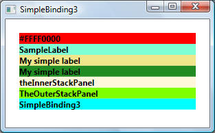
This example shows how to use RelativeSource to access the binding source on a templated control via RelativeSourceMode.TemplatedParent, as well as accessing a binding source from ancestor elements via RelativeSourceMode.FindAncestor (i.e., elements upward in the parent-chain). RelativeSourceMode.TemplatedParent refers to the element to which the template is applied, whereas RelativeSourceMode. FindAncestor refers to an ancestor in the parent-chain of the data bound element.
In the following example, each binding source has the same colour as the binding statement that accesses it:
<Window x:Class="DataBinding1.SimpleBinding3"
xmlns="http://schemas.microsoft.com/winfx/2006/xaml/presentation"
xmlns:x="http://schemas.microsoft.com/winfx/2006/xaml"
Title="SimpleBinding3" Height="300"
Width="300">
<StackPanel Orientation="Vertical" VerticalAlignment="Top"
Name="TheOuterStackPanel">
<Label Content="My
simple label" ToolTip="Label tooltip content" Name="SampleLabel"
Margin="20">
<Label.Template>
<ControlTemplate x:Name="theControlTemplate">
<StackPanel
Name="theInnerStackPanel">
<!-- Sets the Text property to the value of the Background property-->
<TextBlock Background="Red" Text="{Binding
RelativeSource={RelativeSource Self}, Path=Background}"/>
<!-- Sets the Text property to the value of the Name property for the Label
element that
is being templated -->
<TextBlock Background="Aquamarine" Text="{Binding
RelativeSource={RelativeSource TemplatedParent}, Path=Name}"/>
<!-- Same as above, except that Content is used as the source -->
<TextBlock Background="Khaki" Text="{Binding
RelativeSource={RelativeSource TemplatedParent}, Path=Content}"/>
<!-- Sets the Text property to the value of the Content property from an
ancestor element
of type Label in the parent-chain -->
<TextBlock Background="ForestGreen"
Text="{Binding RelativeSource={RelativeSource
FindAncestor, AncestorType={x:Type Label}}, Path=Content}" />
<!-- Sets the Text property to the value of the Name property from an ancestor
element
of type StackPanel that is nearest (AncestorLevel = 1) to this TextBlock element
-->
<TextBlock Background="Cornsilk" Text="{Binding
RelativeSource={RelativeSource FindAncestor,
AncestorLevel=1, AncestorType={x:Type StackPanel}}, Path=Name}"/>
<!-- Sets the Text property to the value of the Name property from an ancestor
element
of type StackPanel that is 2 levels away from this TextBlock element -->
<TextBlock Background="Chartreuse" Text="{Binding
RelativeSource={RelativeSource FindAncestor,
AncestorLevel=2, AncestorType={x:Type StackPanel}}, Path=Name}"/>
<!-- Sets the Text property to the value of the Title property from an ancestor
element
of type Window -->
<TextBlock Background="Cyan" Text="{Binding
RelativeSource={RelativeSource FindAncestor,
AncestorType={x:Type Window}}, Path=Title}"/>
</StackPanel>
</ControlTemplate>
</Label.Template>
</Label>
</StackPanel>
</Window>
The output is shown below:
If your binding source is a CLR object, you use the Path property to specify the property that will provide the actual data value. If you are binding to XML data, you use the XPath property to specify the value. Note that although we have emphasized that the Path to the value to use is one of the four necessary components of a binding, in scenarios where you want to bind to an entire object, the value to use would be the same as the binding source object. In those cases, it is applicable to not specify a path. Consider the following example:
<ListBox
Name="leagueLB" DockPanel.Dock="Top"
ItemsSource="{Binding}"
ItemTemplate="{DynamicResource LBDataTemplate}"
IsSynchronizedWithCurrentItem="true"/>
The above example uses the empty binding syntax: {Binding}. In this case, the ListBox inherits the DataContext from the DockPanel parent element (not shown in this example). The path has been left out because we are binding the ItemsSource property to the entire object. (See the Binding to Collections section for an in-depth discussion of binding to collections.)
Binding class is the high-level class for the declaration of a binding; Binding class provides many properties that allow you to specify the characteristics of a binding. A related class, BindingExpression, is the underlying object that maintains the connection between the source and the target. This example shows how to use code to bind the text content of mytext, an instance of TextBlock, to MyDataProperty:
// Create the
source object and initialize it
MyData myDataObject =
new
MyData(System.DateTime.Now);
// Create the binding identifyin which property to
bind to
Binding myBinding =
new
Binding("MyDataProperty");
myBinding.Mode = BindingMode.TwoWay;
myBinding.Source = myDataObject;
mytext.SetBinding(TextBlock.TextProperty, myBinding);
You can use the same myBinding object to create other bindings. For example, you may use myBinding object to bind the text content of a check box to MyDataProperty. In that scenario, there will be two instances of BindingExpression sharing the myBinding object.
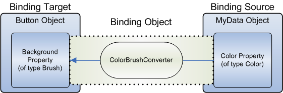
In the previous example, the button's background is Red because its Background property is bound to a string property with the value "Red". This works because a type converter is present on the Brush type to convert the string value to a Brush:

However, what if instead of having a property of type string your binding source object has a Color property of type Color? In that case, in order for the binding to work you would need to first turn the Color property value into something that the Background property accepts. You would need to create a custom converter by implementing the IValueConverter interface, as in the following example:
[ValueConversion(typeof(Color),
typeof(SolidColorBrush))]
public
class ColorBrushConverter :
IValueConverter
{
public object
Convert(object value, Type targetType, object parameter,
System.Globalization.CultureInfo culture)
{
Color color = (Color)value;
return new SolidColorBrush(color);
}
public object
ConvertBack(object value, Type targetType, object parameter,
System.Globalization.CultureInfo culture)
{
return null;
}
}
This is illustrated below:
A binding source object can be treated either as a single object whose properties contain data (see previous examples), or it can be treated as a data collection as illustrated below:
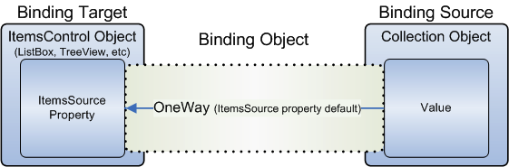
As shown in this diagram, to bind an ItemsControl to a collection object, ItemsSource property is the property to use. You can think of ItemsSource property as the content area of the ItemsControl. Note that the binding is OneWay because the ItemsSource property supports OneWay binding by default.
To set up dynamic bindings so that insertions or deletions in the collection update the UI automatically, the collection must implement the INotifyCollectionChanged interface. This interface exposes an event that should be raised whenever the underlying collection changes. WPF provides the ObservableCollection class, which is a built-in implementation of a data collection that exposes the INotifyCollectionChanged interface. This means that the binding target will be updated whenever items are added or deleted from the collection. But what about when a property on an existing item changes value? This is where INotifyPropertyChanged becomes relevant. To fully support changes in property values in source objects and target objects, each object in your collection that supports bindable properties must also implement the INotifyPropertyChanged interface.
In cases where your source object does not implement INotifyPropertyChanges interface, you have the option of using UpdateTarget method. You can use this method to update the target property explicitly, or you can use this method if your application needs to update the target properties periodically.
Once your ItemsControl is bound to a data collection, you may want to sort, filter, or group the data. To do that, you use collection views, which are classes that implement the ICollectionView interface. Because views do not change the underlying source collections, each source collection can have multiple views associated with it. With the use of views, you can display that same data in different ways.
One way to create and use a view is to instantiate the view object directly and then use it as the binding source. The CollectionViewSource class is the XAML proxy of CollectionView. In this particular example, the Source of the view is bound to the AuctionItems collection (of type ObservableCollection) of the current application object:
<Window.Resources>
...
<CollectionViewSource
Source="{Binding Source={x:Static Application.Current}, Path=AuctionItems}" x:Key="listingDataView" />
...
</Window.Resources>
The resource listingDataView then serves as the binding source for elements in the application, such as the ListBox:
<ListBox Name="Master" ItemsSource="{Binding Source={StaticResource listingDataView}}" ... />
All collections have a default collection view. For example, for all collections implementing IEnumerable, CollectionView is the default view object. ListCollectionView is the default view object for the collections that implement IList, and BindingListCollectionView is the collection view class used for collections that implement IBindingList. To get the default view, you use the GetDefaultView method.
Recall that a convenient way to access XML data that is the binding source in markup is to use an XmlDataProvider object. The following example shows how to use XML data as a binding source within a collection view:
<!--
ListBoxData1.xml: XML data for the examples below -->
<Rows>
<Row Column1="R1C1 Value"
Column2="R1C2 Value"></Row>
<Row Column1="R2C1 Value"
Column2="R2C2 Value"></Row>
<Row Column1="R3C1 Value"
Column2="R3C2 Value"></Row>
<Row Column1="R4C1 Value"
Column2="R4C2 Value"></Row>
<Row Column1="R5C1 Value"
Column2="R5C2 Value"></Row>
</Rows>
<Window x:Class="Templates.ListBox2"
xmlns="http://schemas.microsoft.com/winfx/2006/xaml/presentation"
xmlns:x="http://schemas.microsoft.com/winfx/2006/xaml"
Title="Templates" Height="300" Width="300">
<Window.Resources>
<!-- Create an
XML data provider to read XML data-->
<XmlDataProvider x:Key="ListBoxData1"
Source="DataFiles\ListBoxData1.xml" XPath="/Rows" />
<!-- Bind the
XML data to a collection view -->
<CollectionViewSource
x:Key="ListBoxView1" Source="{Binding
Source={StaticResource ListBoxData1}, XPath=Row}"
/>
<!--
DataTemplate is always used in conjunction with an ItemTemplate to specify the
visual
appearance of a data item, where this
data item can be a ListBoxIem, ListViewItem,etc.-->
<DataTemplate x:Key="DataTemplate1">
<StackPanel
Orientation="Vertical" Margin="5,5,5,5" Background="Beige">
<TextBlock FontSize="12" Text="{Binding XPath=@Column1}" FontWeight="Bold"
Margin="5,0,5,0"/>
<TextBlock FontSize="12" Text="{Binding XPath=@Column2}" FontStyle="Italic"/>
</StackPanel>
</DataTemplate>
</Window.Resources>
<StackPanel>
<!-- List box
is data bound to a collection view whose ID is ListBoxView1, which is bound to
an XML resource . Note that data will
show as blank lines because ListBox does not know how
to display data. To properly display
data, ItemTemplate must be specified to specify how each
item (ListBoxItem will be
displayed)-->
<ListBox Name="lstData"
ItemsSource="{Binding Source={StaticResource
ListBoxView1}}"
ItemTemplate="{StaticResource DataTemplate1}"/>
</StackPanel>
</Window>
The output is shown below:
The following example shows how to use a CLR object as a binding source within a collection view:
<!-- A binding source can be either a
single object whose properties contain data, or it can be
considered as a container/collection of objects. Binding to a data collection is
a common scenario.
The usual approach is to use an ItemsControl control such as a ListBox, ListView, or
TreeView to display a data collection. Without specific instructions on how to display the data in the
data collection, the ListBox will display a string representation of each object in the
underlying collection
(See comments for Employee class in the code-behind file below).
You can enumerate over any collection that implements the IEnumerable interface.
However, to set
up dynamic bindings so that insertions or deletions in the collection update the
UI automatically,
the collection must implement the INotifyCollectionChanged interface. This
interface exposes an event
that should be raised whenever the underlying collection changes.
WPF provides the ObservableCollection class, which is a built-in implementation
of a data collection
that exposes the INotifyCollectionChanged interface. Note that to fully support
transferring data
values from source objects to targets, each object in your collection that
supports bindable properties
must also implement the INotifyPropertyChanged interface.
Once your element is bound to a data collection, you want to sort, filter or
group that data. To do
this you use a collection view which is any class that implements ICollectionView interface. You can
think of a collection view as another layer on top of the binding source
collection. The collection
view allows you to navigate the underlying collection without having to
manipulate the actual collection. And because views do not change the underlying collection, each source can have
multiple views associated
with it - one view can sort data, while another can filter data, and so on.
In WPF all collections have an associated default collection view that can be
accessed via
GetDefaultView method. CollectionView is the default collection view for
collections that only
implement IEnumerable. For all collections implementing IList, the default
collection view is
ListCollectionView.
Alternatively, you can create a view of your collection in XAML using <CollectionViewSource>, which is the XAML representation of CollectionView class.
-->
<Window x:Class="DataBinding1.CollectionBinding"
xmlns="http://schemas.microsoft.com/winfx/2006/xaml/presentation"
xmlns:x="http://schemas.microsoft.com/winfx/2006/xaml"
Title="DataBinding1" Height="300" Width="300"
xmlns:src="clr-namespace:DataBinding1"
xmlns:scm="clr-namespace:System.ComponentModel;assembly=WindowsBase"
xmlns:dat="clr-namespace:System.Windows.Data;assembly=PresentationFramework">
<Window.Resources>
<!-- Identifies an Employees class as a resource to be used as a binding source -->
<src:Employees x:Key="MyEmployees" />
<!-- Identifies MyEmployeesView as a collection-view resource on the resource
identified by
MyEmployees.
CollectionViewSource is the XAML representation of the CollectionView class.
(recall that a view allows for functionalities such as filtering, grouping,
sorting, and the concept
of a current record pointer). The SortDescriptions and
GroupDescriptions attributes declare how this view will sort and group data
-->
<CollectionViewSource x:Key="MyEmployeesView"
Source="{StaticResource MyEmployees}">
<!-- Identify which property will be used for sorting -->
<CollectionViewSource.SortDescriptions>
<scm:SortDescription PropertyName="Name" />
</CollectionViewSource.SortDescriptions>
<!-- Identify which property will be used for grouping -->
<CollectionViewSource.GroupDescriptions>
<dat:PropertyGroupDescription PropertyName="Title" />
</CollectionViewSource.GroupDescriptions>
</CollectionViewSource>
</Window.Resources>
<!-- The one and only child
element of <Window>-->
<StackPanel HorizontalAlignment="Center" VerticalAlignment="Center"
Orientation="Vertical">
<!-- Note how the ListBox is initialized with data coming from resource
MyEmployees -->
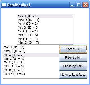
<ListBox Width="200" IsSynchronizedWithCurrentItem="True"
ItemsSource="{Binding
Source={StaticResource MyEmployees}}">
</ListBox>
<StackPanel HorizontalAlignment="Center" VerticalAlignment="Center"
Orientation="Horizontal">
<!-- To create and use a view, instantiate the view object directly and use it
as the
binding source. Note how the ItemSource attribute for the following list box
uses a
view (whose key is MyEmployeesView). The <ListBox.GroupStyle> is added just to
show how
items in a list box can be grouped given that the view identified by
'MyEmployeesView'
supports grouping-->
<ListBox Name="lstEmployeesView" Width="200"
IsSynchronizedWithCurrentItem="True"
ItemsSource="{Binding
Source={StaticResource MyEmployeesView}}">
<ListBox.GroupStyle>
<x:Static Member="GroupStyle.Default"/>
</ListBox.GroupStyle>
</ListBox>
<!-- Various buttons to group and filter on the collection above-->
<StackPanel HorizontalAlignment="Center" VerticalAlignment="Center"
Orientation="Vertical">
<Button Name="btnViewSortOrder" Width="" Height="" Content="Sort by ID"
Click="btnViewSortOrder_Handler"></Button>
<Button Name="btnViewFilter" Width="" Height="" Content="Filter by Mr."
Click="btnViewFilter_Handler"></Button>
<Button Name="btnViewGrouping" Width="" Height="" Content="Group by Title."
Click="btnViewGrouping_Handler"></Button>
<Button Name="btnViewNavigation" Width="" Height="" Content="Move to Last
Record" Click="btnViewNavigation_Handler"></Button>
</StackPanel>
</StackPanel>
</StackPanel>
</Window>
using System;
using System.Collections.Generic;
using System.Text;
using System.Windows;
using System.Windows.Controls;
using System.Windows.Data;
using System.Windows.Documents;
using System.Windows.Input;
using System.Windows.Media;
using System.Windows.Media.Imaging;
using System.Windows.Shapes;
using System.ComponentModel;
namespace DataBinding1
{
/// <summary>
/// The following represents a binding source object. It implements
INotifyPropertyChanged
/// to notify its binding targets that a property has changed. This binding
source is maintained
/// within an Employees collection class which is actually bound to a list view
/// </summary>
public class Employee : System.ComponentModel.INotifyPropertyChanged
{
// Data members
private string _name, _title;
private int _id;
// Constructors
public Employee(string n, string t, int id)
{
_name = n;
_title = t;
_id = id;
}
// Overrides. This property is important as it determines what text will appear
in
// the list box. Without specific instructions of how to display the data in the
data
// collection, the element that will bind to this object (or to a collection of
this
// object) will display a string representation of each object in the underlying
// collection. This can be solved with DataTemplates.
public override string ToString()
{
return _title + " " + _name + " (ID = " + _id + ")";
}
// Properties. These fire events when the property value changes
public string Name
{
get { return _name; }
set
{
_name = value;
OnPropertyChanged("Name");
}
}
public string Title
{
get { return _title; }
set
{
_title = value;
OnPropertyChanged("Title");
}
}
public int ID
{
get { return _id; }
set
{
_id = value;
OnPropertyChanged("ID");
}
}
// INotifyPropertyChanged Members
public event PropertyChangedEventHandler PropertyChanged;
private void OnPropertyChanged(string strPropertyName)
{
PropertyChangedEventHandler handler = PropertyChanged;
if (handler != null)
handler(this, new PropertyChangedEventArgs(strPropertyName));
}
}
/// <summary>
/// Employees is a container that derives from ObservableCollection<T>.
ObservableCollection<T>
/// represents a dynamic data collection that provides notifications when items
are added/deleted,
/// or when the whole list is refreshed.
/// </summary>
public class Employees : System.Collections.ObjectModel.ObservableCollection<Employee>
{
public Employees()
{
int nID = 0;
Add(new Employee("H", "Mrs", nID++));
Add(new Employee("D", "Miss", nID++));
Add(new Employee("A", "Mr.", nID++ ));
Add(new Employee("G", "Mrs", nID++));
Add(new Employee("C", "Mr.", nID++));
Add(new Employee("F", "Mrs", nID++));
Add(new Employee("B", "Mr.", nID++));
Add(new Employee("E", "Miss", nID++));
}
}
public partial class CollectionBinding : System.Windows.Window
{
public CollectionBinding()
{
InitializeComponent();
}
// Shows how to set the sorting order by retrieving the underlying collection
view
// and then setting sorting order on this view
private void btnViewSortOrder_Handler(object sender, RoutedEventArgs args)
{
// Get the view associated with the 'lstEmployeesView' list box
ICollectionView view =
CollectionViewSource.GetDefaultView(lstEmployeesView.ItemsSource);
// Remove grouping (otherwise, sorting will be done within each group)
view.GroupDescriptions.Clear();
// Create a new sorting order
view.SortDescriptions.Clear();
view.SortDescriptions.Add(new SortDescription("ID", ListSortDirection.Ascending));
view.Refresh();
}
// Shows how to set filtering by retrieving the underlying collection view and
then
// specifying a callback function that will be called for each item in the
underlying
// data source. The callback examines the item and determines (based on some
user-defined
// criteria) whether the item should be filtered or not
private void btnViewFilter_Handler(object sender, RoutedEventArgs args)
{
// Get the view associated with the 'lstEmployeesView' list box
ICollectionView view =
CollectionViewSource.GetDefaultView(lstEmployeesView.ItemsSource);
// Apply the filter
view.Filter = new Predicate<object>(Contains);
}
// Shows how to set item grouping by retrieving the underlying collection view
// and then setting grouping on this view
private void btnViewGrouping_Handler(object sender, RoutedEventArgs args)
{
// Get the view associated with the 'lstEmployeesView' list box
ICollectionView view =
CollectionViewSource.GetDefaultView(lstEmployeesView.ItemsSource);
// Create a new group
view.GroupDescriptions.Clear();
view.GroupDescriptions.Add(new PropertyGroupDescription("Title"));
}
// Shows to navigate items in a view
private void btnViewNavigation_Handler(object sender, RoutedEventArgs args)
{
// Get the view associated with the 'lstEmployeesView' list box
ICollectionView view =
CollectionViewSource.GetDefaultView(lstEmployeesView.ItemsSource);
// Move to last item in the view
view.MoveCurrentToLast();
// Display some results
Employee employee = view.CurrentItem as Employee;
MessageBox.Show("Employee details: " + employee.Title + " " + employee.Name + "
(ID = " + employee.ID + ")");
}
// This method is a callback that provides filtering functionality by removing
employees
// whose ID is > 5. Once the filter is registered by setting the Filter property
on the
// collection view, this method will bed called back for each item in the
collection.
private bool Contains(object o)
{
Employee oEmployee = o as Employee;
if (oEmployee == null) return true;
return !(oEmployee.ID > 5);
}
}
}
Collection Binding (with the result of clicking the 'Sort By ID' button shown next to it):

Most applications that take user input need to have data validation to ensure that the user has entered the expected information. Data validation is about target-to-source. As such, it only applies to TwoWay and OneWayToSource bindings. Validation occurs each time an input value is transferred to the binding-source property. What causes a value to be transferred to the binding-source property depends on the value of the UpdateSourceTrigger property (discussed fully here). The following illustrates and describes the validation process which occurs during target-to-source value transfer:
When a value is being transferred from target to source, the data binding engine clears the Validation.Errors collection which is an attached property of the bound element. It then checks if there are any custom validation rules (ValidationRule) defined for that binding, in which case it calls the Validate method on each of the ValidatonRule objects until one of them fails or until all of them pass.
If there is a custom rule that does not pass, the binding engine creates a ValidationError object and adds it the Validation.Errors collection on the bound element (this also sets Validation.HasErrors to true). The binding engine can raise the Validation.Error attached event if the Binding.NotifyOnValidationError is set to true.
If all of the rules pass, the binding engine calls the converter. If the converter passes, the binding engine calls the setter of the source property.
If the binding has an ExceptionValidationRule associated with it and an exception is thrown during step 3, the binding engine checks to see if there is a UpdateSourceExceptionFilter: if there is non, a ValidationError is added to Validation.Errors.
In the following example, the binding source is assumed to be an object (not shown) with a property called StartPrice of type int. The target property is TextBox.Text. When the user enters a value that cannot be converted to an int, an exception is thrown by the built-in validation rule, causing the binding to be marked as invalid:
<TextBox Name="StartPriceEntryForm"
Style="{StaticResource textStyleTextBox}">
<TextBox.Text>
<Binding Path="StartPrice"
UpdateSourceTrigger="PropertyChanged">
<Binding.ValidationRules>
<ExceptionValidationRule />
</Binding.ValidationRules>
</Binding>
</TextBox.Text>
</TextBox>
The ValidationRules property takes a collection of ValidationRule objects. ExceptionValidationRule is a built-in ValidationRule that checks for exceptions thrown during the update of the binding source property. In addition to use built-in validation rules (ExceptionValidationRule and DataErrorValidationRule), you can also create your own validation rule by deriving from the ValidationRule class. ValidationRule class is used to create a custom rule in order to check the validity of user input. To create custom rules, make a subclass of this class and implement the Validate method as shown below:
// The following
validation rule is used to check that a date value is in the future,
i.e., it is greater t han today's date
class
FutureDateRule
: ValidationRule
{
// Implement Validate method.
Note the return values for success and failure
public override
ValidationResult Validate(object value, CultureInfo cultureInfo)
{
DateTime date;
try
{
date = DateTime.Parse(value.ToString());
}
catch (FormatException)
{
return new ValidationResult(false,
"Value is not a valid date.");
}
if (DateTime.Now.Date >
date)
{
return new ValidationResult(false,
"Please enter a date in the
future.");
}
else
{
return new ValidationResult(true,
null);
}
}
}
The FutureDateRule validation rule can be used as shown in the following example:
<TextBox Name="StartDateEntryForm">
<TextBox.Text>
<Binding Path="StartDate" UpdateSourceTrigger="PropertyChanged"
Converter="{StaticResource dateConverter}">
<Binding.ValidationRules>
<src:FutureDateRule
/>
</Binding.ValidationRules>
</Binding>
</TextBox.Text>
</TextBox>
If the user enters an invalid value, you may want to provide some visual feedback about the error on the application UI. One way to provide such feedback is to set the Validation.ErrorTemplate attached property to a custom ControlTemplate (ControlTemplate is covered fully in ControlTemplates chapter). ErrorTemplate gets/sets the ControlTemplate used to generate some visual-feedback for a validation error. This visual feedback can by any visual effect to draw the user's attention to the error, for example, when validation fails, the input text box may be given a Red background, an extra label may be displayed, etc.
The following example illustrates the concepts above:
<Window x:Class="DataBinding1.BindingValidation"
xmlns="http://schemas.microsoft.com/winfx/2006/xaml/presentation"
xmlns:x="http://schemas.microsoft.com/winfx/2006/xaml"
xmlns:c="clr-namespace:DataBinding1"
Title="Binding Validation Sample"
SizeToContent="WidthAndHeight"
ResizeMode="NoResize">
<Window.Resources>
<!-- Data
source for textbox textbox1 which binds to property 'Age' -->
<c:ValidationDataSource x:Key="ods"/>
<!-- Control
template for Validation.ErrorTemplate. The ErrorTemplate in this case
provides a visual error by display a
big 'ERROR' text in Red
Note the use of
AdornedElementPlaceholder which represents the element used in a
ControlTemplate to specify where a
decorated control is placed relative to other
elements in the ControlTemplate. -->
<ControlTemplate x:Key="validationTemplate">
<DockPanel>
<AdornedElementPlaceholder/>
<TextBlock Foreground="Red">(ERROR!)</TextBlock>
</DockPanel>
</ControlTemplate>
<!-- TextBox
style that uses a tigger to check Validation.HasErrors property
and if equal to true, binds to the
textbox (i.e., textbox becomes the source),
and sets the TextBox Tooltip to the
validation error content (i.e., obtained
from the text box) -->
<Style x:Key="textBoxInError"
TargetType="{x:Type TextBox}">
<Style.Triggers>
<Trigger Property="Validation.HasError" Value="true">
<Setter Property="ToolTip" Value="{Binding RelativeSource={x:Static
RelativeSource.Self},
Path=(Validation.Errors)[0].ErrorContent}"/>
<Setter Property="Background" Value="Red"></Setter>
</Trigger>
</Style.Triggers>
</Style>
</Window.Resources>
<Grid>
<!-- Screen layout definition -->
<Grid.ColumnDefinitions>
<ColumnDefinition />
<ColumnDefinition />
<ColumnDefinition />
</Grid.ColumnDefinitions>
<Grid.RowDefinitions>
<RowDefinition />
<RowDefinition />
<RowDefinition />
<RowDefinition/>
<RowDefinition />
<RowDefinition />
</Grid.RowDefinitions>
<!-- Main Title
-->
<TextBlock Grid.Row="0" Grid.ColumnSpan="2" Margin="8"
Text="Enter a number between 21-130 or there will be a validation error:"/>
<Label Grid.Column="0" Grid.Row="1" Margin="2" Content="TextBox with _custom
ErrorTemplate and ToolTip:"/>
<!-- Textbox with validation. Note the following
1. Uses Validation.ErrorTemplate to display visual feedback on error
2. Uses a Style element 'textBoxInError' with triggers to change appearance
on error and display an error-tooltip
3. Binds to the 'Age' property of the 'ods' source.
4. Associates a validation rule (a class of type AgeRangeRule) with its binding
-->
<TextBox Name="textBox1" Width="50" Grid.Row="1" Grid.Column="1" Margin="2"
Validation.ErrorTemplate="{StaticResource validationTemplate}"
Style="{StaticResource textBoxInError}">
<TextBox.Text>
<Binding Path="Age" Source="{StaticResource
ods}" UpdateSourceTrigger="PropertyChanged">
<Binding.ValidationRules>
<c:AgeRangeRule Min="21" Max="130"/>
</Binding.ValidationRules>
</Binding>
</TextBox.Text>
</TextBox>
<Label Grid.Row="2" Grid.Column="0" Margin="2" Content="TextBox with _default
ErrorTemplate:"/>
<!-- Same as textbox1 except that it uses the default ErrorTemplate rather than
explicitly
specifying one -->
<TextBox Name="textBox2" Width="50"
Grid.Row="2" Grid.Column="1" Margin="2">
<TextBox.Text>
<Binding Path="Age2" Source="{StaticResource
ods}" UpdateSourceTrigger="PropertyChanged"
>
<Binding.ValidationRules>
<c:AgeRangeRule Min="21" Max="130"/>
</Binding.ValidationRules>
</Binding>
</TextBox.Text>
</TextBox>
<TextBlock Grid.Row="3" Grid.ColumnSpan="3" Margin="8"
Text="The following TextBox uses the ExceptionValidationRule and
UpdateSourceExceptionFilter handler:"/>
<Label Grid.Row="4" Grid.Column="0" Margin="2" Content="TextBox with
UpdateSourceExceptionFilter _handler:"/>
<!-- Same as textbox1 except that it uses the built-in ExceptionValidationRule
validation rule. The ExceptionValidationRule class is a built-in rule that
checks for
exceptions that are thrown during the updates of the binding source property.
You can
provide custom logic to specify how the binding engine handles these exceptions
by
using a UpdateSourceExceptionFilterCallback -->
<TextBox Name="textBox3" Width="50" Grid.Row="4" Grid.Column="1" Margin="2"
Validation.ErrorTemplate="{StaticResource validationTemplate}"
Style="{StaticResource textBoxInError}">
<TextBox.Text>
<Binding Path="Age3" Source="{StaticResource
ods}" UpdateSourceTrigger="PropertyChanged">
<Binding.ValidationRules>
<ExceptionValidationRule/>
</Binding.ValidationRules>
</Binding>
</TextBox.Text>
</TextBox>
<CheckBox Name="cb"
HorizontalAlignment="Left" Grid.Row="4" Grid.Column="2" Margin="5"
Checked="UseCustomHandler"
Unchecked="DisableCustomHandler">Enable Custom Handler (see ToolTip)</CheckBox>
<Label Grid.Row="5" Grid.Column="0" Margin="2" Content="TextBox with
DataErrorValidationRule:"/>
<!-- Same as
textbox1 except that it binds to Age4 and uses the built-in
DataErrorValidationRule validation
rule. DataErrorValidationRule represents
a rule that checks for errors that
are raised by the IDataErrorInfo
implementation of the source object.
-->
<TextBox Name="textBox4"
Width="50" Grid.Row="6" Grid.Column="1" Margin="2"
Validation.ErrorTemplate="{StaticResource validationTemplate}"
Style="{StaticResource textBoxInError}">
<TextBox.Text>
<Binding Path="Age4" Source="{StaticResource ods}" UpdateSourceTrigger="PropertyChanged">
<Binding.ValidationRules>
<DataErrorValidationRule/>
</Binding.ValidationRules>
</Binding>
</TextBox.Text>
</TextBox>
</Grid>
</Window>
public partial class BindingValidation : Window
{
public BindingValidation()
{
InitializeComponent();
}
void UseCustomHandler(object sender, RoutedEventArgs e)
{
BindingExpression myBindingExpression =
textBox3.GetBindingExpression(TextBox.TextProperty);
Binding myBinding = myBindingExpression.ParentBinding;
myBinding.UpdateSourceExceptionFilter = new
UpdateSourceExceptionFilterCallback(ReturnExceptionHandler);
myBindingExpression.UpdateSource();
}
void DisableCustomHandler(object sender, RoutedEventArgs e)
{
// textBox3 is an instance of a TextBox
// the TextProperty is the data-bound dependency property
Binding myBinding = BindingOperations.GetBinding(textBox3, TextBox.TextProperty);
myBinding.UpdateSourceExceptionFilter -= new
UpdateSourceExceptionFilterCallback(ReturnExceptionHandler);
BindingOperations.GetBindingExpression(textBox3,
TextBox.TextProperty).UpdateSource();
}
object ReturnExceptionHandler(object bindingExpression, Exception exception)
{
return "This is from the UpdateSourceExceptionFilterCallBack.";
}
}
// A simple class to act as a data source
public class ValidationDataSource : IDataErrorInfo
{
private int _age;
private int _age2;
private int _age3;
private int _age4;
public ValidationDataSource()
{
Age = 0;
Age2 = 0;
}
public int Age
{
get { return _age; }
set { _age = value; }
}
public int Age2
{
get { return _age2; }
set { _age2 = value; }
}
public int Age3
{
get { return _age3; }
set { _age3 = value; }
}
public int Age4
{
get { return _age4; }
set { _age4 = value; }
}
#region IDataErrorInfo Members
public string Error
{
get { return null; }
}
public string this[string name]
{
get
{
string result
= null;
if (name ==
"Age4")
{
if (_age4 < 21|| _age4 > 130)
{
result = "Age must not be less than 21 or greater than 130.";
}
}
return
result;
}
}
#endregion
}
// Validation class
public class AgeRangeRule : ValidationRule
{
private int _min;
private int _max;
public AgeRangeRule()
{ /* Empty implementation */
}
public int Min
{
get { return _min; }
set { _min = value; }
}
public int Max
{
get { return _max; }
set { _max = value; }
}
public override ValidationResult Validate(object value, CultureInfo cultureInfo)
{
int age = 0;
try
{
// Check that we have a non-empty value, and that the value is an int
// Int32.Parse() throws an exception if the value is not an int
if (((string)value).Length > 0)
age = Int32.Parse((String)value);
}
catch (Exception e)
{
return new ValidationResult(false, "Illegal characters or " + e.Message);
}
// We have a valid value (i.e., an int). Check that the value
// is within a specific range
if ((age < Min) || (age > Max))
return new ValidationResult(false, "Please enter an age in the range: " + Min +
" - " + Max + ".");
else
return new ValidationResult(true, null);
}
}
In the following output screen illustrates the resulting behaviour for empty text boxes:
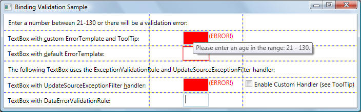
In the following output screen illustrates the resulting behaviour for text boxes with invalid values:
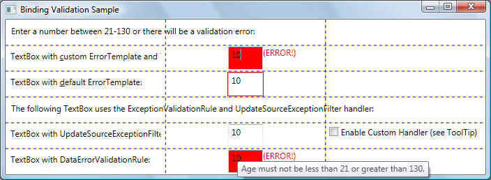
In the following output screen illustrates the resulting behaviour for text boxes with valid values
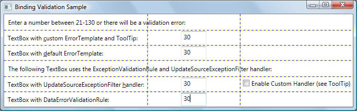
Just as you can apply a visual Style to a user interface (UI) element, you can apply a DataTemplate to define the presentation of your data. By applying different data templates to the same data, you can flexibly change the visual appearance of the data in your application.
To demonstrate why DataTemplate is important, consider the following example in which a ListBox is bound to a collection of Employee objects:
<Window x:Class="DataBinding1.DataTemplating_NeedFor"
xmlns="http://schemas.microsoft.com/winfx/2006/xaml/presentation"
xmlns:x="http://schemas.microsoft.com/winfx/2006/xaml"
xmlns:src="clr-namespace:DataBinding1"
Title="DataTemplating_NeedFor">
<Window.Resources>
<src:Employees
x:Key="EmployeesKey" />
</Window.Resources>
<StackPanel>
<Label FontSize="30" FontWeight="Bold"
Content="Employees:"></Label>
<ListBox Name="lbEmployees"
Width="400" ItemsSource="{Binding Source={StaticResource
EmployeesKey}}" />
</StackPanel>
</Window>
// The following represents a binding source object. It
implements INotifyPropertyChanged
// to notify its binding targets that a property has changed. This binding
source is maintained
// within an Employees collection class which is actually bound to a list view
public class Employee :
System.ComponentModel.INotifyPropertyChanged
{
// Data members
private string _name, _title;
private int _id;
// Constructors
public Employee(string n, string t, int id)
{
_name = n;
_title = t;
_id = id;
}
// Overrides. This property is
important as it determines what text will appear in
// the list box. Without specific instructions of how to
display the data in the data
// collection, the element that will bind to this object (or
to a collection of this
// object) will display a string representation of each
object in the underlying
// collection. (see output screen below)
/*public override string ToString()
{
return _title + " " + _name + " (ID =
" + _id + ")";
}*/
// Properties. These fire events when
the property value changes
public string Name
{
get { return _name; }
set
{
_name =
value;
OnPropertyChanged("Name");
}
}
public string Title
{
get { return _title; }
set
{
_title =
value;
OnPropertyChanged("Title");
}
}
public int ID
{
get { return _id; }
set
{
_id = value;
OnPropertyChanged("ID");
}
}
// INotifyPropertyChanged Members
public event PropertyChangedEventHandler
PropertyChanged;
private void OnPropertyChanged(string strPropertyName)
{
PropertyChangedEventHandler handler =
PropertyChanged;
if (handler != null)
handler(this,
new PropertyChangedEventArgs(strPropertyName));
}
}
// Employees is a contianer that derives from
ObservableCollection<T>. ObservableCollection<T>
// represents a dynamic data collection that provides notifications when items
are added/deleted,
// or when the whole list is refreshed.
public class Employees :
System.Collections.ObjectModel.ObservableCollection<Employee>
{
public Employees()
{
int nID = 0;
Add(new Employee("H", "Mrs", nID++));
Add(new Employee("D", "Miss", nID++));
Add(new Employee("A", "Mr.", nID++
));
Add(new Employee("G", "Mrs", nID++));
Add(new Employee("C", "Mr.", nID++));
Add(new Employee("F", "Mrs", nID++));
Add(new Employee("B", "Mr.", nID++));
Add(new Employee("E", "Miss", nID++));
}
}
Output from the previous code is shown below:
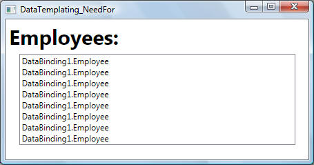
What's happening is that without any specific instructions, the ListBox by default calls ToString when trying to display the objects in the collection. Therefore, if the Employee object overrides the ToString method, then the ListBox displays the string representation of each source object in the underlying collection. When ToString() override in the code above is uncommented, the output looks like this:
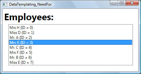
The following is a full example of using data templates.
<!-- Data templates provide great
flexibility for defining the PRESENTATION of data.
Data templating therefore, is
all about data presentation -->
<Window x:Class="DataBinding1.DataTemplating"
xmlns="http://schemas.microsoft.com/winfx/2006/xaml/presentation"
xmlns:x="http://schemas.microsoft.com/winfx/2006/xaml"
xmlns:src="clr-namespace:DataBinding1"
Title="DataBinding1" Height="300"
Width="300">
<!-- Read the contents of the main
StackPanel element before reading this resources section -->
<Window.Resources>
<!-- Identifies
Employees as a resource to be used as a binding source.
Employees collection was
defined in the previous section -->
<src:Employees x:Key="MyEmployees"
/>
<src:EmployeeDataTemplateSelector
x:Key="EmpDataTemplateSelector"/>
<!-- See
comments for ListBox LB1 first. This DataTemplate is applied to LB2.
Note how we added a Border to
illustrate how the visual appearance can be
changed -->
<DataTemplate x:Key="MyDataTemplate">
<Border
Name="border" BorderBrush="Aqua" BorderThickness="1" Padding="5" Margin="5">
<StackPanel>
<TextBlock Text="{Binding Path=Title}" />
<TextBlock Text="{Binding Path=Name}" Background="LightBlue"/>
<TextBlock Text="{Binding Path=ID}" Background="LightGreen"/>
</StackPanel>
</Border>
</DataTemplate>
<!-- See
comments for ListBox LB2 first. This DataTemplate is applied to LB3
The DataTemplate has a DataType
property that is very similar to TargetType property
of the Style class. This DataTemplate
now gets applied automatically for all Employee
objects. The DataType property is
particularly useful when you have a CompositeCollection
of different types of data objects.
Note that in this case the x:Key is
set implicitly. Therefore, if you assign this
DataTemplate an x:Key value, you are
overriding the implicit x:Key and the DataTemplate
would not be applied automatically.
-->
<DataTemplate DataType="{x:Type
src:Employee}">
<Border
Name="border" BorderBrush="Green" BorderThickness="2" Padding="3" Margin="5">
<StackPanel Name="sb">
<TextBlock Text="{Binding Path=Title}" />
<TextBlock Text="{Binding Path=Name}" Background="LightBlue"/>
<TextBlock Text="{Binding Path=ID}" Background="LightGreen"/>
</StackPanel>
</Border>
<DataTemplate.Triggers>
<DataTrigger Binding="{Binding Path=ID}" Value="1">
<Setter TargetName="sb"
Property="Background" Value="Yellow"/>
<Setter TargetName="border"
Property="Background" Value="Red"/>
<Setter TargetName="border" Property="BorderThickness"
Value="4"/>
</DataTrigger>
</DataTemplate.Triggers>
</DataTemplate>
<!-- Data template used via a data template selector
class (i.e., a class that
implements DataTemplateSelector -->
<DataTemplate x:Key="DataTempalteViaSelector">
<Border
Name="border" BorderBrush="Red" BorderThickness="1" Padding="5" Margin="5">
<StackPanel Orientation="Horizontal" Background="Orange">
<TextBlock Text="{Binding Path=Title}" Foreground="Black" Margin="2"/>
<TextBlock Text="{Binding Path=Name}" Foreground="Black" Margin="2"/>
<TextBlock Text="{Binding Path=ID}" Foreground="Red" Margin="2"/>
</StackPanel>
</Border>
</DataTemplate>
</Window.Resources>
<StackPanel HorizontalAlignment="Center" VerticalAlignment="Center"
Orientation="Horizontal">
<!-- Note how
the ListBox is initialized with data coming from resource MyEmployees -->
<ListBox Name="LB1"
Margin="5"
Width="100"
IsSynchronizedWithCurrentItem="True"
ItemsSource="{Binding Source={StaticResource MyEmployees}}">
<!-- The ItemTemplate attribute of ListBox is one way to define a DataTemplate
What we specify in the DataTemplate becomes the VISUAL STRUCTURE of our data
object
in this case, the Employees object. The following DataTemplate is very simple:
It says
that each item should appear as three TextBlock elements within a StackPanel.
Note that the underlying data is a CLR object. For XML data, the same exact
approach is used, except that XPath is used instead of Path -->
<ListBox.ItemTemplate>
<DataTemplate>
<StackPanel Margin="5,5,5,5">
<TextBlock Text="{Binding Path=Title}" />
<TextBlock Text="{Binding Path=Name}"/>
<TextBlock Text="{Binding Path=ID}" Background="Red"/>
</StackPanel>
</DataTemplate>
</ListBox.ItemTemplate>
</ListBox>
<!-- In the
previous ListBox, the DataTemplate was defined inline. It is more common
to define it in the Resources section
so that it can be reusable -->
<ListBox
Name="LB2" Margin="5"
Width="100"
IsSynchronizedWithCurrentItem="True"
ItemsSource="{Binding Source={StaticResource MyEmployees}}"
ItemTemplate="{StaticResource MyDataTemplate}">
</ListBox>
<!-- The
ItemTemplate is set implicitly because we have defined a data template for
Employee
objects. See last DataTemplate in the
Resources section -->
<ListBox Name="LB3"
Margin="5"
Width="100"
IsSynchronizedWithCurrentItem="True"
ItemsSource="{Binding Source={StaticResource MyEmployees}}" >
</ListBox>
<!-- The data template is selectd programmatically -->
<ListBox
Name="LB4" Margin="5"
Width="100"
IsSynchronizedWithCurrentItem="True"
ItemsSource="{Binding Source={StaticResource MyEmployees}}"
ItemTemplateSelector="{StaticResource
EmpDataTemplateSelector}">
</ListBox>
</StackPanel>
</Window>
namespace DataBinding1
{
public partial class DataTemplating : System.Windows.Window
{
public DataTemplating()
{
InitializeComponent();
}
}
public class EmployeeDataTemplateSelector :
DataTemplateSelector
{
public override DataTemplate
SelectTemplate(object item, DependencyObject container)
{
if (item !=
null && item is Employee)
{
Employee emp = item as Employee;
Window window = Application.Current.MainWindow;
if (emp.ID < 3)
return window.FindResource("DataTempalteViaSelector")
as DataTemplate;
else
return window.FindResource("MyDataTemplate") as DataTemplate;
}
return null;
}
}
}
Output is shown below:
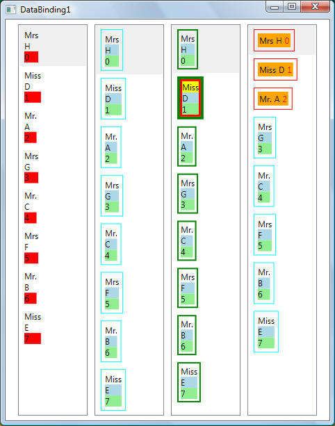
In this example, a data trigger was placed within a DataTemplate (in the Resources section) using the DataTemplate.Triggers property. Each Setter of the trigger sets the value of a property of an element (Border and StackPanel element) that is within the DataTemplate. However, if the properties that your Setters are concerned with are not properties of elements that are within the current DataTemplate, it may be more suitable to set the properties using a Style that is for the ListBoxItem class (if the control you are binding is a ListBox).
In general, keep in mind that the DataTemplate is being applied to each of the generated ListBoxItem. Your DataTemplate is concerned with only the presentation and appearance of the data objects. In most cases, all other aspects of presentation, such as what an item looks like when it is selected or how the ListBox lays out the items, do not belong in the definition of a DataTemplate.
As shown in the previous example, ItemTemplate is used to get/set the DataTemplate used to display each item. As shown above, the syntax is:
<!-- Property Element
Usage -->
<object>
<object.ItemTemplate>
<DataTemplate .../>
</object.ItemTemplate>
</object>
<!-- Attribute Usage -->
<object ItemTemplate=" ResourceExtension TemplateResourceKey"/>
Again, an ItemTemplate is used to specify the visual representation of data objects. As shown above, if your ItemsControl is bound to a collection object and you do not provide specific display instructions using a DataTemplate, the resulting UI of each item is a string representation of each object in the underlying collection.
A data template can be applied automatically using the DataType attribute, based on the type of the data item contained in the control. In the following markup, a template is designated as applying to data items of type Place. The ListBox applies this data template automatically when it displays the items in its collection.
<Window.Resources>
<!-- Data source object -->
<c:Places x:Key="PlacesData"/>
<Style TargetType="{x:Type
ListBoxItem}">
<Style.Triggers>
<DataTrigger Binding="{Binding
Path=State}" Value="WA">
<Setter Property="Foreground"
Value="Red" />
</DataTrigger>
<MultiDataTrigger>
<MultiDataTrigger.Conditions>
<Condition
Binding="{Binding Path=Name}" Value="Portland" />
<Condition
Binding="{Binding Path=State}" Value="OR" />
</MultiDataTrigger.Conditions>
<MultiDataTrigger.Setters>
<Setter
Property="Background" Value="Cyan" />
</MultiDataTrigger.Setters>
</MultiDataTrigger>
</Style.Triggers>
</Style>
<DataTemplate DataType="{x:Type
c:Place}">
<Canvas Width="160" Height="20">
<TextBlock FontSize="12" Width="130" Canvas.Left="0" Text="{Binding Path=Name}"/>
<TextBlock FontSize="12" Width="30" Canvas.Left="130" Text="{Binding Path=State}"/>
</Canvas>
</DataTemplate>
</Window.Resources>
<StackPanel>
<TextBlock FontSize="18" Margin="5"
FontWeight="Bold"
HorizontalAlignment="Center">
Data Trigger Sample
</TextBlock>
<ListBox Width="180"
HorizontalAlignment="Center" Background="Honeydew"
ItemsSource="{Binding Source={StaticResource PlacesData}}"/>
</StackPanel>
The following example shows how to bind to an enum. In particular it shows how to bind the HorizontalAlignment property of a button to values of the HorizontalAlignment enumeration:
<Window x:Class="DataBinding1.EnumBinding"
xmlns="http://schemas.microsoft.com/winfx/2006/xaml/presentation"
xmlns:x="http://schemas.microsoft.com/winfx/2006/xaml"
xmlns:sys="clr-namespace:System;assembly=mscorlib"
Title="EnumBinding">
<Window.Resources>
<ObjectDataProvider MethodName="GetValues"
ObjectType="{x:Type sys:Enum}" x:Key="AlignmentValues">
<ObjectDataProvider.MethodParameters>
<x:Type TypeName="HorizontalAlignment" />
</ObjectDataProvider.MethodParameters>
</ObjectDataProvider>
</Window.Resources>
<Border Margin="10" BorderBrush="DarkBlue" BorderThickness="2"
Padding="8">
<StackPanel>
<TextBlock>Choose the HorizontalAlignment value of the Button:</TextBlock>
<ListBox
Name="myComboBox" SelectedIndex="0" Margin="8"
ItemsSource="{Binding Source={StaticResource
AlignmentValues}}"/>
<Button
Content="Click Me!" HorizontalAlignment="{Binding ElementName=myComboBox,
Path=SelectedItem}"/>
</StackPanel>
</Border>
</Window>
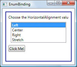
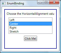
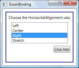
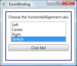
MultiBinding allows you to bind a binding target property to a list of source properties and then apply logic to produce a value with the given inputs. To associate a converter with a MultiBinding, create a class that implements the IMultiValueConverter interface, and then implement the Convert and ConvertBack methods. For example:
<Window.Resources>
<c:NameList x:Key="NameListData"/>
<c:NameConverter
x:Key="myNameConverter"/>
</Window.Resources>
...
<TextBlock Name="textBox2" DataContext="{StaticResource
NameListData}">
<TextBlock.Text>
<MultiBinding
Converter="{StaticResource myNameConverter}"
ConverterParameter="FormatLastFirst">
<Binding Path="FirstName"/>
<Binding Path="LastName"/>
</MultiBinding>
</TextBlock.Text>
</TextBlock>
...
public class
NameConverter : IMultiValueConverter
{
public object Convert(object[] values, Type targetType,
object parameter, CultureInfo culture)
{
string name;
switch ((string)parameter)
{
case "FormatLastFirst":
name = values[1] + ", " + values[0];
break;
case "FormatNormal":
default:
name = values[0] + " " + values[1];
break;
}
return name;
}
public object[] ConvertBack(object value, Type[] targetTypes,
object parameter, CultureInfo culture)
{
string[] splitValues = ((string)value).Split('
');
return splitValues;
}
}
Similar to MultiBinding is
PriorityBinding which describes a collection of
Binding objects that is attached to a single binding
target property, which receives its value from the first binding in the
collection that produces a value successfully. The priority of the bindings is
determined by their order in the list. The binding that appears first in the
list has the highest priority. The binding engine starts with the first binding
in the list and verifies whether that binding returns a value successfully; if
it does, the value from that binding is used. If the first binding does not
return a value successfully, the binding engine examines the second binding to
determine whether it returns a value successfully; if it does, the value from
the second binding becomes the active value. This verification process continues
to the end of the list of bindings. If none of the bindings returns a value
successfully, the binding uses the
FallbackValue.
<Window x:Class="SortedList.Window1"
xmlns="http://schemas.microsoft.com/winfx/2006/xaml/presentation"
xmlns:x="http://schemas.microsoft.com/winfx/2006/xaml"
Title="SortedList" Height="300" Width="521"
>
<DockPanel LastChildFill="True">
<StackPanel Orientation="Horizontal" DockPanel.Dock="Top">
<Button Content="Use List" Click="UseList_Handler" Width="100"></Button>
<Button Content="Use ListCollectionView" Click="UseCollectionView_Handler"
Width="100"></Button>
<Button Content="Use Observable" Click="UseObservable_Handler"
Width="100"></Button>
<Button Name="btnAdd" Click="btnClick_Handler">Button</Button>
<TextBox Name="txtData" Width="100"></TextBox>
</StackPanel>
<ListBox Margin="58,54,56,65" Name="lbData" />
</DockPanel>
</Window>
using System;
using System.Collections.Generic;
using System.Text;
using System.Windows;
using System.Windows.Controls;
using System.Windows.Data;
using System.Windows.Documents;
using System.Windows.Input;
using System.Windows.Media;
using System.Windows.Media.Imaging;
using System.Windows.Shapes;
using System.Diagnostics;
using System.Collections.ObjectModel;
using System.ComponentModel;
namespace SortedList
{
/// <summary>
/// Interaction logic for Window1.xaml
/// </summary>
public partial class Window1 : System.Windows.Window
{
private enum CollectionType {LIST, COLLECTIONVIEW, OBSERVABLECOLLECTION}
private CollectionType _eCT;
private List<string> _lstData;
private ListCollectionView _lstCV;
private ObservableCollection<string> _lstOC;
public Window1()
{
InitializeComponent();
}
private void UseList_Handler(object sender, RoutedEventArgs args)
{
_eCT = CollectionType.LIST;
// Create list
_lstData = new List<string>();
_lstData.Add("A");
_lstData.Add("E");
_lstData.Add("B");
_lstData.Add("D");
_lstData.Add("C");
// Sort list
_lstData.Sort();
foreach (string s in _lstData)
Trace.WriteLine(s);
// Now bind list to the list box
lbData.ItemsSource = _lstData;
}
private void UseCollectionView_Handler(object sender, RoutedEventArgs args)
{
_eCT = CollectionType.COLLECTIONVIEW;
// Create list
List<string> lstData = new List<string>();
lstData.Add("A");
lstData.Add("E");
lstData.Add("B");
lstData.Add("D");
lstData.Add("C");
_lstCV = new ListCollectionView(lstData); // Constructor must take a IList list
// Sort list
SortDescription sd = new SortDescription();
sd.Direction = ListSortDirection.Ascending;
_lstCV.SortDescriptions.Add(sd);
// Now bind list to the list box
lbData.ItemsSource = _lstCV;
}
private void UseObservable_Handler(object sender, RoutedEventArgs args)
{
_eCT = CollectionType.OBSERVABLECOLLECTION;
// Create list
_lstOC = new ObservableCollection<string>();
_lstOC.Add("A");
_lstOC.Add("E");
_lstOC.Add("B");
_lstOC.Add("D");
_lstOC.Add("C");
// Sort list
ICollectionView view = CollectionViewSource.GetDefaultView(_lstOC);
SortDescription sd = new SortDescription();
sd.Direction = ListSortDirection.Ascending;
view.SortDescriptions.Add( sd);
// Now bind list to the list box
lbData.ItemsSource = _lstOC;
}
// Adds items to the current data source
private void btnClick_Handler(object sender, RoutedEventArgs args)
{
switch (_eCT)
{
case CollectionType.LIST:
// Data added to list but is not reflected in the ListBox. To allow changes
// to be reflected in the list box, use an INotifyCollectionChanged-derived
container
_lstData.Add(txtData.Text);
break;
case CollectionType.COLLECTIONVIEW:
// CANNOT ADD ITEMS TO A CollectionView-derived collection!
break;
case CollectionType.OBSERVABLECOLLECTION:
_lstOC.Add(txtData.Text);
break;
}
}
}
}